You can use the xlim() and ylim() functions to set the x-axis limits and y-axis limits of plots in R.
The following examples show how to use these functions in practice.
Example 1: Use xlim() to Set X-Axis Limits
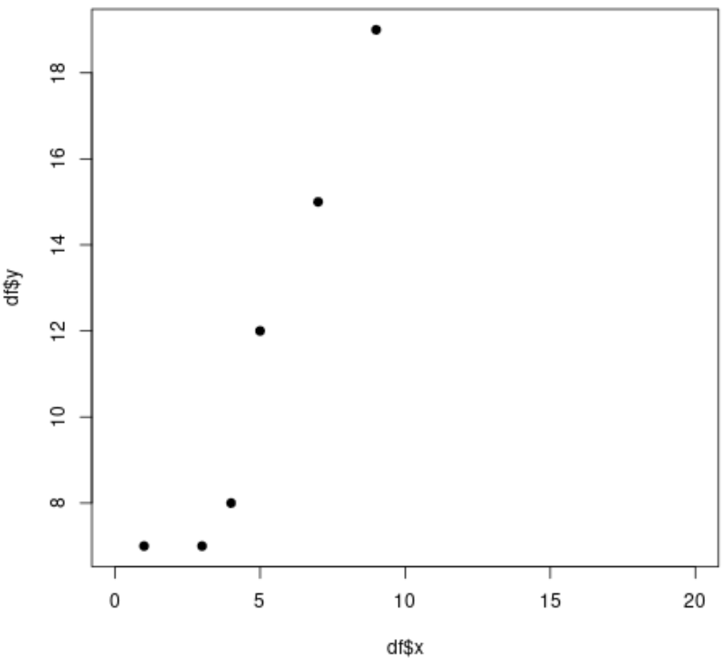
The following code shows how to create a scatterplot in R and specify the x-axis limits using the xlim() function:
#define data frame
df frame(x=c(1, 3, 4, 5, 7, 9),
                 y=c(7, 7, 8, 12, 15, 19))

#create scatterplot with x-axis limits ranging from 0 to 20
plot(df$x, df$y, pch=19, xlim=c(0, 20))
Example 2: Use ylim() to Set Y-Axis Limits
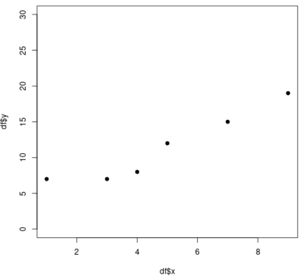
The following code shows how to create a scatterplot in R and specify the y-axis limits using the ylim() function:
#define data frame
df frame(x=c(1, 3, 4, 5, 7, 9),
                 y=c(7, 7, 8, 12, 15, 19))

#create scatterplot with y-axis limits ranging from 0 to 30
plot(df$x, df$y, pch=19, ylim=c(0, 30))
Example 3: Use xlim() & ylim() to Set Axis Limits
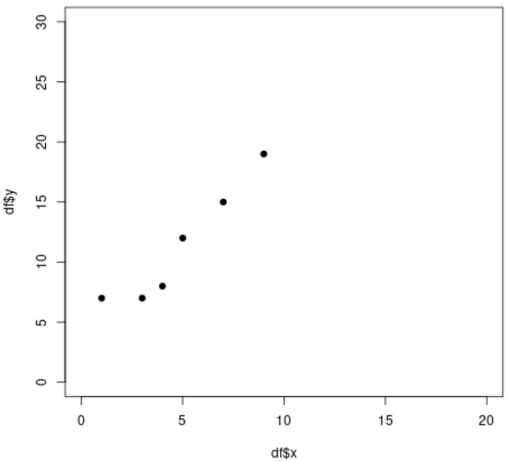
The following code shows how to create a scatterplot in R and specify both the x-axis limits and the y-axis limits:
#define data frame
df frame(x=c(1, 3, 4, 5, 7, 9),
                 y=c(7, 7, 8, 12, 15, 19))

#create scatterplot and specify both x-axis limits and y-axis limits
plot(df$x, df$y, pch=19, xlim=c(0, 20), ylim=c(0, 30))
Additional Resources
How to Set Axis Limits in ggplot2
How to Set Axis Breaks in ggplot2
How to Create a Log Scale in ggplot2
How to Create a Log-Log Plot in R


