The term univariate analysis refers to the analysis of one variable. You can remember this because the prefix “uni” means “one.”
There are three common ways to perform univariate analysis on one variable:
1. Summary statistics – Measures the center and spread of values.
2. Frequency table – Describes how often different values occur.
3. Charts – Used to visualize the distribution of values.
This tutorial provides an example of how to perform univariate analysis with the following pandas DataFrame:
import pandas as pd

#create DataFrame
df = pd.DataFrame({'points': [1, 1, 2, 3.5, 4, 4, 4, 5, 5, 6.5, 7, 7.4, 8, 13, 14.2],
                   'assists': [5, 7, 7, 9, 12, 9, 9, 4, 6, 8, 8, 9, 3, 2, 6],
                   'rebounds': [11, 8, 10, 6, 6, 5, 9, 12, 6, 6, 7, 8, 7, 9, 15]})

#view first five rows of DataFrame
df.head()

	points	assists	rebounds
0	1.0	5	11
1	1.0	7	8
2	2.0	7	10
3	3.5	9	6
4	4.0	12	6
1. Calculate Summary Statistics
We can use the following syntax to calculate various summary statistics for the ‘points’ variable in the DataFrame:
#calculate mean of 'points'
df['points'].mean()

5.706666666666667

#calculate median of 'points'
df['points'].median()

5.0

#calculate standard deviation of 'points'
df['points'].std()

3.858287308169384
2. Create Frequency Table
We can use the following syntax to create a frequency table for the ‘points’ variable:
#create frequency table for 'points'
df['points'].value_counts()

4.0     3
1.0     2
5.0     2
2.0     1
3.5     1
6.5     1
7.0     1
7.4     1
8.0     1
13.0    1
14.2    1
Name: points, dtype: int64
This tells us that:
- The value 4 occurs 3 times
- The value 1 occurs 2 times
- The value 5 occurs 2 times
- The value 2 occurs 1 time
And so on.
Related: How to Create Frequency Tables in Python
3. Create Charts
We can use the following syntax to create a boxplot for the ‘points’ variable:
import matplotlib.pyplot as plt

df.boxplot(column=['points'], grid=False, color='black')
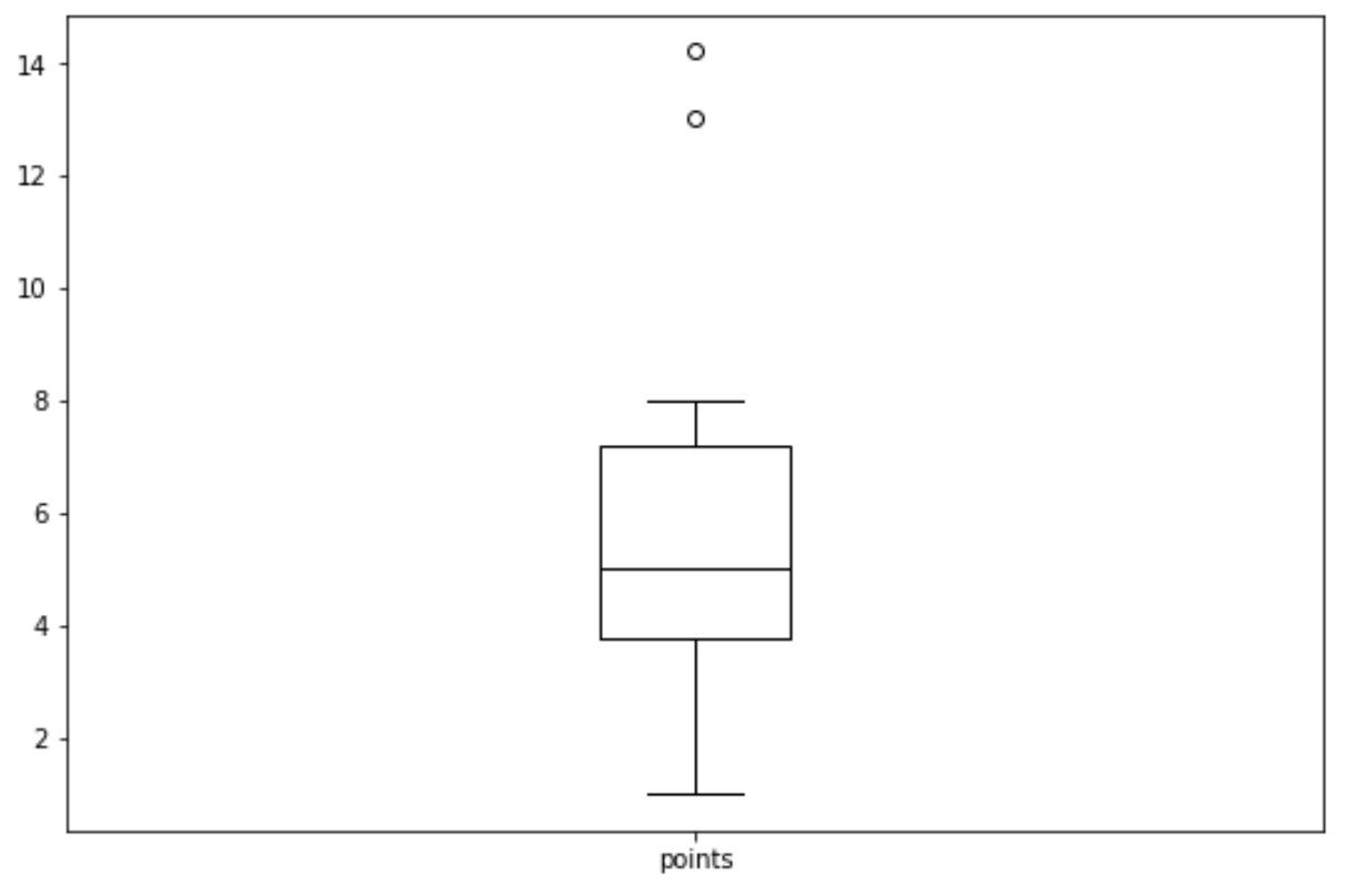
Related: How to Create Boxplot from Pandas DataFrame
We can use the following syntax to create a histogram for the ‘points’ variable:
import matplotlib.pyplot as plt

df.hist(column='points', grid=False, edgecolor='black')
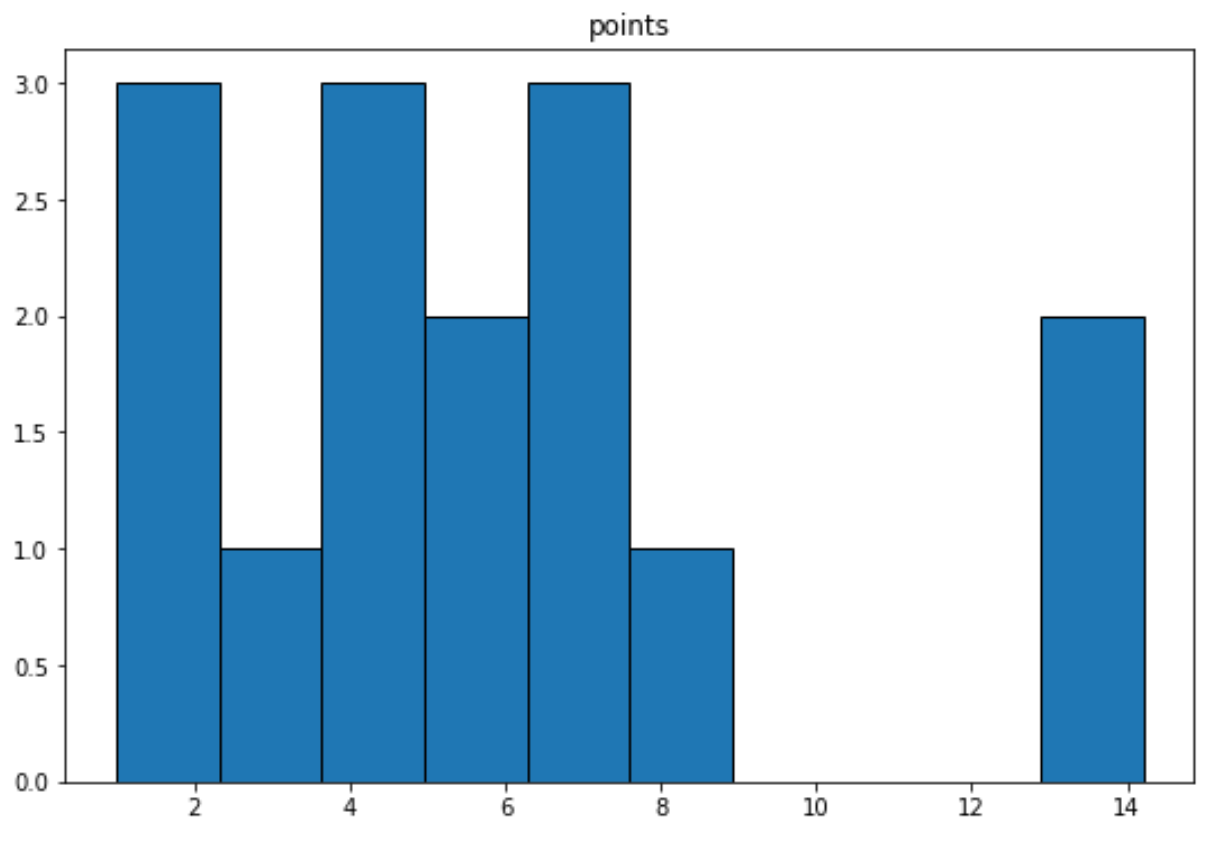
Related: How to Create a Histogram from Pandas DataFrame
We can use the following syntax to create a density curve for the ‘points’ variable:
import seaborn as sns

sns.kdeplot(df['points'])
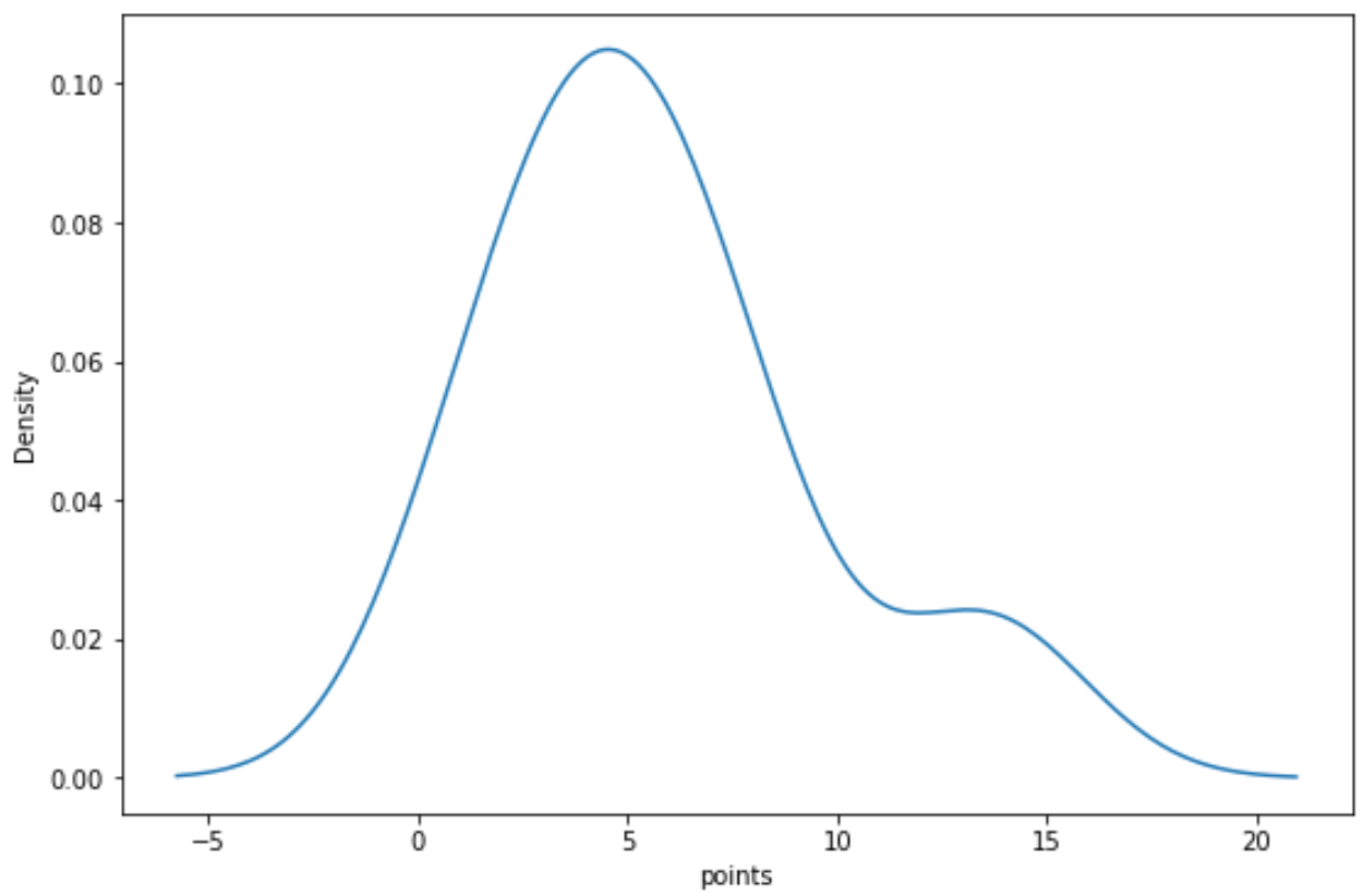
Related: How to Create a Density Plot in Matplotlib
Each of these charts give us a unique way to visualize the distribution of values for the ‘points’ variable.