A statistical process control chart is a type of chart that is used to visualize how a process changes over time and is used to determine whether or not a process remains in a state of control.
The following step-by-step example shows how to create a statistical process control chart in Excel.
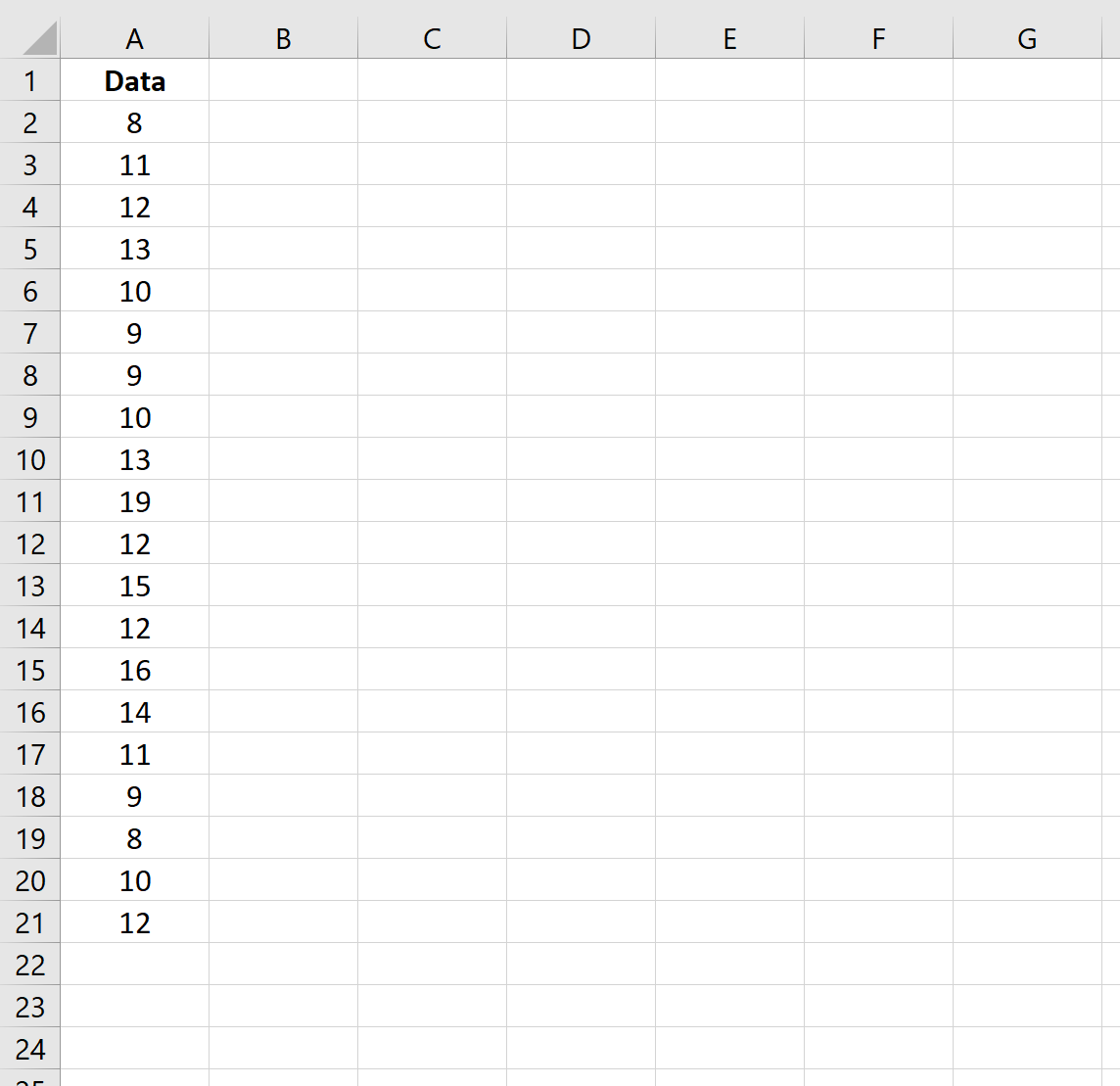
Step 1: Enter the Data
First, let’s enter the values for our sample data:
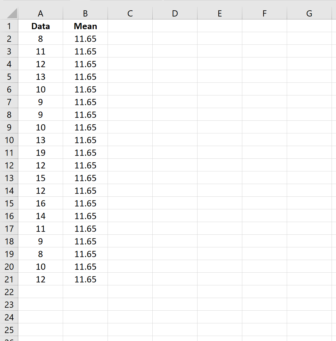
Step 2: Calculate the Mean
Next, we can use the following formula to calculate the mean value of the dataset:
=AVERAGE($A$2:$A$21)
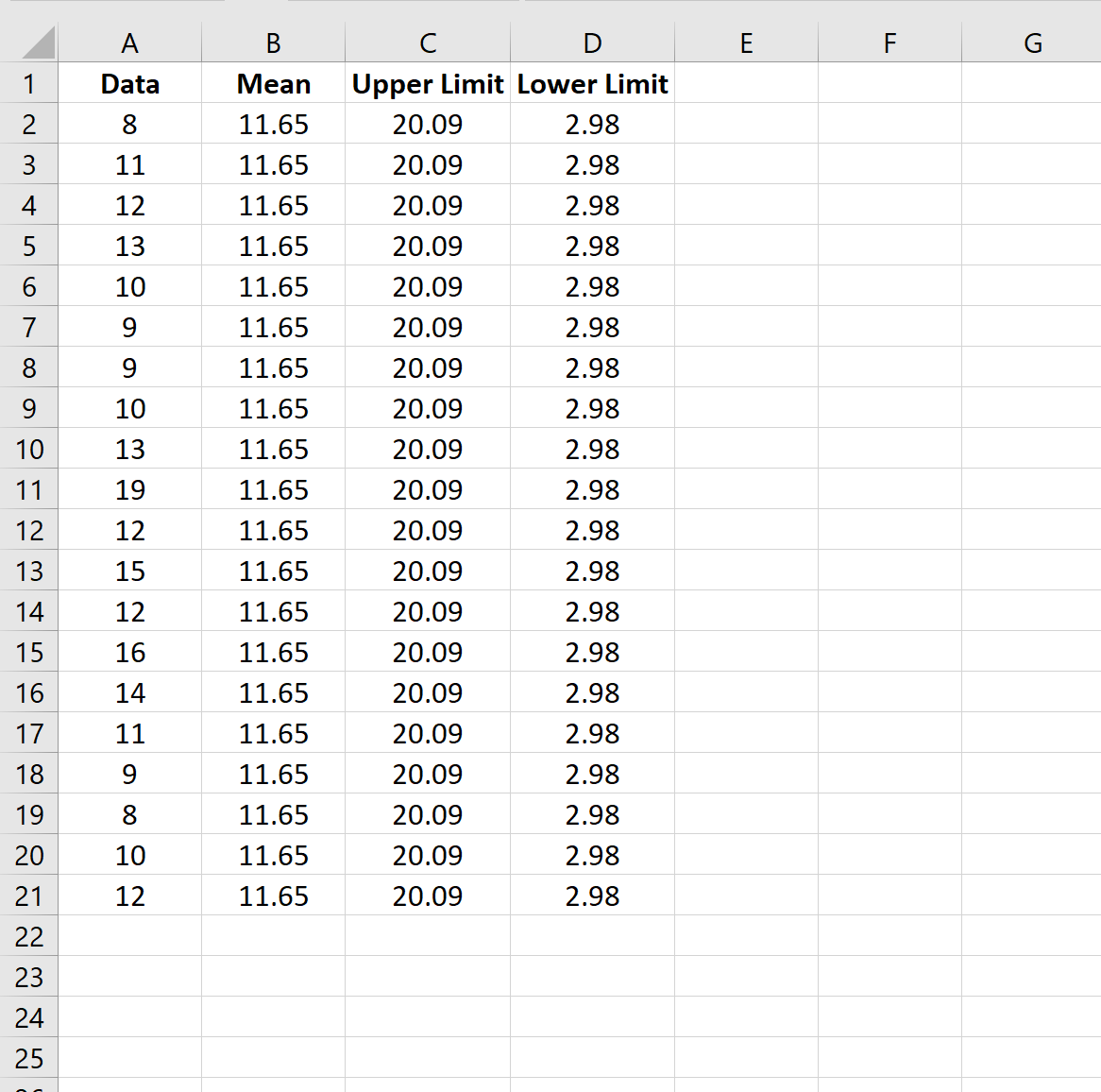
Step 3: Calculate the Upper & Lower Limits
Next, we can use the following formula to calculate the upper and lower limits for the chart:
#Upper limit calculation
=$B$2+3*STDEV.S($A$2:$A$21)

#Lower limit calculation
=$B$2-3*STDEV.S($A$2:$A$21)
Step 4: Create the Statistical Process Control Chart
Lastly, we can highlight every value in the cell range A1:D21, then click the Insert tab along the top ribbon, then click Insert Line Chart.
The following statistical process control chart will appear:
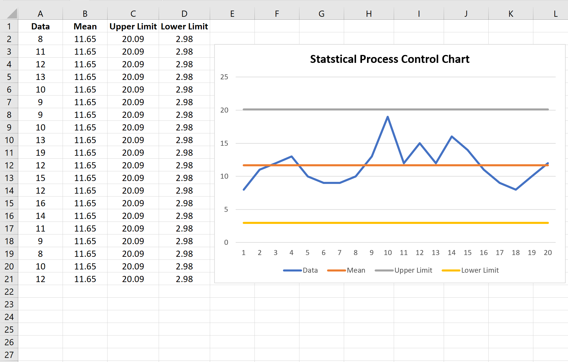
Here’s how to interpret the lines in the chart:
- Blue line: The raw data
- Orange line: The mean value of the data
- Grey line: The upper limit on the process
- Yellow line: The lower limit of the process
Since the blue line (the raw data) never crosses the upper limit or lower limit on the chart, we would say that the process remained in a state of control for the entire duration of the data collection.
In more technical terms, we would say that the data values never exceeded 3 standard deviations above or below the mean value of the dataset.
Additional Resources
The following examples explain how to create other common charts in Excel:
How to Plot Multiple Lines in Excel
How to Create an Ogive Graph in Excel
How to Make a Bell Curve in Excel