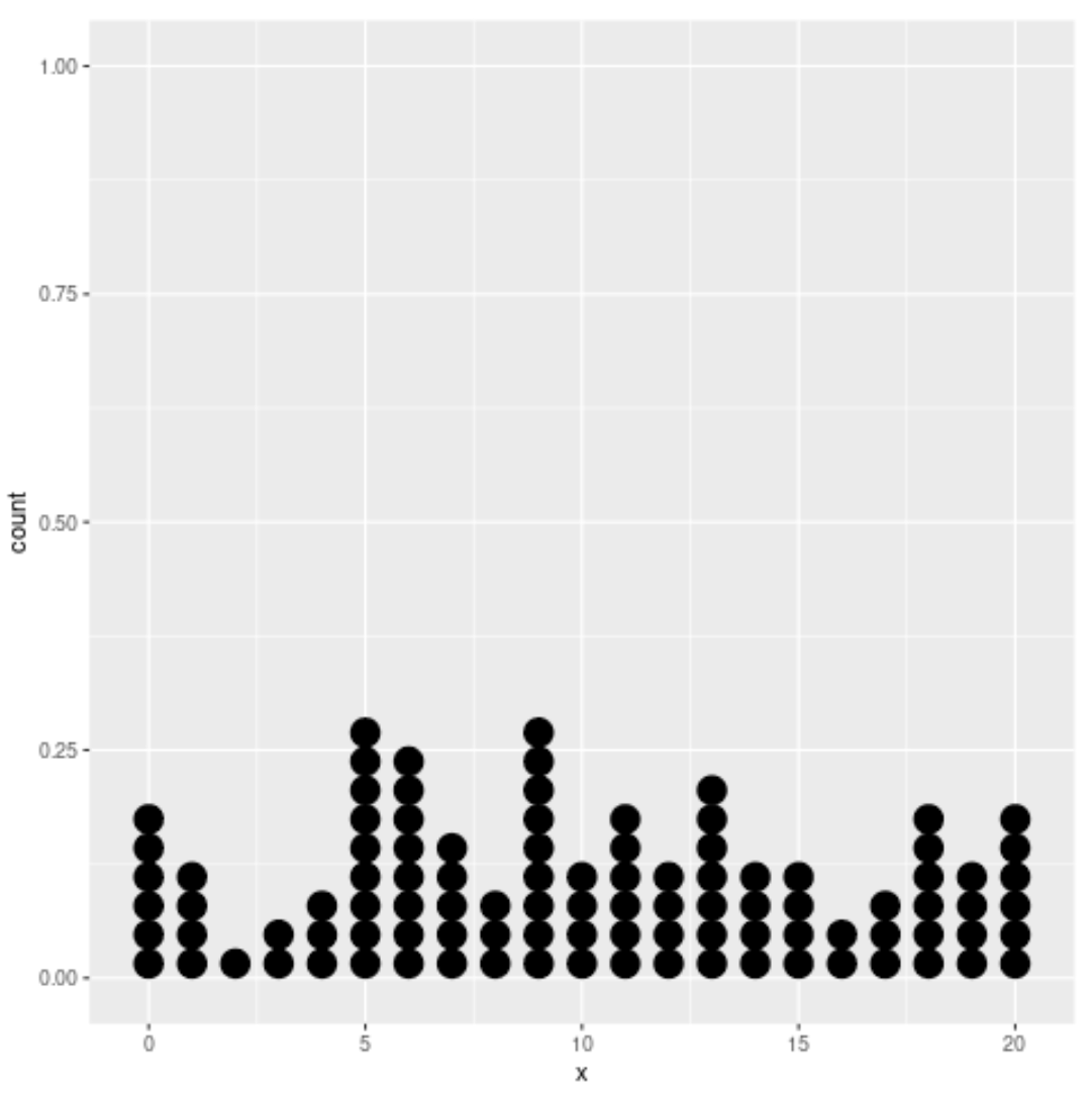
A stacked dot plot is a type of plot that displays frequencies using dots.
There are two methods you can use to create a stacked dot plot in R:
Method 1: The stripchart() function in base R.
Method 2: The geom_dotplot() function in ggplot2.
This tutorial provides a brief example of how to use each of these methods to produce a stacked dot plot.
Example 1: Stacked Dot Plot in Base R
The following code shows how to make a basic stacked dot plot in base R:
#create some fake data
set.seed(0)
data TRUE)

#create stacked dot plot
stripchart(data, method = "stack")
And the following code shows how to customize the stacked dot plot to make it more aesthetically pleasing:
#create some fake data
set.seed(0)
data TRUE)

#create stacked dot plot
stripchart(data, method = "stack", offset = .5, at = 0, pch = 19,
           col = "steelblue", main = "Stacked Dot Plot", xlab = "Data Values")
Example 2: Stacked Dot Plot in ggplot2
The following code shows how to make a basic stacked dot plot in ggplot2:
#load ggplot2
library(ggplot2)

#create some fake data
set.seed(0)
data frame(x = sample(0:20, 100, replace = TRUE))

#create stacked dot plot
ggplot(data, aes(x = x)) +
  geom_dotplot()
And the following code shows how to customize the stacked dot plot to make it more aesthetically pleasing:
#load ggplot2
library(ggplot2)

#create some fake data
set.seed(0)
data frame(x = sample(0:20, 100, replace = TRUE))

#create customized stacked dot plot
ggplot(data, aes(x = x)) +
  geom_dotplot(dotsize = .75, stackratio = 1.2, fill = "steelblue") +
  scale_y_continuous(NULL, breaks = NULL) +
  labs(title = "Stacked Dot Plot", x = "Data Values", y = "")
You can find more R tutorials here.


