A stacked barplot is a type of chart that displays quantities for different variables, stacked by another variable.
This tutorial explains how to create stacked barplots in R using the data visualization library ggplot2.
Stacked Barplot in ggplot2
Suppose we have the following data frame that displays the average points scored per game for nine basketball players:
#create data frame
df rep(c('A', 'B', 'C'), each=3),
                 position=rep(c('Guard', 'Forward', 'Center'), times=3),
                 points=c(14, 8, 8, 16, 3, 7, 17, 22, 26))

#view data frame
df

  team position points
1    A    Guard     14
2    A  Forward      8
3    A   Center      8
4    B    Guard     16
5    B  Forward      3
6    B   Center      7
7    C    Guard     17
8    C  Forward     22
9    C   Center     26
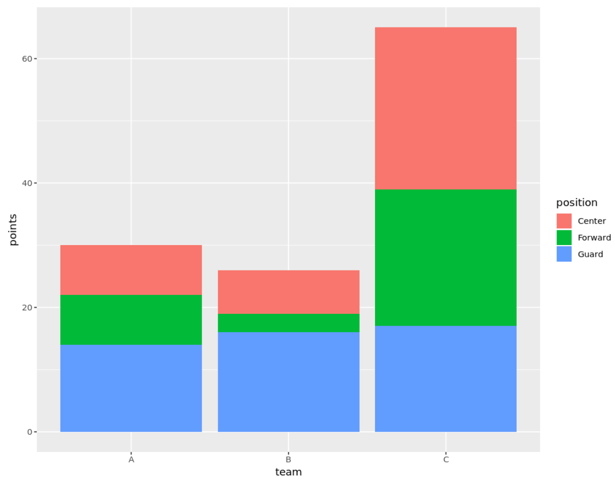
We can use the following code to create a stacked barplot that displays the points scored by each player, stacked by team and position:
library(ggplot2)

ggplot(df, aes(fill=position, y=points, x=team)) +
  geom_bar(position='stack', stat='identity')
Customizing a Stacked Barplot
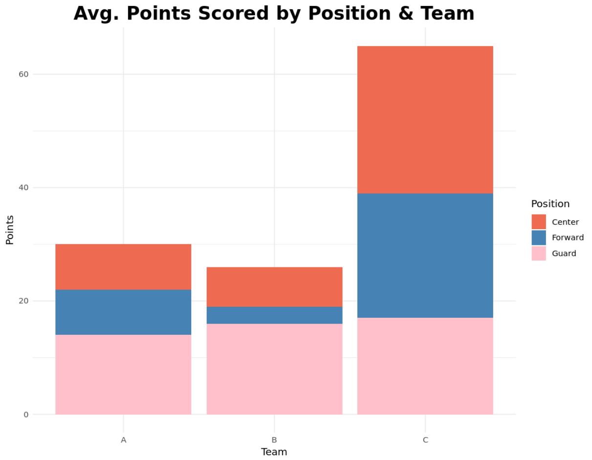
We can also customize the title, axes labels, theme, and colors of the stacked barplot to make it look however we’d like:
library(ggplot2)

ggplot(df, aes(fill=position, y=points, x=team)) +
  geom_bar(position='stack', stat='identity') +
  theme_minimal() +
  labs(x='Team', y='Points', title='Avg. Points Scored by Position & Team') +
  theme(plot.title = element_text(hjust=0.5, size=20, face='bold')) +
  scale_fill_manual('Position', values=c('coral2', 'steelblue', 'pink'))
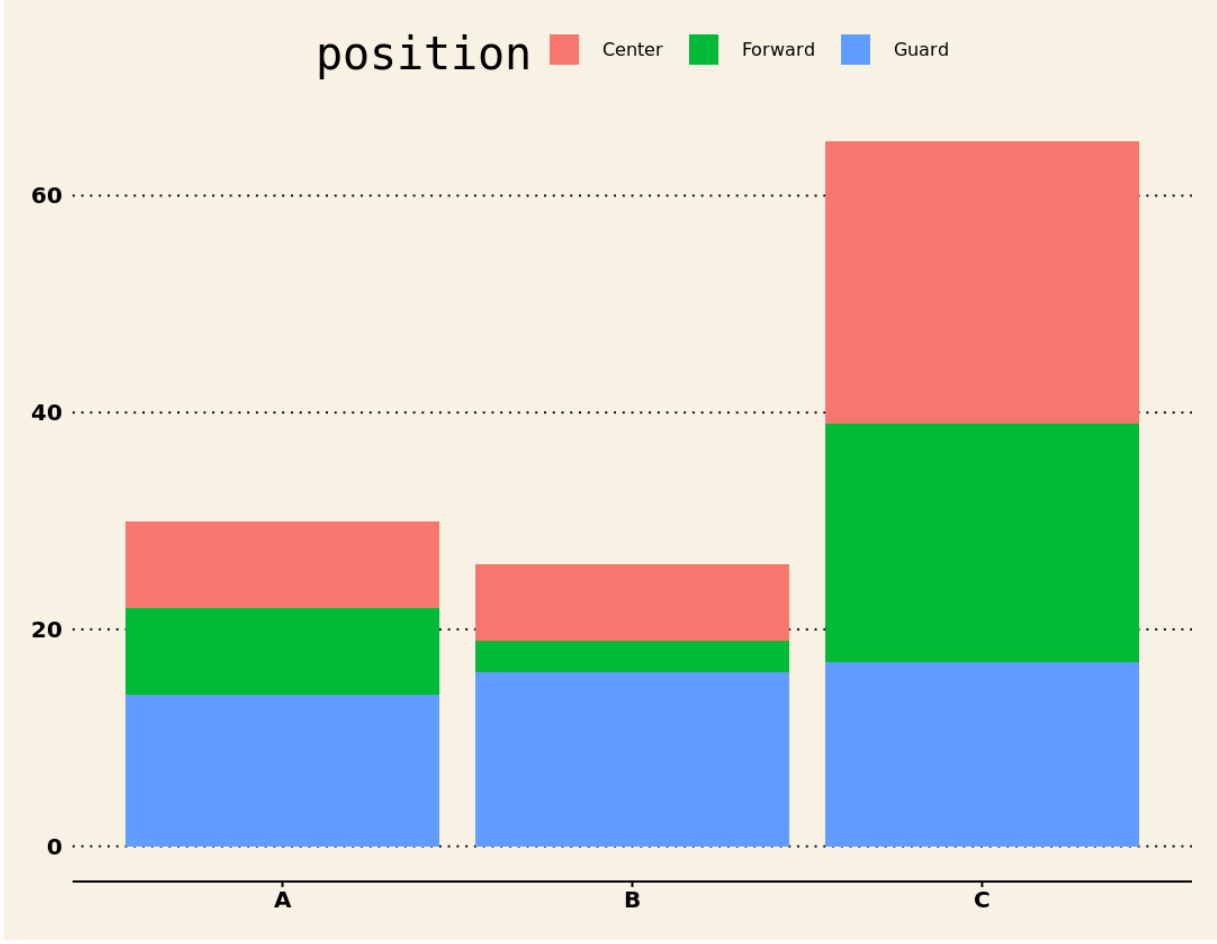
We can also customize the appearance further by using one of the pre-defined themes in the ggthemes library. For example, we could use the Wall Street Journal Theme from this library:
install.packages('ggthemes')

library(ggplot2)
library(ggthemes)

ggplot(df, aes(fill=position, y=points, x=team)) +
  geom_bar(position='stack', stat='identity') +
  theme_wsj()
Refer to our Complete Guide to the Best ggplot2 Themes for even more themes.
Additional Resources
The Complete Guide to ggplot2 Titles
How to Create a Grouped Boxplot in R Using ggplot2
How to Create Side-by-Side Plots in ggplot2


