A time series plot is useful for visualizing data values that change over time.
This tutorial explains how to create various time series plots using the seaborn data visualization package in Python.
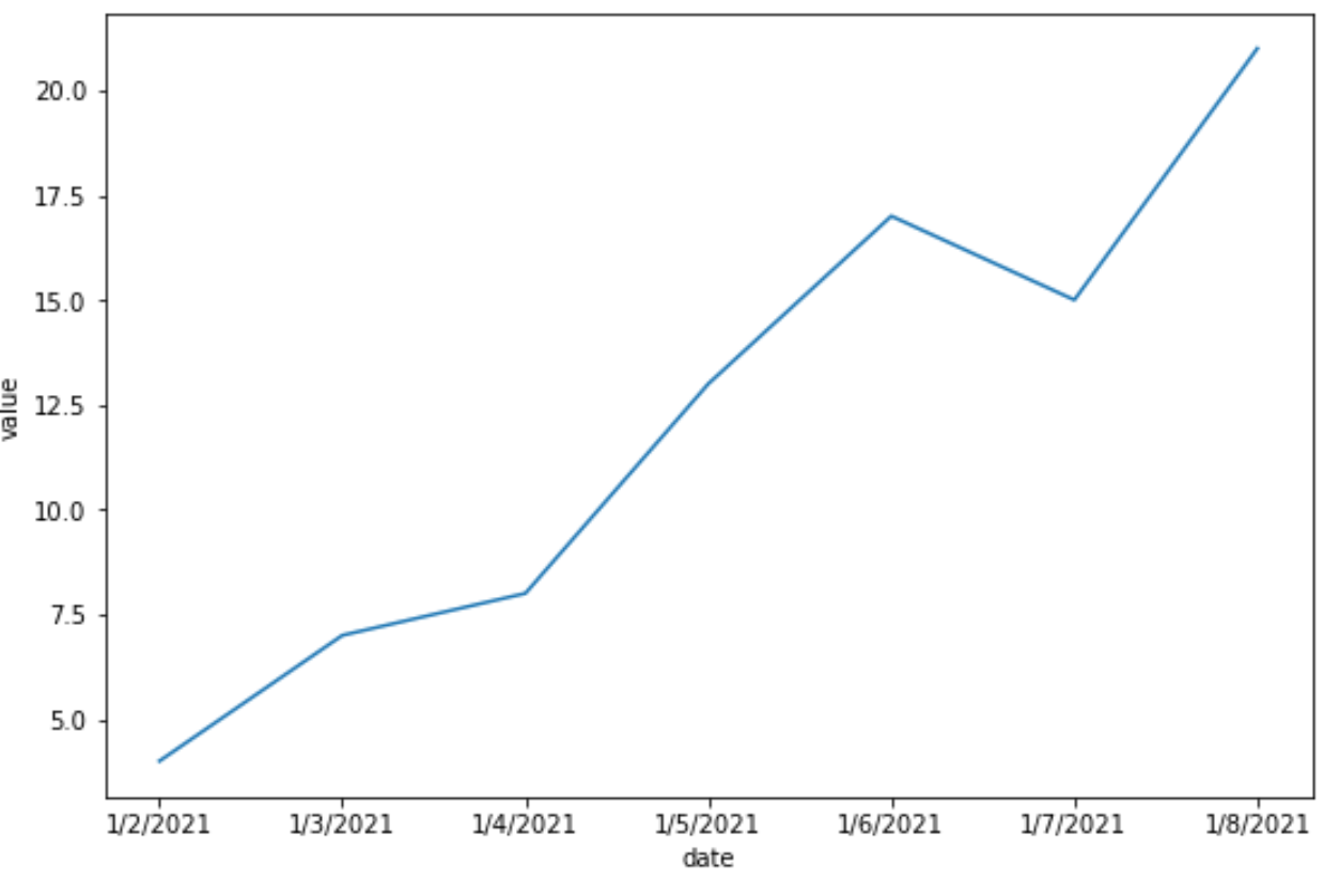
Example 1: Plot a Single Time Series
The following code shows how to plot a single time series in seaborn:
import pandas as pd
import matplotlib.pyplot as plt
import seaborn as sns

#create DataFrame
df = pd.DataFrame({'date': ['1/2/2021',
                            '1/3/2021',
                            '1/4/2021',
                            '1/5/2021',
                            '1/6/2021',
                            '1/7/2021',
                            '1/8/2021'],
                   'value': [4, 7, 8, 13, 17, 15, 21]})

sns.lineplot(x='date', y='value', data=df)
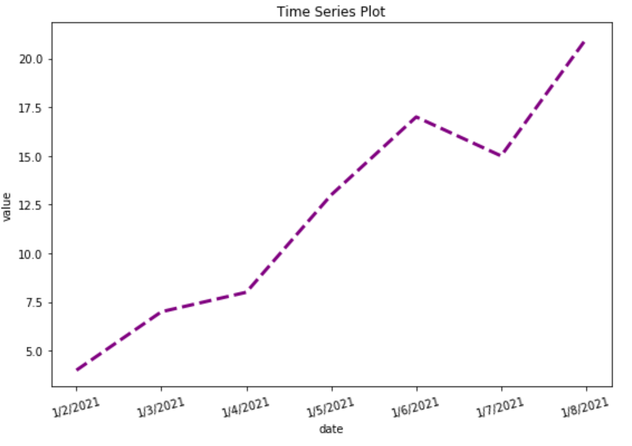
Note that we can also customize the colors, line width, line style, labels, and titles of the plot:
#create time series plot with custom aesthetics
sns.lineplot(x='date', y='value', data=df, linewidth=3, color='purple',
             linestyle='dashed').set(title='Time Series Plot')

#rotate x-axis labels by 15 degrees
plt.xticks(rotation=15)
Example 2: Plot Multiple Time Series
The following code shows how to plot multiple time series in seaborn:
import pandas as pd
import matplotlib.pyplot as plt
import seaborn as sns

#create DataFrame
df = pd.DataFrame({'date': ['1/1/2021',
                            '1/2/2021',
                            '1/3/2021',
                            '1/4/2021',
                            '1/1/2021',
                            '1/2/2021',
                            '1/3/2021',
                            '1/4/2021'],
                   'sales': [4, 7, 8, 13, 17, 15, 21, 28],
                   'company': ['A', 'A', 'A', 'A', 'B', 'B', 'B', 'B']})

#plot multiple time series
sns.lineplot(x='date', y='sales', hue='company', data=df)
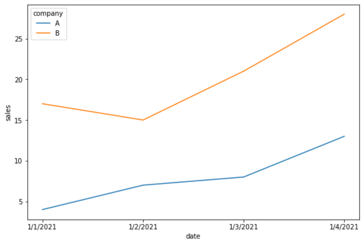
Note that the hue argument is used to provide different colors to each line in the plot.
Additional Resources
The following tutorials explain how to perform other common functions in seaborn:
How to Add a Title to Seaborn Plots
How to Change Legend Font Size in Seaborn
How to Change the Position of a Legend in Seaborn