The Python data visualization library Seaborn doesn’t have a default function to create pie charts, but you can use the following syntax in Matplotlib to create a pie chart and add a Seaborn color palette:
import matplotlib.pyplot as plt
import seaborn as sns

#define data
data = [value1, value2, value3, ...]
labels = ['label1', 'label2', 'label3', ...]

#define Seaborn color palette to use
colors = sns.color_palette('pastel')[0:5]

#create pie chart
plt.pie(data, labels = labels, colors = colors, autopct='%.0f%%')
plt.show()
Refer to the Seaborn documentation for a complete list of color palettes.
The following examples show how to use this syntax in practice.
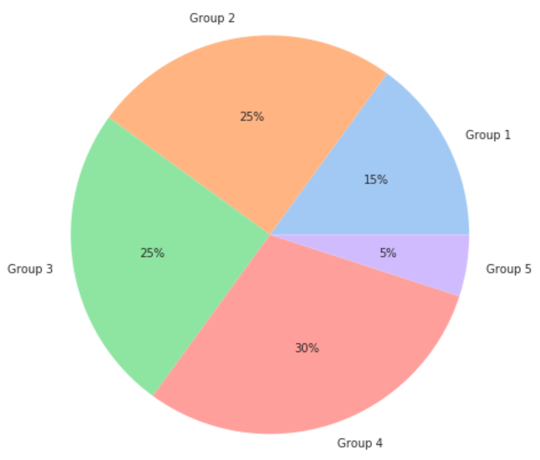
Example 1: Pie Chart with Pastel Seaborn Color Palette
The following code shows how to create a pie chart using the ‘pastel‘ Seaborn color palette:
import matplotlib.pyplot as plt
import seaborn as sns

#define data
data = [15, 25, 25, 30, 5]
labels = ['Group 1', 'Group 2', 'Group 3', 'Group 4', 'Group 5']

#define Seaborn color palette to use
colors = sns.color_palette('pastel')[0:5]

#create pie chart
plt.pie(data, labels = labels, colors = colors, autopct='%.0f%%')
plt.show()
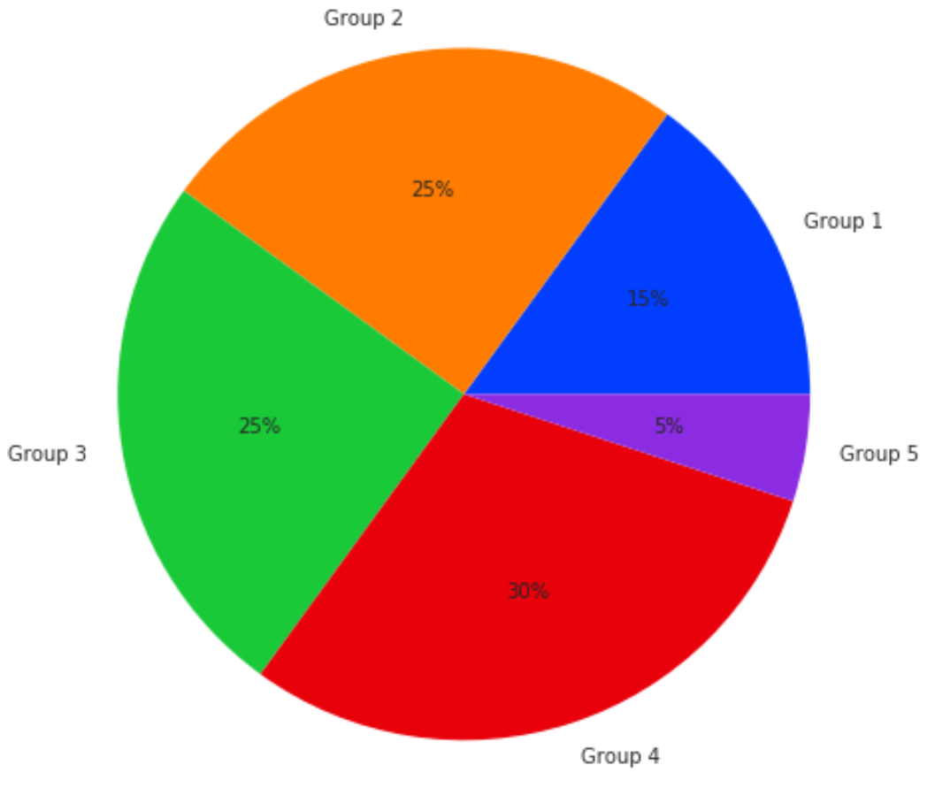
Example 2: Pie Chart with Bright Seaborn Color Palette
The following code shows how to create a pie chart using the ‘bright‘ Seaborn color palette:
import matplotlib.pyplot as plt
import seaborn as sns

#define data
data = [15, 25, 25, 30, 5]
labels = ['Group 1', 'Group 2', 'Group 3', 'Group 4', 'Group 5']

#define Seaborn color palette to use
colors = sns.color_palette('bright')[0:5]

#create pie chart
plt.pie(data, labels = labels, colors = colors, autopct='%.0f%%')
plt.show()
These two examples illustrate how to create a pie chart with two different Seaborn color palettes.
However, there are many more styles you could use. Refer to the online documentation for a complete list of color palettes.
Additional Resources
How to Create Heatmaps in Seaborn
How to Create Barplots in Seaborn
How to Add a Title to Seaborn Plots