You can use the following methods to change the colors of lines in a seaborn plot:
Method 1: Change Color of One Line in Seaborn
You can use the color argument to specify the color when creating a line plot with one line:
sns.lineplot(data=df, x='x_var', y='y_var', color='red')
Method 2: Change Color of Multiple Lines in Seaborn
You can use the palette argument to specify several colors when creating a line plot with multiple lines:
sns.lineplot(data=df, x='x_var', y='y_var', hue='group_var', palette=['red', 'blue'])
The following examples show how to use each method in practice.
Example 1: Change Color of One Line in Seaborn
Suppose we have the following pandas DataFrame that contains information about the sales made during ten consecutive days at some retail store:
import pandas as pd

#create DataFrame
df = pd.DataFrame({'day': [1, 2, 3, 4, 5, 6, 7, 8, 9, 10],
                   'sales': [3, 3, 5, 4, 5, 6, 8, 9, 14, 18]})

#view DataFrame
print(df)

   day  sales
0    1      3
1    2      3
2    3      5
3    4      4
4    5      5
5    6      6
6    7      8
7    8      9
8    9     14
9   10     18
We can use the color argument within the lineplot() function to create a line plot with a specific color:
import seaborn as sns

#create lineplot with red line to show sales by day
sns.lineplot(data=df, x='day', y='sales', color='red')
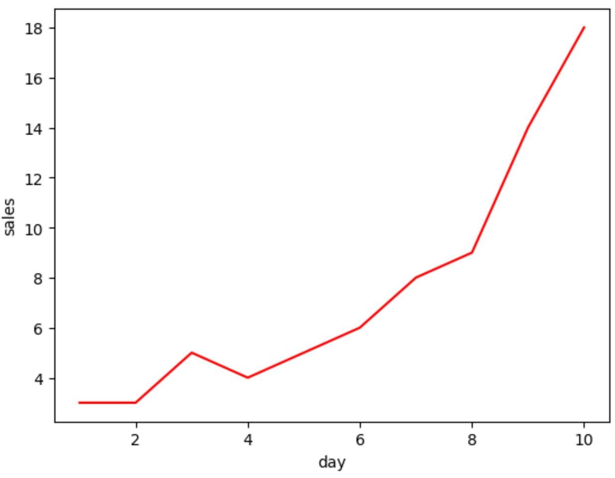
The color of the line in the plot corresponds to the ‘red’ that we specified using the color argument.
Also note that we can provide hex color codes to the color argument:
import seaborn as sns

#create lineplot with teal line to show sales by day
sns.lineplot(data=df, x='day', y='sales', color='#028ca1')

Example 2: Change Color of Multiple Lines in Seaborn
Suppose we have the following pandas DataFrame that contains information about the sales made during five consecutive days at two different retail stores:
import pandas as pd

#create DataFrame
df = pd.DataFrame({'day': [1, 2, 3, 4, 5, 1, 2, 3, 4, 5],
                   'store': ['A', 'A', 'A', 'A', 'A',
                             'B', 'B', 'B', 'B', 'B'],
                   'sales': [3, 3, 5, 4, 7, 6, 8, 9, 12, 13]})

#view DataFrame
print(df)

   day store  sales
0    1     A      3
1    2     A      3
2    3     A      5
3    4     A      4
4    5     A      7
5    1     B      6
6    2     B      8
7    3     B      9
8    4     B     12
9    5     B     13
We can use the palette argument within the lineplot() function to create a line plot with multiple specific colors:
import seaborn as sns

#create lineplot with red and blue lines to show sales by day by store
sns.lineplot(data=df, x='day', y='sales', hue='store', palette=['red', 'blue'])
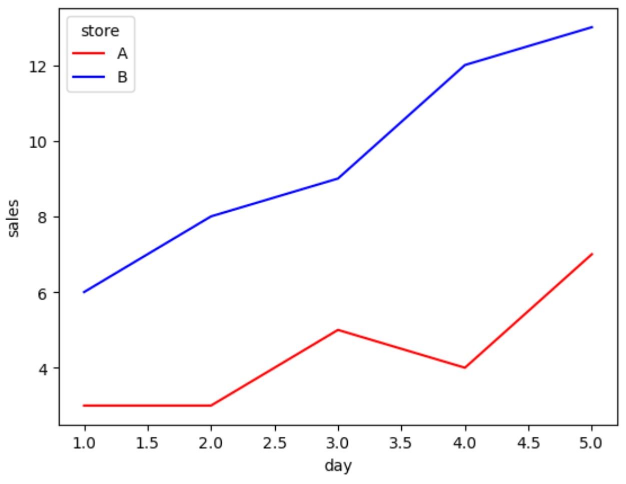
The colors of the lines correspond to the colors that we specified using the palette argument.
Also note that you can provide hex color codes to the palette argument as well.
Additional Resources
The following tutorials explain how to perform other common tasks in seaborn:
How to Adjust Line Thickness in Seaborn
How to Plot Multiple Lines in Seaborn
How to Change the Position of a Legend in Seaborn