You can use the following basic syntax to create a horizontal barplot in seaborn:
sns.barplot(x=df.values_var, y=df.group_var, orient='h')
The orient=’h’ argument tells seaborn to orient the bars horizontally instead of the default vertical.
The following example shows how to use this syntax in practice.
Example: How to Create a Horizontal Barplot in Seaborn
Suppose we have the following pandas DataFrame that contains information about the total sales made by various employees at a company:
import pandas as pd

#create DataFrame
df = pd.DataFrame({'employee': ['Andy', 'Bert', 'Chad', 'Doug', 'Eric', 'Frank'],
                   'sales': [22, 14, 9, 7, 29, 20]})

#view DataFrame
print(df)

  employee  sales
0     Andy     22
1     Bert     14
2     Chad      9
3     Doug      7
4     Eric     29
5    Frank     20
We can use the following syntax to create a horizontal barplot to visualize the sales by each employee:
import seaborn as sns

#create horizontal barplot
sns.barplot(x=df.sales, y=df.employee, orient='h')
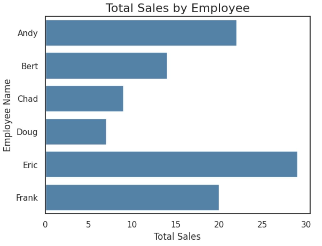
The x-axis displays the sales made by each employee and the y-axis shows the names of the employees.
Note that we can also specify the colors of the bars and add a custom title with axis labels:
import matplotlib.pyplot as plt
import seaborn as sns

#create horizontal bar chart
sns.barplot(x=df.sales, y=df.employee, color='steelblue', orient='h')

#add plot title
plt.title('Total Sales by Employee', fontsize=16)

#add axis labels
plt.xlabel('Total Sales')
plt.ylabel('Employee Name')
The bars in the plot now each have the same color and we’ve added an overall plot title and axis labels to make the plot easier to read.
Note: If you have trouble importing seaborn in a Jupyter notebook, you may first need to run the command %pip install seaborn.
Additional Resources
The following tutorials explain how to perform other common functions in seaborn:
How to Show Values on Seaborn Barplot
How to Create a Grouped Barplot in Seaborn
How to Set the Color of Bars in a Seaborn Barplot


