A grouped bar plot is a type of chart that uses bars grouped together to visualize the values of multiple variables at once.
This tutorial provides a step-by-step example of how to create the following grouped bar plot in Python using the Seaborn data visualization package:
Step 1: Create the Data
First, let’s create the following pandas DataFrame that shows the total number of customers that a restaurant receives in the morning and evening from Monday through Friday:
import pandas as pd

#create DataFrame
df = pd.DataFrame({'Day': ['Mon', 'Tue', 'Wed', 'Thur', 'Fri',
                           'Mon', 'Tue', 'Wed', 'Thur', 'Fri'],
                   'Customers': [44, 46, 49, 59, 54,
                                 33, 46, 50, 49, 60],
                   'Time': ['M', 'M', 'M', 'M', 'M',
                            'E', 'E', 'E', 'E', 'E']})

#view DataFrame
df

	Day	Customers Time
0	Mon	44	  M
1	Tue	46	  M
2	Wed	49	  M
3	Thur	59	  M
4	Fri	54	  M
5	Mon	33	  E
6	Tue	46	  E
7	Wed	50	  E
8	Thur	49	  E
9	Fri	60	  E
Step 2: Create the Grouped Bar Chart
We can use the following code to create a grouped bar chart to visualize the total customers each day, grouped by time:
import matplotlib.pyplot as plt
import seaborn as sns

#set seaborn plotting aesthetics
sns.set(style='white')

#create grouped bar chart
sns.barplot(x='Day', y='Customers', hue='Time', data=df)
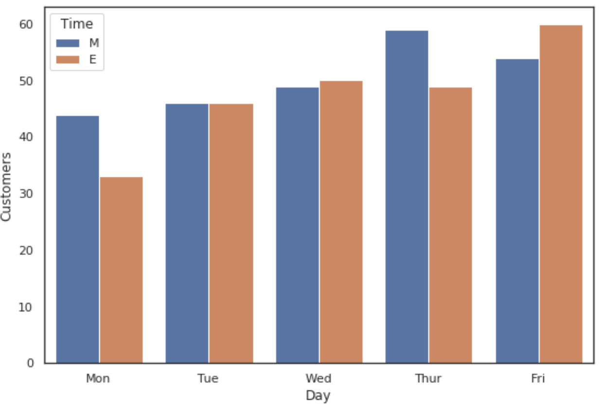
The x-axis displays the day of the week and the bars display how many customers visited the restaurant in the morning and evening each day.
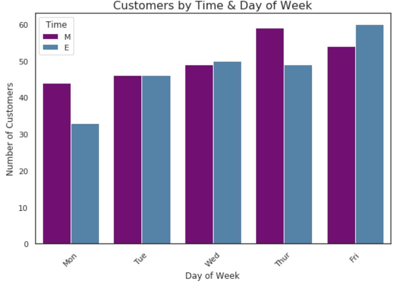
Step 3: Customize the Grouped Bar Chart
The following code shows how to add axis titles, add an overall title, change the colors of the bars, and rotate the x-axis labels to make them easier to read:
import matplotlib.pyplot as plt
import seaborn as sns

#set seaborn plotting aesthetics
sns.set(style='white')

#create grouped bar chart
sns.barplot(x='Day', y='Customers', hue='Time', data=df,
            palette=['purple', 'steelblue'])

#add overall title
plt.title('Customers by Time & Day of Week', fontsize=16)

#add axis titles
plt.xlabel('Day of Week')
plt.ylabel('Number of Customers')

#rotate x-axis labels
plt.xticks(rotation=45)
Note: We set the seaborn style to ‘white’ for this plot, but you can find a complete list of Seaborn plotting aesthetics on this page.
Additional Resources
The following tutorials explain how to create other common visualizations in Seaborn:
How to Create a Stacked Bar Plot in Seaborn
How to Create a Pie Chart in Seaborn
How to Create a Time Series Plot in Seaborn
How to Create an Area Chart in Seaborn