A barplot is a type of plot that displays the numerical values for different categorical variables.
This tutorial explains how to create heatmaps using the Python visualization library Seaborn with the built-in tips dataset:
import seaborn as sns

#load tips dataset
data = sns.load_dataset("tips")

#view first five rows of tips dataset
data.head()

total_bill	tip	sex	smoker	day	time	size
0	16.99	1.01	Female	No	Sun	Dinner	2
1	10.34	1.66	Male	No	Sun	Dinner	3
2	21.01	3.50	Male	No	Sun	Dinner	3
3	23.68	3.31	Male	No	Sun	Dinner	2
4	24.59	3.61	Female	No	Sun	Dinner	4
Make a Basic Barplot
The following syntax shows how to make a simple barplot that displays the time of day along the x-axis and the mean tip along the y-axis:
sns.barplot(x="time", y="tip", data=data)
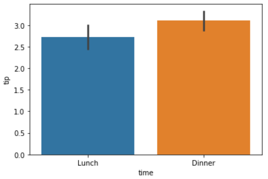
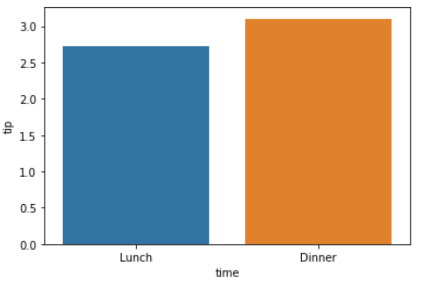
The barplot displays the standard error of the mean for each bar by default, but we can turn these off by using the argument ci=None as follows:
sns.barplot(x="time", y="tip", data=data, ci=None)
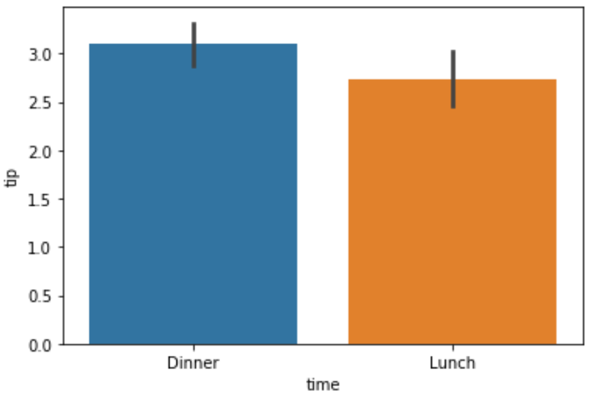
Order the Bars in the Barplot
We can use the order argument to quickly put the bars in a certain order:
sns.barplot(x="time", y="tip", data=data, order=["Dinner", "Lunch"])
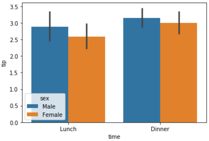
Make a Grouped Barplot
We can make a grouped barplot by using the hue argument. For example, we can use the following syntax to display the mean tip grouped by day and sex:
sns.barplot(x="time", y="tip", hue="sex", data=data)
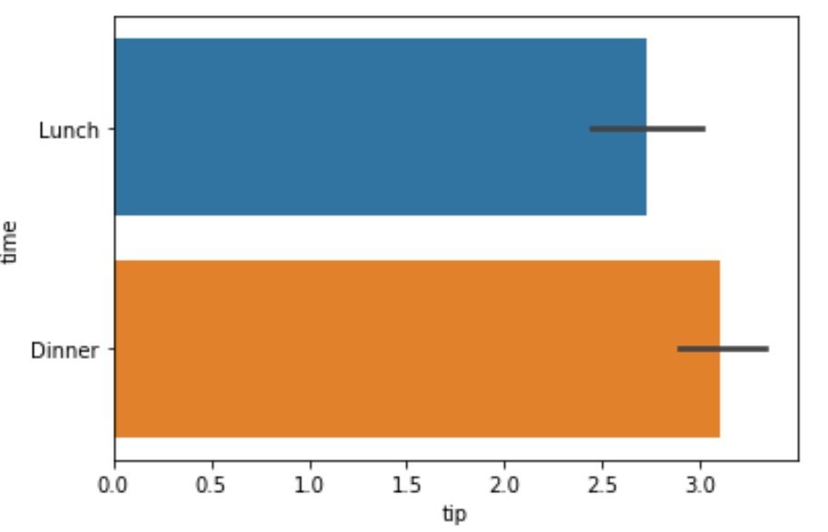
Make a Horizontal Barplot
To create a horizontal barplot, we simply need to pass a categorical variable to the y argument and a numerical variable to the x argument:
sns.barplot(x="tip", y="time", data=data)
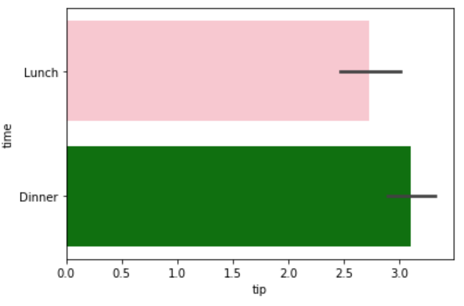
Modify the Colors of the Barplot
We can use the palette argument to pass a list of colors to use for the bars in the barplot:
sns.barplot(x="tip", y="time", palette=["pink", "green"], data=data)
Additional Resources
The following tutorials explain how to create other common charts in seaborn:
How to Create an Area Chart in Seaborn
How to Create a Time Series Plot in Seaborn
How to Create a Pie Chart in Seaborn