There are two ways to change the axis labels on a seaborn plot.
The first way is to use the ax.set() function, which uses the following syntax:
ax.set(xlabel='x-axis label', ylabel='y-axis label')
The second way is to use matplotlib functions, which use the following syntax:
plt.xlabel('x-axis label')
plt.ylabel('y-axis label')
The following examples show how to use each of these methods in practice.
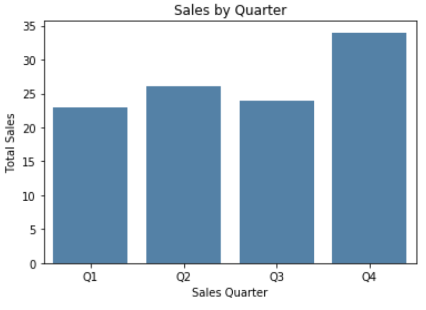
Method 1: Change Axis Labels Using ax.set()
The following code shows how to create a seaborn barplot and use ax.set() to specify the axis labels:
import pandas as pd
import seaborn as sns
import matplotlib.pyplot as plt

#create some fake data
df = pd.DataFrame({'quarter': ['Q1', 'Q2', 'Q3', 'Q4'],
                   'sales': [23, 26, 24, 34]})

#create seaborn barplot
ax = sns.barplot(x='quarter', y='sales',
                 data = df,
                 color='steelblue')

#specfiy axis labels
ax.set(xlabel='Sales Quarter',
       ylabel='Total Sales',
       title='Sales by Quarter')

#display barplot
plt.show()
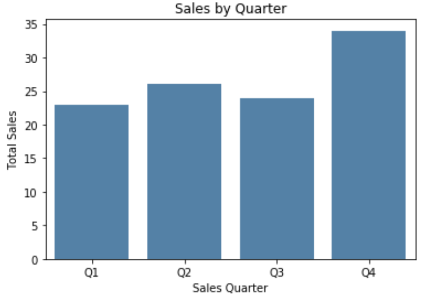
Method 2: Change Axis Labels Using Matplotlib Functions
The following code shows how to create a seaborn barplot and use matplotlib functions to specify the axis labels:
import pandas as pd
import seaborn as sns
import matplotlib.pyplot as plt

#create some fake data
df = pd.DataFrame({'quarter': ['Q1', 'Q2', 'Q3', 'Q4'],
                   'sales': [23, 26, 24, 34]})

#create seaborn barplot
ax = sns.barplot(x='quarter', y='sales',
                 data = df,
                 color='steelblue')

#specify axis labels
plt.xlabel('Sales Quarter')
plt.ylabel('Total Sales')
plt.title('Sales by Quarter')

#display barplot
plt.show()
Note that you can also specify the font size, font style, font family, and other font features using this method:
#specify axis labels
plt.xlabel('Sales Quarter', size=16, fontstyle='italic', weight=900)
plt.ylabel('Total Sales', size=16, family='monospace')
plt.title('Sales by Quarter')

#display barplot
plt.show()
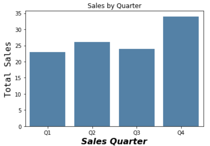
Refer to the matplotlib documentation for a full list of ways you can customize the font on the axis labels.