You can use the following basic syntax to create an area chart in seaborn:
import matplotlib.pyplot as plt
import seaborn as sns

#set seaborn style
sns.set_theme()

#create seaborn area chart
plt.stackplot(df.x, df.y1, df.y2, df.y3)
The following examples show how to use this syntax in practice.
Example 1: Create Basic Area Chart in Seaborn
The following code shows how to create a basic area chart in seaborn:
import pandas as pd
import matplotlib.pyplot as plt
import seaborn as sns

#set seaborn style
sns.set_theme()

#define DataFrame
df = pd.DataFrame({'period': [1, 2, 3, 4, 5, 6, 7, 8],
                   'team_A': [20, 12, 15, 14, 19, 23, 25, 29],
                   'team_B': [5, 7, 7, 9, 12, 9, 9, 4],
                   'team_C': [11, 8, 10, 6, 6, 5, 9, 12]})

#create area chart
plt.stackplot(df.period, df.team_A, df.team_B, df.team_C)
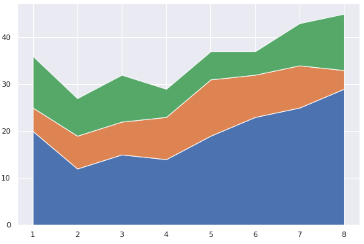
The x-axis displays the period variable and the y-axis displays the values for each of the three teams over time.
Example 2: Create Custom Area Chart in Seaborn
The following code shows how to modify the colors of the area chart and add a legend with specific labels:
import pandas as pd
import matplotlib.pyplot as plt
import seaborn as sns

#set seaborn style
sns.set_theme()

#define DataFrame
df = pd.DataFrame({'period': [1, 2, 3, 4, 5, 6, 7, 8],
                   'team_A': [20, 12, 15, 14, 19, 23, 25, 29],
                   'team_B': [5, 7, 7, 9, 12, 9, 9, 4],
                   'team_C': [11, 8, 10, 6, 6, 5, 9, 12]})

#define colors to use in chart
color_map = ['red', 'steelblue', 'pink']

#create area chart
plt.stackplot(df.period, df.team_A, df.team_B, df.team_C,
              labels=['Team A', 'Team B', 'Team C'],
              colors=color_map)

#add legend
plt.legend(loc='upper left')

#add axis labels
plt.xlabel('Period')
plt.ylabel('Points Scored')

#display area chart
plt.show()
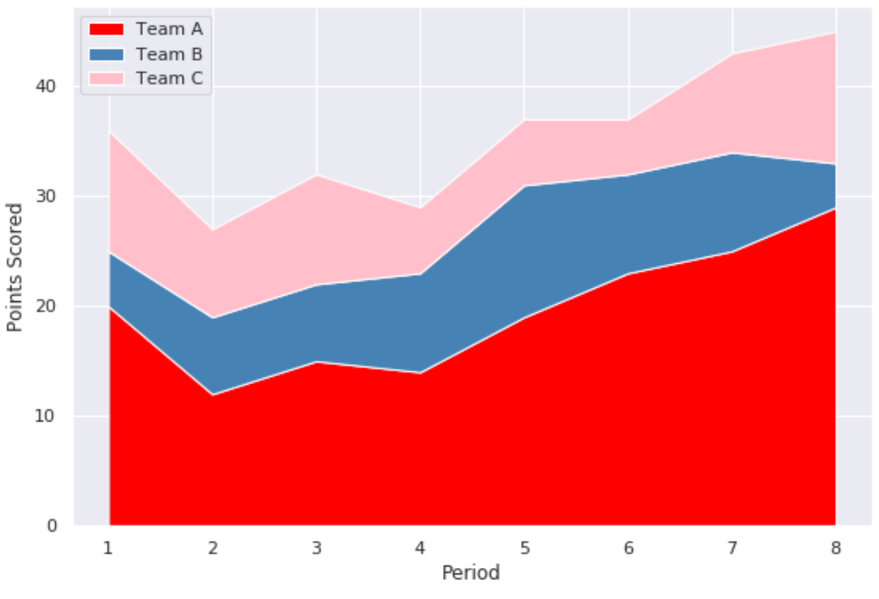
Note that the colors argument accepts color names along with hex color codes.
Additional Resources
The following tutorials explain how to create other common plots in seaborn:
How to Create a Time Series Plot in Seaborn
How to Create a Pie Chart in Seaborn
How to Create a Barplot in Seaborn