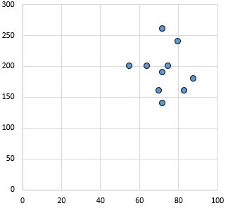
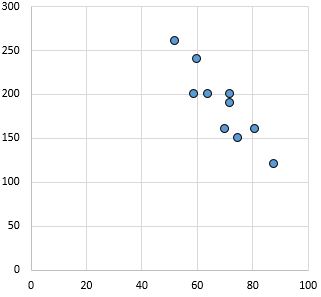
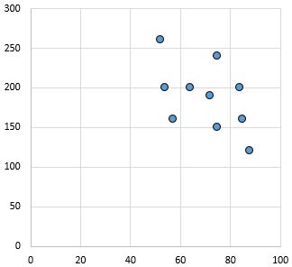
Scatterplots are used to display the relationship between two variables.
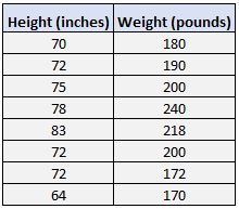
Suppose we have the following dataset that shows the weight and height of players on a basketball team:
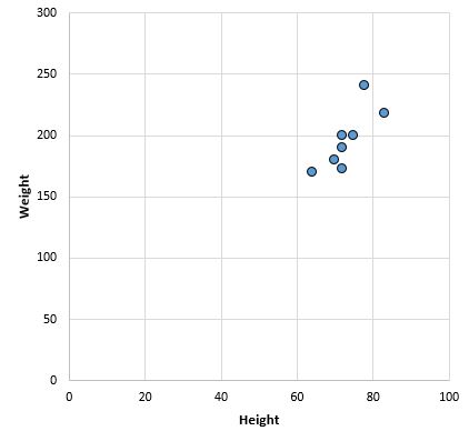
The two variables in this dataset are height and weight. To make a scatterplot, we place the height along the x-axis and the weight along the y-axis. Each player is then represented as a dot on the scatterplot:
Scatterplots help us see relationships between two variables. In this case, we see that height and weight have a positive relationship. As height increases, weight tends to increase as well.
Interpreting Scatterplots
Scatterplots help us see the relationship (positive, negative, none) between two variables as well as the strength of that relationship (weak, strong).
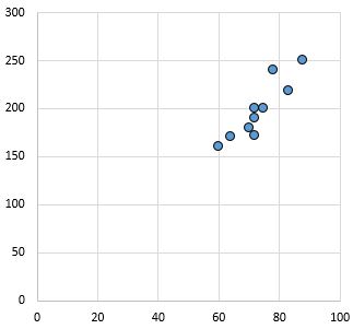
Strong, positive relationship: As the variable on the x-axis increases, the variable on the y-axis increases as well. The dots are packed together tightly, which indicates a strong relationship.
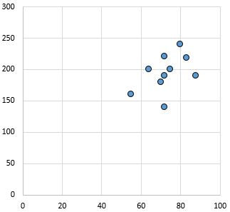
Weak, positive relationship: As the variable on the x-axis increases, the variable on the y-axis increases as well. The dots are fairly spread out, which indicates a weak relationship.
No relationship: There is no clear relationship (positive or negative) between the variables.
Strong, negative relationship: As the variable on the x-axis increases, the variable on the y-axis decreases. The dots are packed tightly together, which indicates a strong relationship.
Weak, negative relationship: As the variable on the x-axis increases, the variable on the y-axis decreases. The dots are fairly spread out, which indicates a weak relationship.
Scatterplot Generator
Use the free Statology scatterplot generator to generate a scatterplot for a dataset simply by entering data values.


