A scatterplot matrix is a matrix of scatterplots that lets you understand the pairwise relationship between different variables in a dataset.
There are two common ways to create a scatterplot matrix in R:
Method 1: Use Base R
#create scatterplot matrix (pch=20 means to use a solid circle for points)
plot(df, pch=20)
Method 2: Use ggplot2 and GGally packages
library(ggplot2)
library(GGally)

#create scatterplot matrix
ggpairs(df)
The following examples show how to use each method in practice with the following data frame in R:
#create data frame
df frame(points=c(99, 90, 86, 88, 95, 99, 101, 104),
                 assists=c(33, 28, 31, 39, 40, 40, 35, 47),
                 rebounds=c(30, 28, 24, 24, 20, 20, 15, 12))

#view first few rows of data frame
head(df)

  points assists rebounds
1     99      33       30
2     90      28       28
3     86      31       24
4     88      39       24
5     95      40       20
6     99      40       20
Example 1: Create Scatterplot Matrix Using Base R
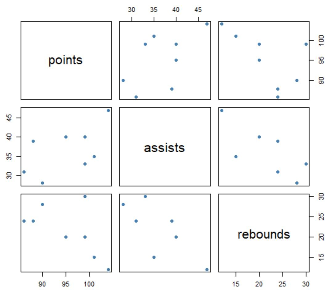
We can use the plot() function in base R to create a scatterplot matrix for each variable in our data frame:
#create scatterplot matrix
plot(df, pch=20, cex=1.5, col='steelblue')
The way to interpret the matrix is as follows:
- The variable names are shown along the diagonals boxes.
- All other boxes display a scatterplot of the relationship between each pairwise combination of variables. For example, the box in the top right corner of the matrix displays a scatterplot of values for points and rebounds. The box in the middle left displays a scatterplot of values for points and assists, and so on.
Note that cex controls the size of points in the plot and col controls the color of the points.
Example 2: Create Scatterplot Matrix Using ggplot2 and GGally
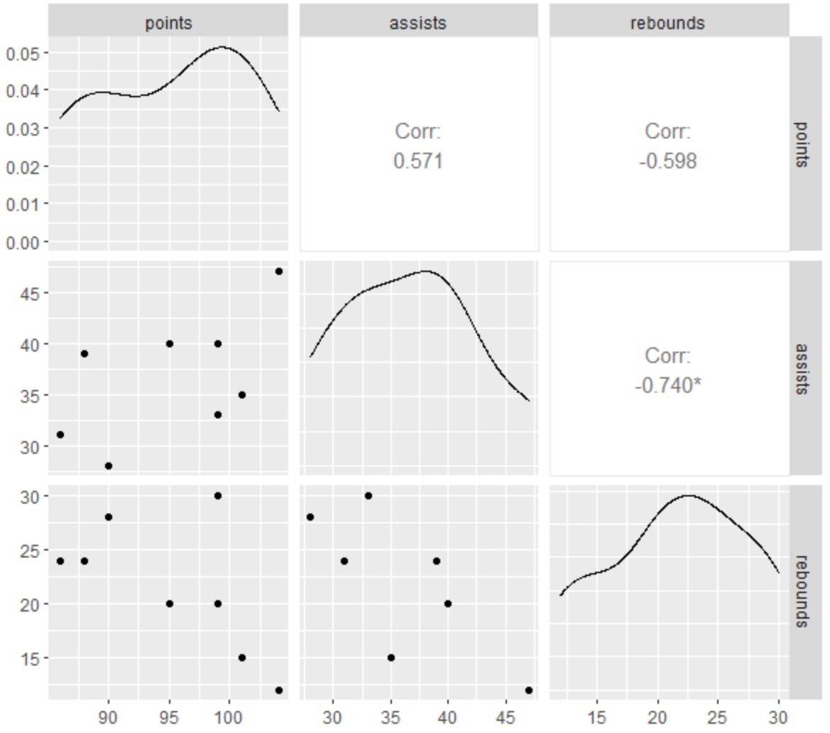
We can also use the ggpairs() function from the ggplot2 and GGally packages in R to create a scatterplot matrix for each variable in our data frame:
library(ggplot2)
library(GGally)

#create scatterplot matrix
ggpairs(df)
This scatterplot matrix contains the same scatterplots as the plot() function from base R, but in addition we can also see the correlation coefficient between each pairwise combination of variables as well as a density plot for each individual variable.
For example, we can see:
- The correlation coefficient between assists and points is 0.571.
- The correlation coefficient between rebounds and points is -0.598.
- The correlation coefficient between rebounds and assists is -0.740.
The tiny star (*) next to -0.740 also indicates that the correlation between rebounds and assists is statistically significant.
Additional Resources
The following tutorials explain how to perform other common tasks in R:
How to Create a Correlation Matrix in R
How to Create Scatter Plots by Group in R


