You can use the following methods to create a scatter plot by group in R:
Method 1: Use Base R
plot(df$x, df$y, col=as.factor(df$group))
Method 2: Use ggplot2
library(ggplot2)

ggplot(df, aes(x, y)) +
  geom_point(aes(color=group))
The following examples show how to use each method in practice with the following data frame:
#create data frame
df frame(x=c(1, 2, 2, 3, 5, 6, 7),
                 y=c(4, 8, 7, 9, 15, 14, 20),
                 group=c('A', 'A', 'A', 'B', 'B', 'B', 'B'))

#view data frame
df

  x  y group
1 1  4     A
2 2  8     A
3 2  7     A
4 3  9     B
5 5 15     B
6 6 14     B
7 7 20     B
Example 1: Scatter Plot by Group in Base R
The following code shows how to create a scatterplot in base R where the points are colored based on the value of the ‘group’ variable:
#create scatterplot with points colored by group
plot(df$x, df$y, col=as.factor(df$group), pch=19)
The color of each point reflects the value of the ‘group’ variable in the data frame.
The points with a ‘group’ value of A are shown in black and the points with a ‘group’ value of B are shown in red.
Note that pch=19 tells R to use solid circles for the points in the plot.
You can find a complete list of pch values and their corresponding shapes here.
Example 2: Scatter Plot by Group in ggplot2
The following code shows how to create a scatterplot in ggplot2 where the points are colored based on the value of the ‘group’ variable:
library(ggplot2)

#create scatterplot with points colored by group
ggplot(df, aes(x, y)) +
  geom_point(aes(color=group))
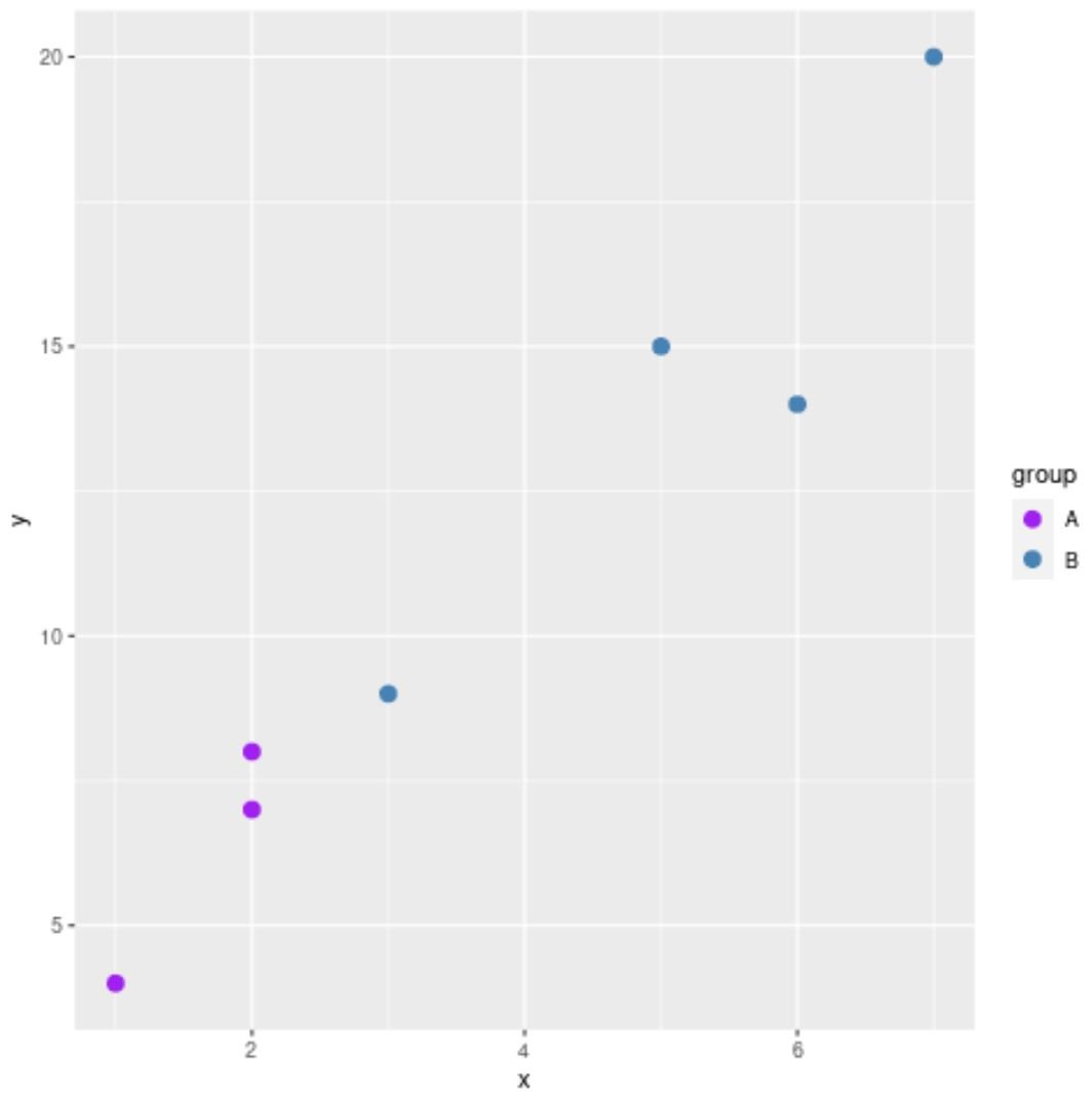
Note that you can also modify the colors and size of the points in the plot:
library(ggplot2)

#create scatterplot with points colored by group
ggplot(df, aes(x, y)) +
  geom_point(aes(color=group), size=3) +
  scale_color_manual(values=c('purple', 'steelblue'))
Notice that we increased the point size using the size argument and the colors of the points match the colors that we specified in the scale_color_manual() argument.
Additional Resources
The following tutorials explain how to perform other common tasks with scatterplots in R:
How to Label Points on a Scatterplot in R
How to Create a Scatterplot with a Regression Line in R
How to Use the Jitter Function for Scatterplots in R


