You can use the following syntax to rotate axis labels in a ggplot2 plot:
p + theme(axis.text.x = element_text(angle = 45, vjust = 1, hjust=1))
The angle controls the angle of the text while vjust and hjust control the vertical and horizontal justification of the text.
The following step-by-step example shows how to use this syntax in practice.
Step 1: Create the Data Frame
First, let’s create a simple data frame:
#create data frame
df = data.frame(team=c('The Amazing Amazon Anteaters',
                       'The Rowdy Racing Raccoons',
                       'The Crazy Camping Cobras'),
                points=c(14, 22, 11))

#view data frame
df

                          team points
1 The Amazing Amazon Anteaters     14
2    The Rowdy Racing Raccoons     22
3     The Crazy Camping Cobras     11
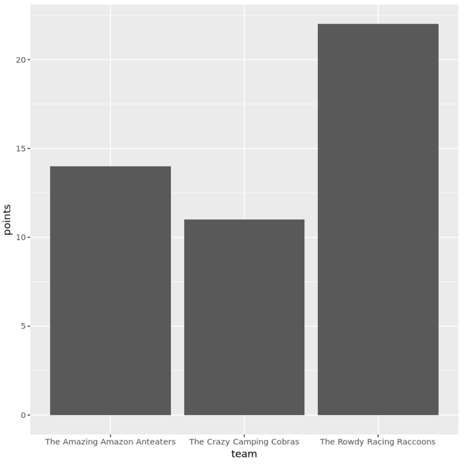
Step 2: Create a Bar Plot
Next, let’s create a bar plot to visualize the points scored by each team:
library(ggplot2)

#create bar plot
ggplot(data=df, aes(x=team, y=points)) +
  geom_bar(stat="identity")
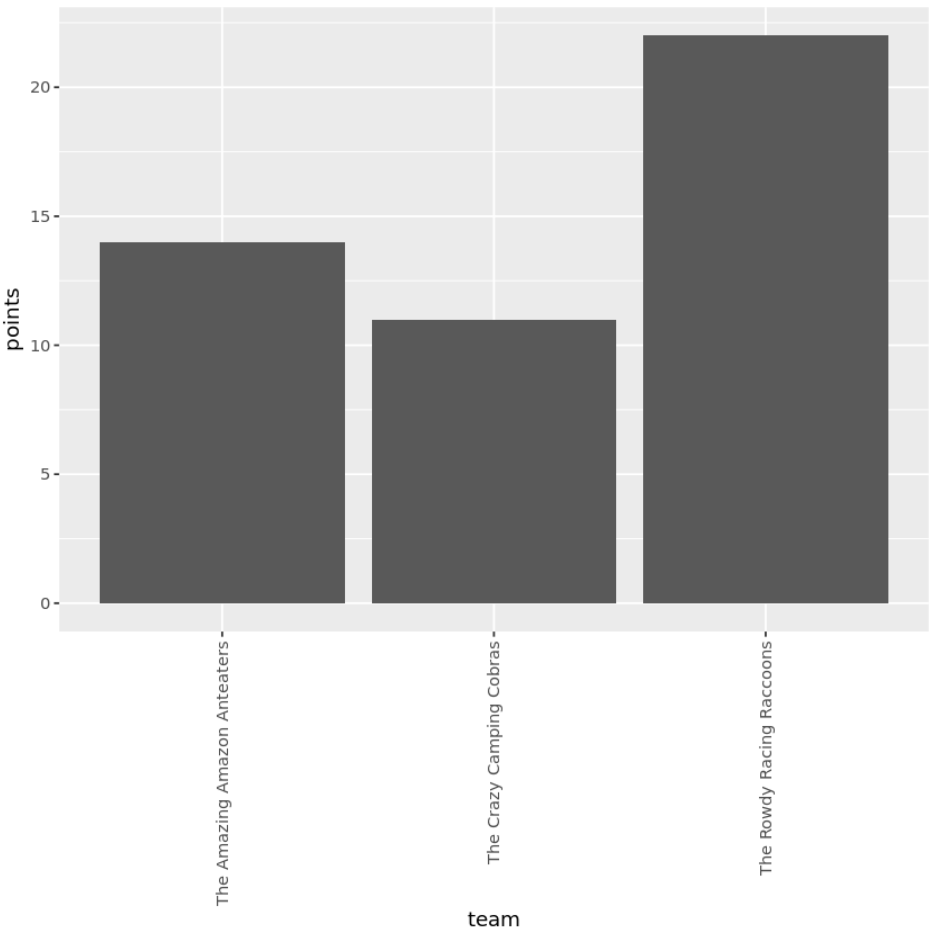
Step 3: Rotate the Axis Labels of the Plot
We can use the following code to rotate the x-axis labels 90 degrees:
library(ggplot2)

#create bar plot with axis labels rotated 90 degrees
ggplot(data=df, aes(x=team, y=points)) +
  geom_bar(stat="identity") +
  theme(axis.text.x = element_text(angle=90, vjust=.5, hjust=1))
Or we can use the following code to rotate the x-axis labels 45 degrees:
library(ggplot2)

#create bar plot with axis labels rotated 90 degrees
ggplot(data=df, aes(x=team, y=points)) +
  geom_bar(stat="identity") +
  theme(axis.text.x = element_text(angle=45, vjust=1, hjust=1))
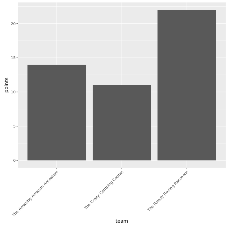
Depending on the angle you rotate the labels, you may need to adjust the vjust and hjust values to ensure that the labels are close enough to the plot.
Additional Resources
The following tutorials explain how to perform other common tasks in ggplot2:
How to Set Axis Limits in ggplot2
How to Reverse Order of Axis in ggplot2
How to Remove Gridlines in ggplot2
How to Adjust Line Thickness in ggplot2