Logistic Regression is a statistical method that we use to fit a regression model when the response variable is binary. To assess how well a logistic regression model fits a dataset, we can look at the following two metrics:
- Sensitivity: The probability that the model predicts a positive outcome for an observation when indeed the outcome is positive. This is also called the “true positive rate.”
- Specificity: The probability that the model predicts a negative outcome for an observation when indeed the outcome is negative. This is also called the “true negative rate.”
One way to visualize these two metrics is by creating a ROC curve, which stands for “receiver operating characteristic” curve. This is a plot that displays the sensitivity and specificity of a logistic regression model.
The following step-by-step example shows how to create and interpret a ROC curve in Excel.
Step 1: Enter the Data
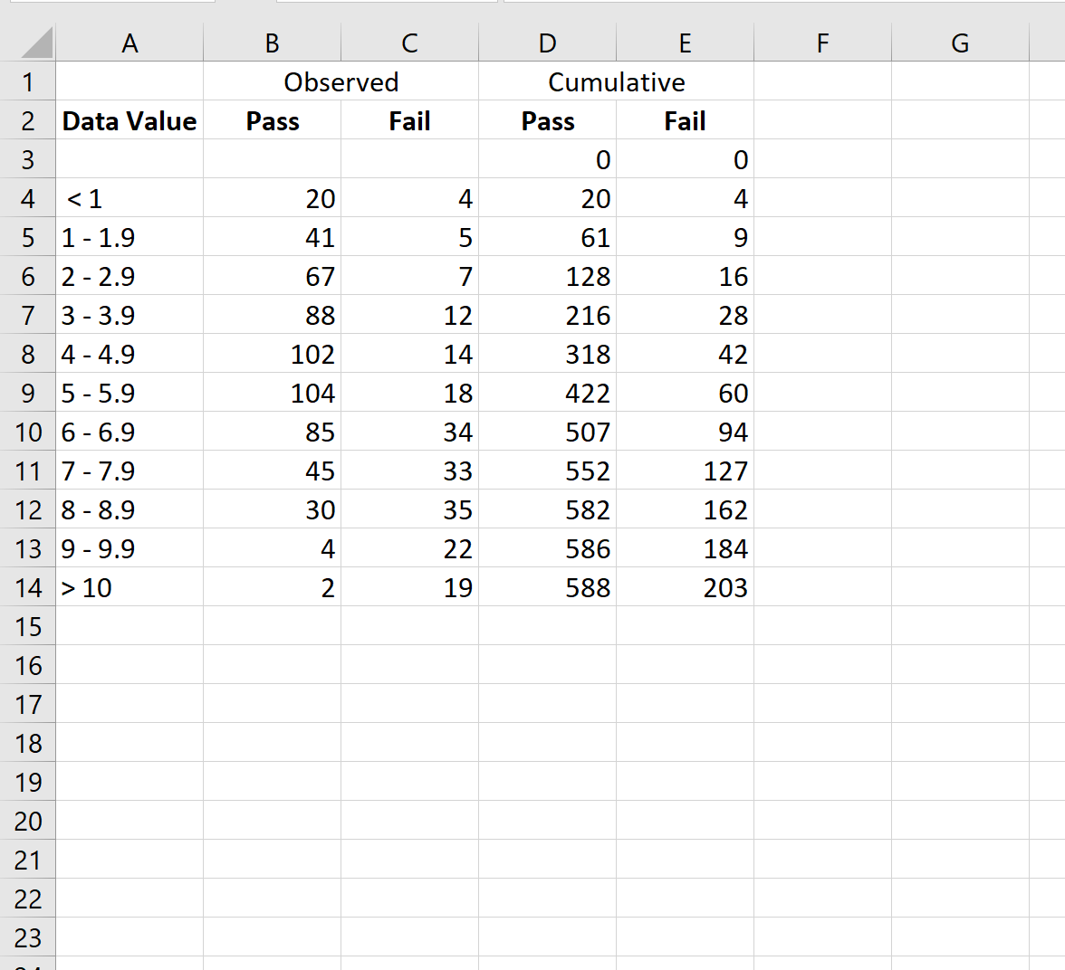
First, let’s enter some raw data:
Step 2: Calculate the Cumulative Data
Next, let’s use the following formula to calculate the cumulative values for the Pass and Fail categories:
- Cumulative Pass values: =SUM($B$3:B3)
- Cumulative Fail values: =SUM($C$3:C3)
We’ll then copy and paste these formulas down to every cell in column D and column E:
Step 3: Calculate False Positive Rate & True Positive Rate
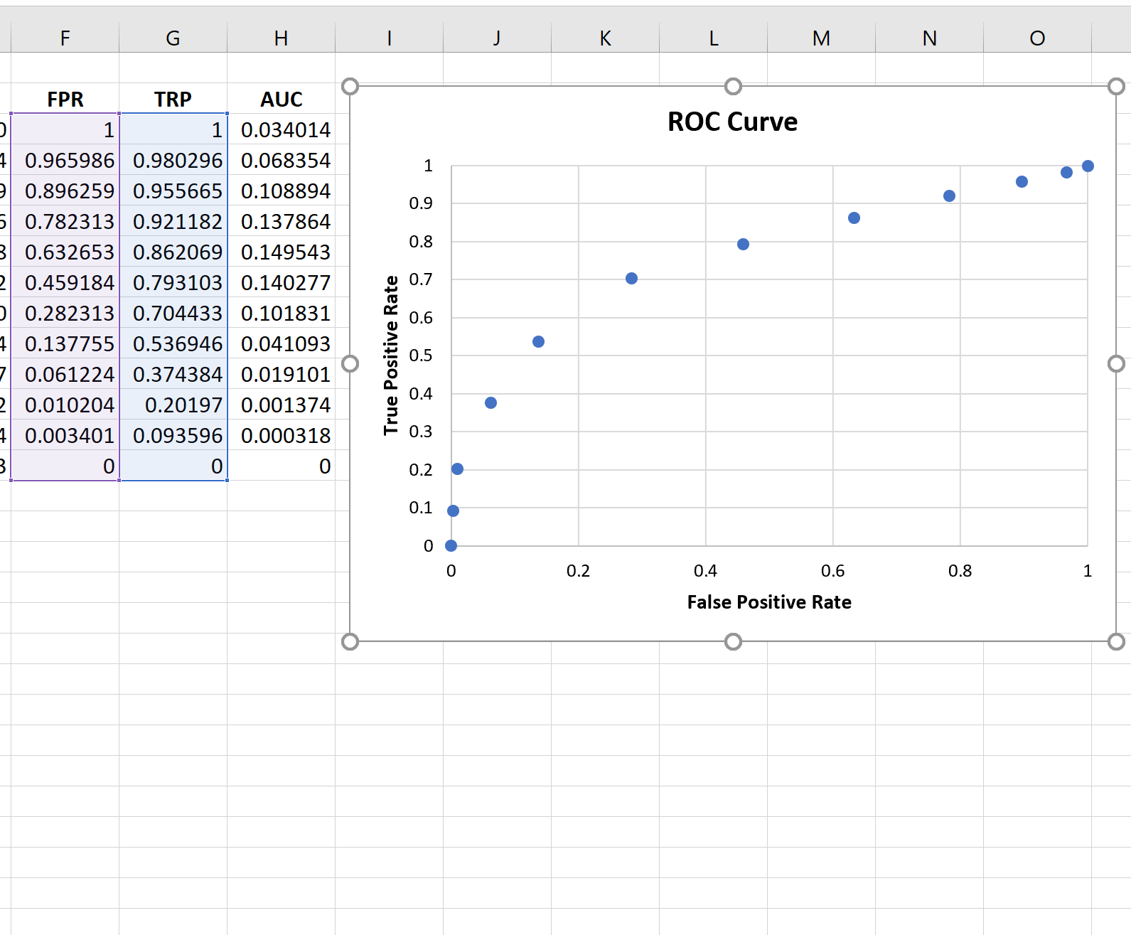
Next, we’ll calculate the false positive rate (FPR), true positive rate (TPR), and the area under the curve AUC) using the following formulas:
- FPR: =1-D3/$D$14
- TPR: =1-E3/$E$14
- AUC: =(F3-F4)*G3
We’ll then copy and paste these formulas down to every cell in columns F, G, and H:
Step 4: Create the ROC Curve
To create the ROC curve, we’ll highlight every value in the range F3:G14.
Then we’ll click the Insert tab along the top ribbon and then click Insert Scatter(X, Y) to create the following plot:
Step 5: Calculate the AUC
The more that the curve hugs the top left corner of the plot, the better the model does at classifying the data into categories.
As we can see from the plot above, this logistic regression model does a pretty good job of classifying the data into categories.
To quantify this, we can calculate the AUC (area under the curve) which tells us how much of the plot is located under the curve.
The closer AUC is to 1, the better the model. A model with an AUC equal to 0.5 is no better than a model that makes random classifications.
To calculate the AUC of the curve, we can simply take the sum of all of the values in column H:
The AUC turns out to be 0.802662. This value is fairly high, which indicates that the model does a good job of classifying the data into ‘Pass’ and ‘Fail’ categories.
Additional Resources
The following tutorials explain how to create other common plots in Excel:
How to Plot a CDF in Excel
How to Create a Survival Curve in Excel
How to Create a Statistical Process Control Chart in Excel


