Residual plots are often used to assess whether or not the residuals in a regression analysis are normally distributed and whether or not they exhibit heteroscedasticity.
This tutorial explains how to create residual plots for a regression model in R.
Example: Residual Plots in R
In this example we will fit a regression model using the built-in R dataset mtcars and then produce three different residual plots to analyze the residuals.
Step 1: Fit regression model.
First, we will fit a regression model using mpg as the response variable and disp and hp as explanatory variables:
#load the dataset
data(mtcars)

#fit a regression model
model #get list of residuals
res
Step 2: Produce residual vs. fitted plot.
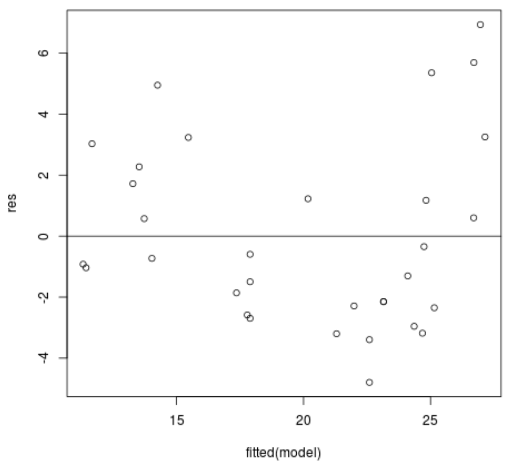
Next, we will produce a residual vs. fitted plot, which is helpful for visually detecting heteroscedasticity – e.g. a systematic change in the spread of residuals over a range of values.
#produce residual vs. fitted plot
plot(fitted(model), res)

#add a horizontal line at 0
abline(0,0)
The x-axis displays the fitted values and the y-axis displays the residuals. From the plot we can see that the spread of the residuals tends to be higher for higher fitted values, but it doesn’t look serious enough that we would need to make any changes to the model.
Step 3: Produce a Q-Q plot.
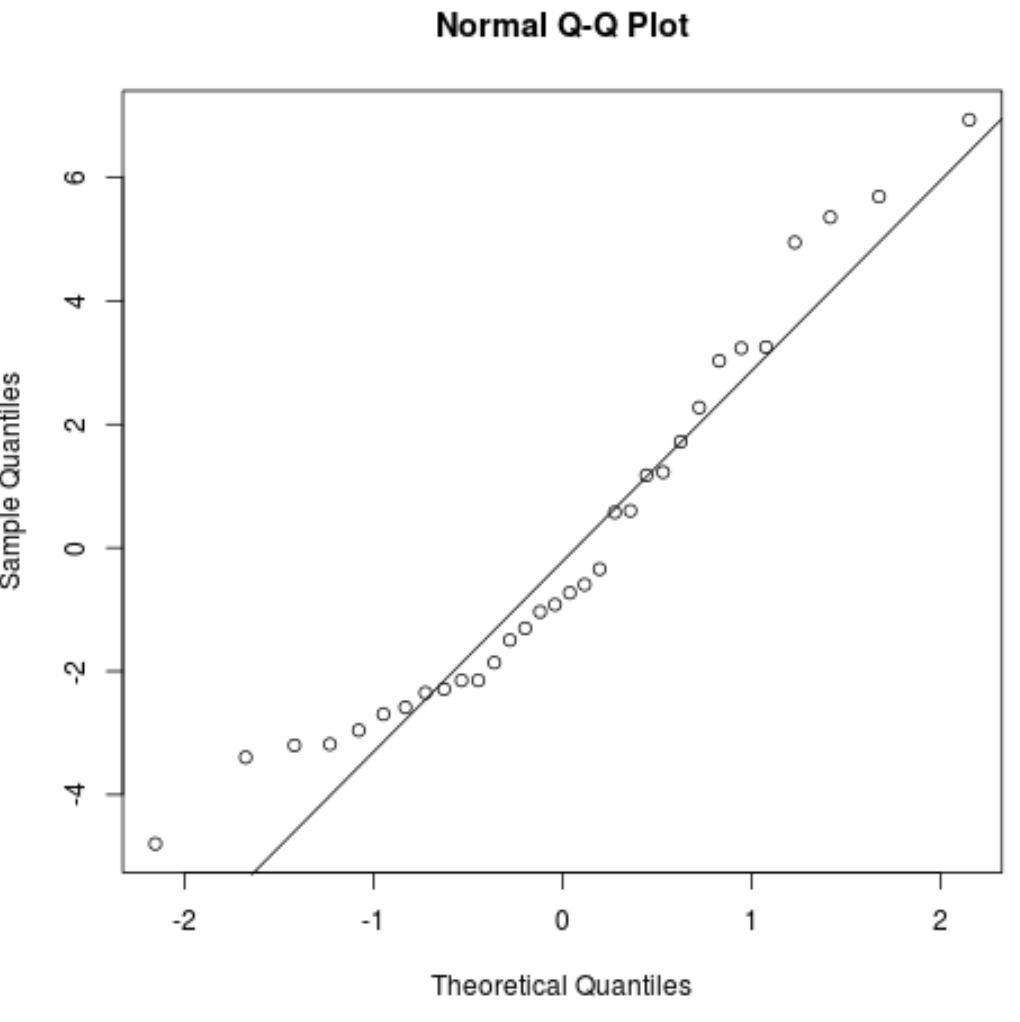
We can also produce a Q-Q plot, which is useful for determining if the residuals follow a normal distribution. If the data values in the plot fall along a roughly straight line at a 45-degree angle, then the data is normally distributed.
#create Q-Q plot for residuals
qqnorm(res)

#add a straight diagonal line to the plot
qqline(res)
We can see that the residuals tend to stray from the line quite a bit near the tails, which could indicate that they’re not normally distributed.
Step 4: Produce a density plot.
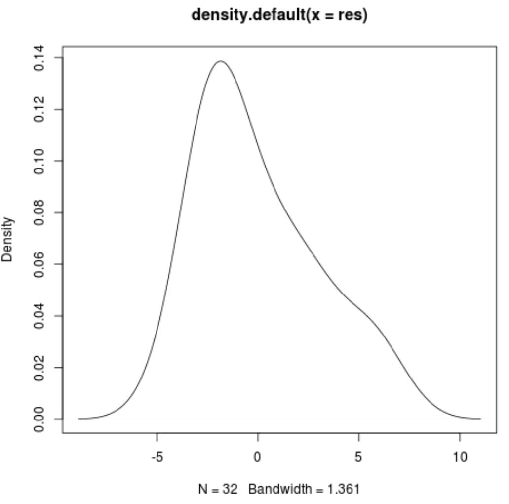
We can also produce a density plot, which is also useful for visually checking whether or not the residuals are normally distributed. If the plot is roughly bell-shaped, then the residuals likely follow a normal distribution.
#Create density plot of residuals
plot(density(res))
We can see that the density plot roughly follows a bell shape, although it is slightly skewed to the right. Depending on the type of study, a researcher may or may not decide to perform a transformation on the data to ensure that the residuals are more normally distributed.
Additional Resources
How to Calculate Standardized Residuals in R
How to Calculate Studentized Residuals in R
How to Create a Histogram of Residuals in R


