A radar chart (sometimes called a “spider chart”) is a type of chart that offers a unique way to visualize the quantities of several variables.
This tutorial explains how to create the following radar chart in R, using the fmsb library:

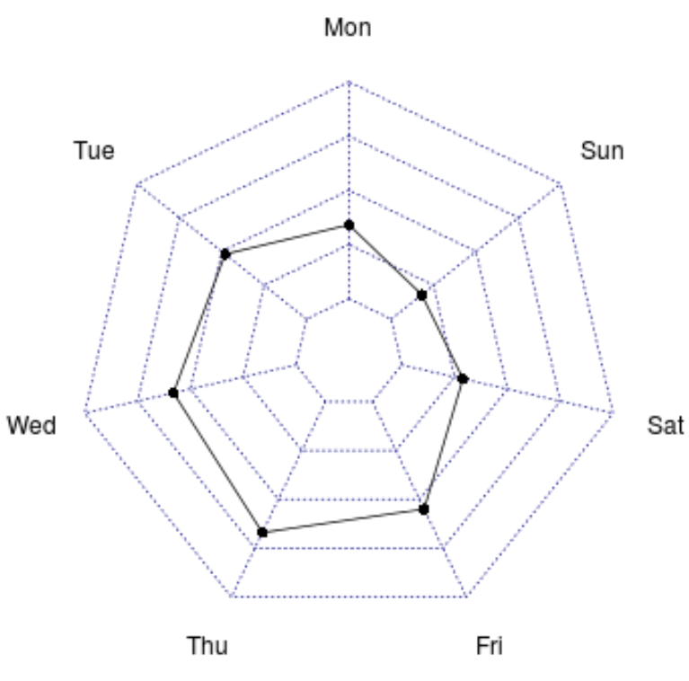
Basic Radar Chart in R
In order to create a radar chart in R, we need our data to meet the following requirements:
- Each variable that we’d like to display on the edges of the chart must be its own column.
- The first row must contain the max value.
- The second row must contain the min value.
- The third row must contain the value that you’d like to display on the radar chart.
To illustrate this, we will use the following data frame that contains the number of customers that come into a given shop during each day of the week:
#create data
df #view data
df

  Mon Tue Wed Thu Fri Sat Sun
1 100 100 100 100 100 100 100
2   0   0   0   0   0   0   0
3  34  48  58  67  55  29  18
Once the data is in this format, we can use the radarchart() function from the fmsb library to create a basic radar chart:
library(fmsb)

radarchart(df)
Customizing Radar Charts in R
We can customize the radar chart by using the following arguments:
- pcol: Line color
- pfcol: Fill color
- plwd: Line width
- cglcol: Net color
- cglty: Net line type
- axislabcol: Axis label color
- caxislabels: Vector of axis labels to display
- cglwd: Net width
- vlcex: Group labels size
The following code shows an example of how to use some of these arguments to create a customized radar chart:
radarchart(df,
    axistype=1,
    pcol='pink',
    pfcol=rgb(0.9,0.2,0.5,0.3),
    plwd=3,
    cglcol='grey',
    cglty=1,
    axislabcol='grey',
    cglwd=0.6,
    vlcex=1.1,
    title='Customers per Day'
    )
You can read more about using rgb() colors in the R documentation.
Additional Resources
How to Create Heatmaps in R
How to Create a Lollipop Chart in R
How to Create a Population Pyramid in R