You can use the following basic syntax to create a scatterplot with multiple variables in R:
#create scatterplot of x1 vs. y1
plot(x1, y1, col='red')

#add scatterplot of x2 vs. y2
points(x2, y2, col='blue')

#add legend
legend(1, 25, legend=c('Data 1', 'Data 2'), pch=c(19, 19), col=c('red', 'blue'))
The following examples show how to use this syntax in practice.
Example 1: Create Scatterplot with Two Variables
The following code shows how to create a scatterplot with two different variables:
#define datasets
x1 = c(1, 3, 6, 11, 19, 20)
y1 = c(7, 10, 11, 12, 18, 25)

x2 = c(1, 3, 8, 13, 17, 19)
y2 = c(9, 15, 18, 21, 22, 22)

#create scatterplot of x1 vs. y1
plot(x1, y1, col='red', pch=19)

#add scatterplot of x2 vs. y2
points(x2, y2, col='blue', pch=19)

#add legend
legend(1, 25, legend=c('Data 1', 'Data 2'), pch=c(19, 19), col=c('red', 'blue'))

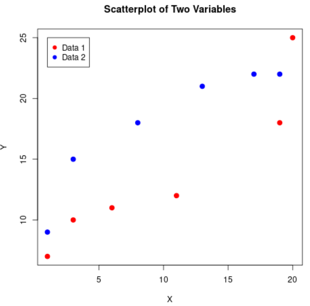
Example 2: Customize the Scatterplot
The following code shows how to customize the axes labels, title, and size of the points in the plot:
#define datasets
x1 = c(1, 3, 6, 11, 19, 20)
y1 = c(7, 10, 11, 12, 18, 25)

x2 = c(1, 3, 8, 13, 17, 19)
y2 = c(9, 15, 18, 21, 22, 22)

#create scatterplot of x1 vs. y1
plot(x1, y1, col='red', pch=19, cex=1.3,
     xlab='X', ylab='Y', main='Scatterplot of Two Variables')

#overlay scatterplot of x2 vs. y2
points(x2, y2, col='blue', pch=19, cex=1.3)

#add legend
legend(1, 25, legend=c('Data 1', 'Data 2'), pch=c(19, 19), col=c('red', 'blue'))
Note that the pch argument specifies the shape of the points in the plot. A pch value of 19 specifies a filled-in circle.
You can find a complete list of pch values and their corresponding shapes here.
Additional Resources
How to Label Points on a Scatterplot in R
How to Create a Scatterplot with a Regression Line in R
How to Use the Jitter Function for Scatterplots in R