Often you may want to create a histogram that has several different colors in R.
The following examples show how to do so in base R and in ggplot2.
Example 1: Histogram with Different Colors in Base R
The following code shows how to create a histogram with just one color in base R:
#create data frame
df frame(x=c(12, 14, 14, 15, 15, 17, 19, 22, 23, 23, 24))

#create histogram
hist(df$x)
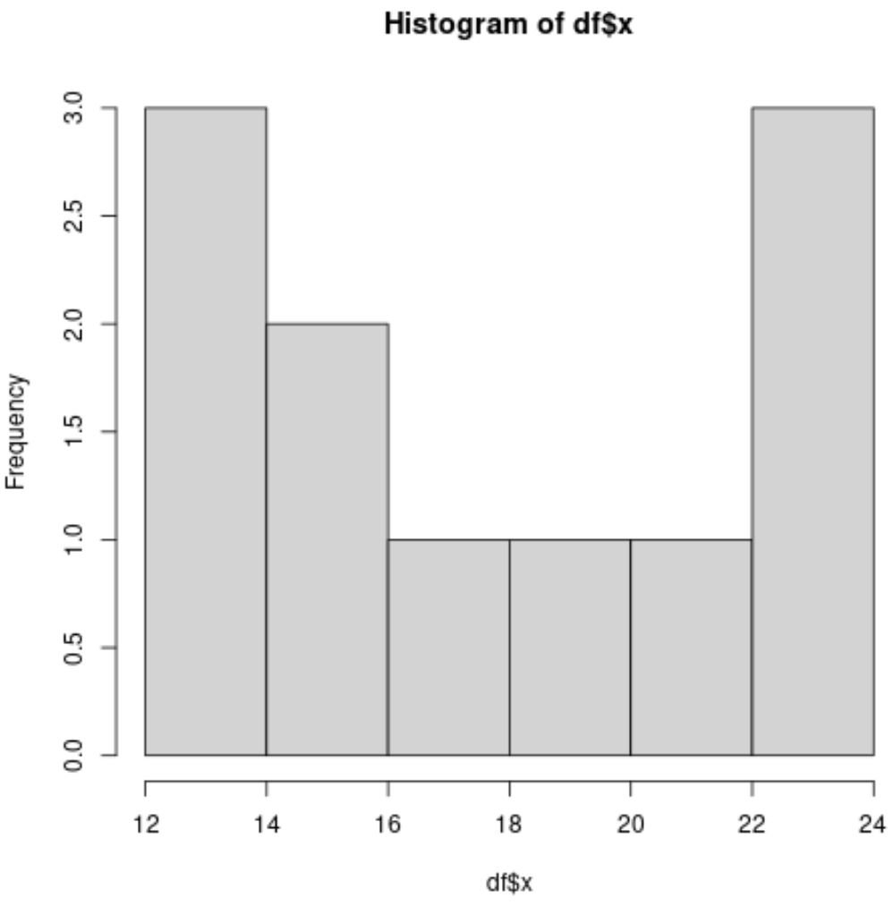
By default, all of the colors of the bars are the same in the histogram.
However, we can use the following code to create a histogram with three different colors:
#create data frame
df frame(x=c(12, 14, 14, 15, 15, 17, 19, 22, 23, 23, 24))

#define histogram break points
hist_breaks #define colors to use in histogram based on break points
color_list red', length(hist_breaks))
color_list[hist_breaks 20] blue'
color_list[hist_breaks 16] purple'

#create histogram with custom colors
hist(df$x, col=color_list)
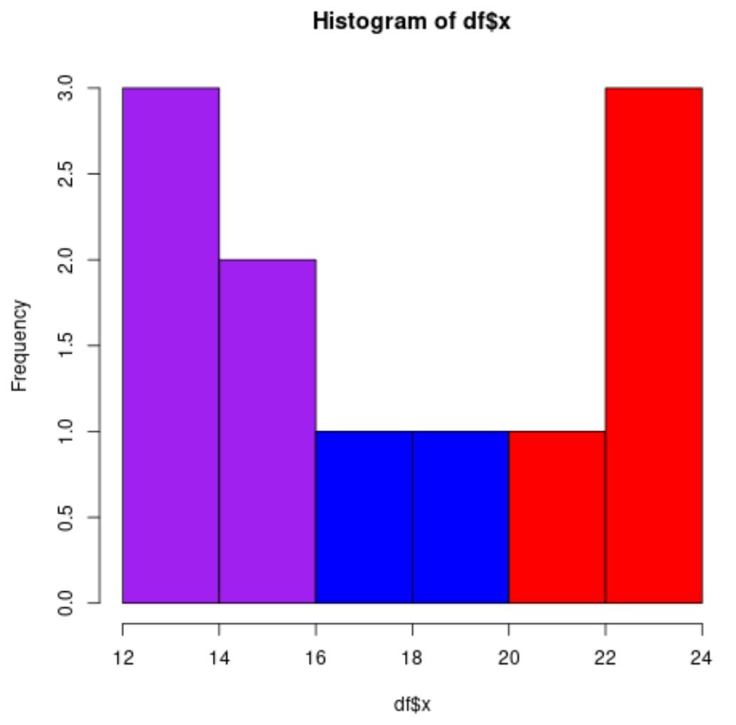
Here’s how the logic worked to create the three colors:
- First, we specified every bar to be red.
- Then, we changed every bar with a break point less than 20 to be blue.
- Then, we changed every bar with a break point less than 16 to be purple.
The end result is a histogram with three colors.
Example 2: Histogram with Different Colors in ggplot2
Suppose we have the following data frame in R:
#create data frame
df frame(x=c(12, 14, 14, 15, 15, 17, 19, 22, 23, 23, 24))

#view data frame
df

    x
1  12
2  14
3  14
4  15
5  15
6  17
7  19
8  22
9  23
10 23
11 24
To create a histogram with different colors for this data frame, we need to first create a grouping variable for the values using a nested if else statement:
#create grouping variable
df$group = ifelse(df$x 16, 'C', ifelse(df$x 20, 'B', 'A'))

#view updated data frame
df

    x group
1  12     C
2  14     C
3  14     C
4  15     C
5  15     C
6  17     B
7  19     B
8  22     A
9  23     A
10 23     A
11 24     A
Now we can create a histogram in ggplot2 and define the colors in the plot using the group variable:
#create histogram with custom colors
ggplot(df, aes(x, fill=group)) +
  geom_histogram(bins=6, color='black') +
   scale_fill_manual(values = c('A' = 'red',
                                'B' = 'blue',
                                'C' = 'purple'))
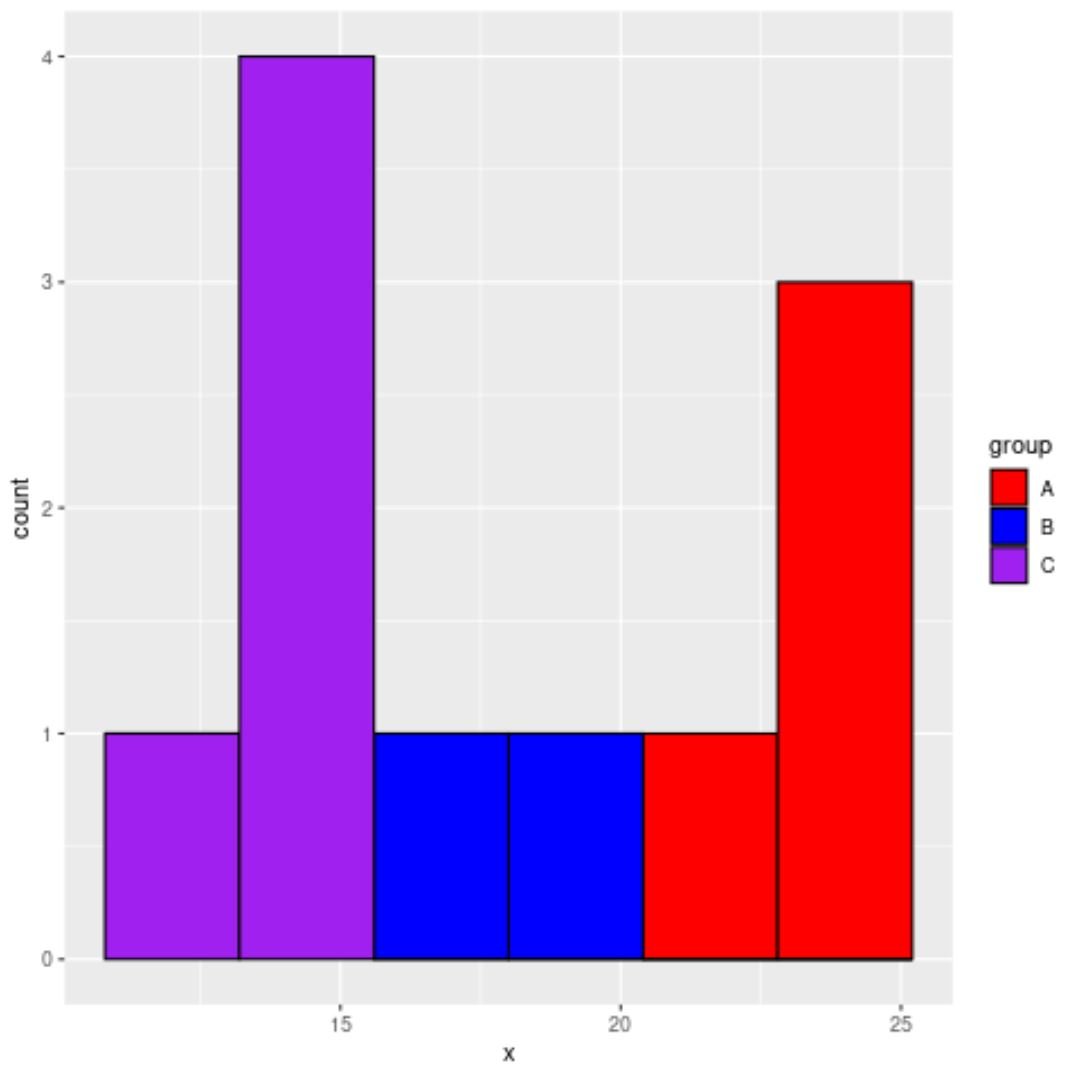
The end result is a histogram with three colors.
Note: You can find the complete documentation for scale_fill_manual() here.
Additional Resources
The following tutorials explain how to perform other common operations in R:
How to Create a Relative Frequency Histogram in R
How to Overlay Normal Curve on Histogram in R
How to Specify Histogram Breaks in R