A quadrant chart is a type of chart that allows you to visualize points on a scatter plot in four distinct quadrants.
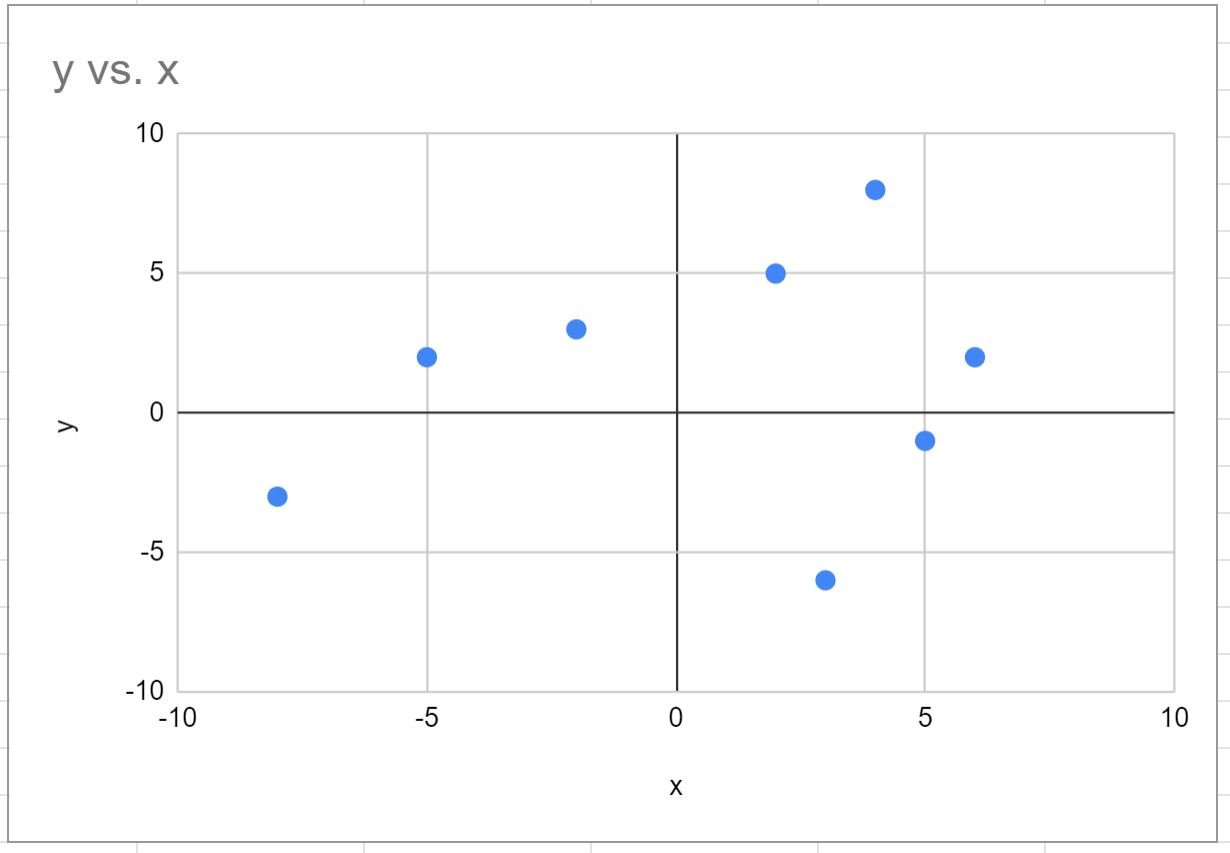
This tutorial provides a step-by-step example of how to create the following quadrant chart in Google Sheets:
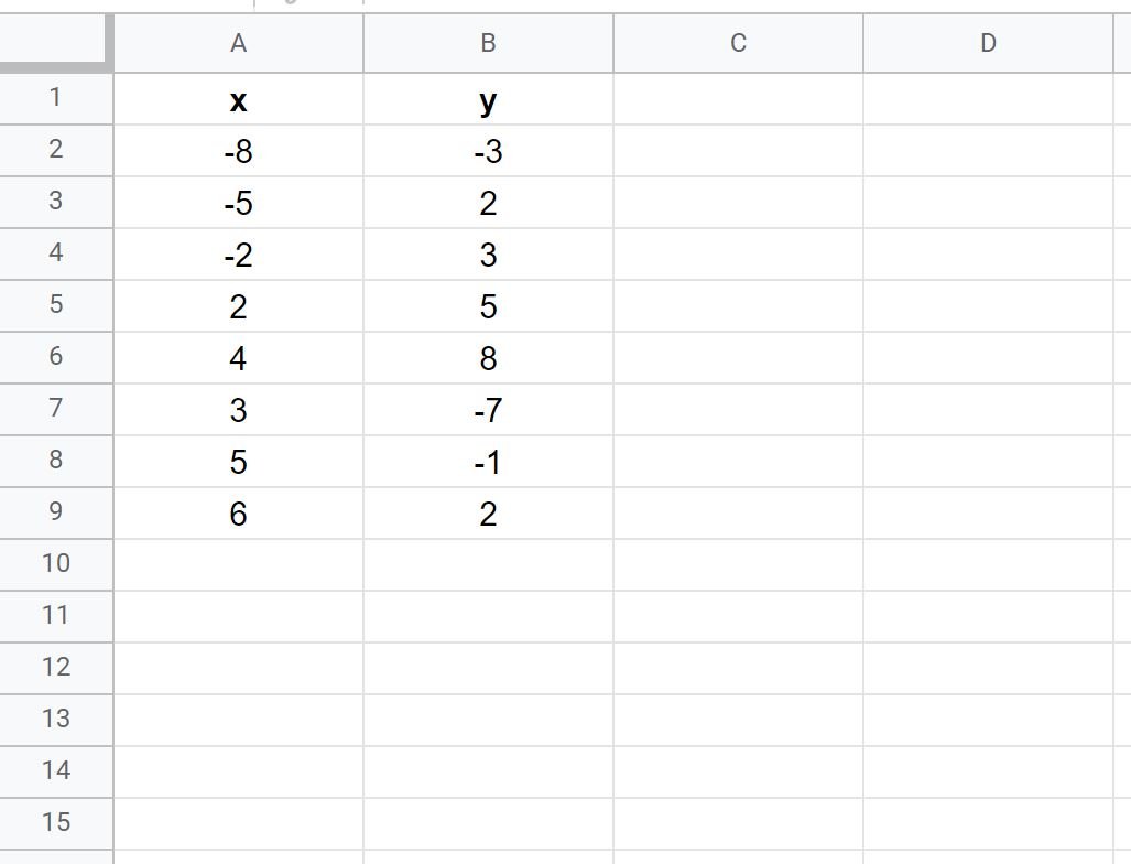
Step 1: Create the Data
First, let’s enter the following dataset of x and y values in Google Sheets:
Step 2: Create a Scatter Plot
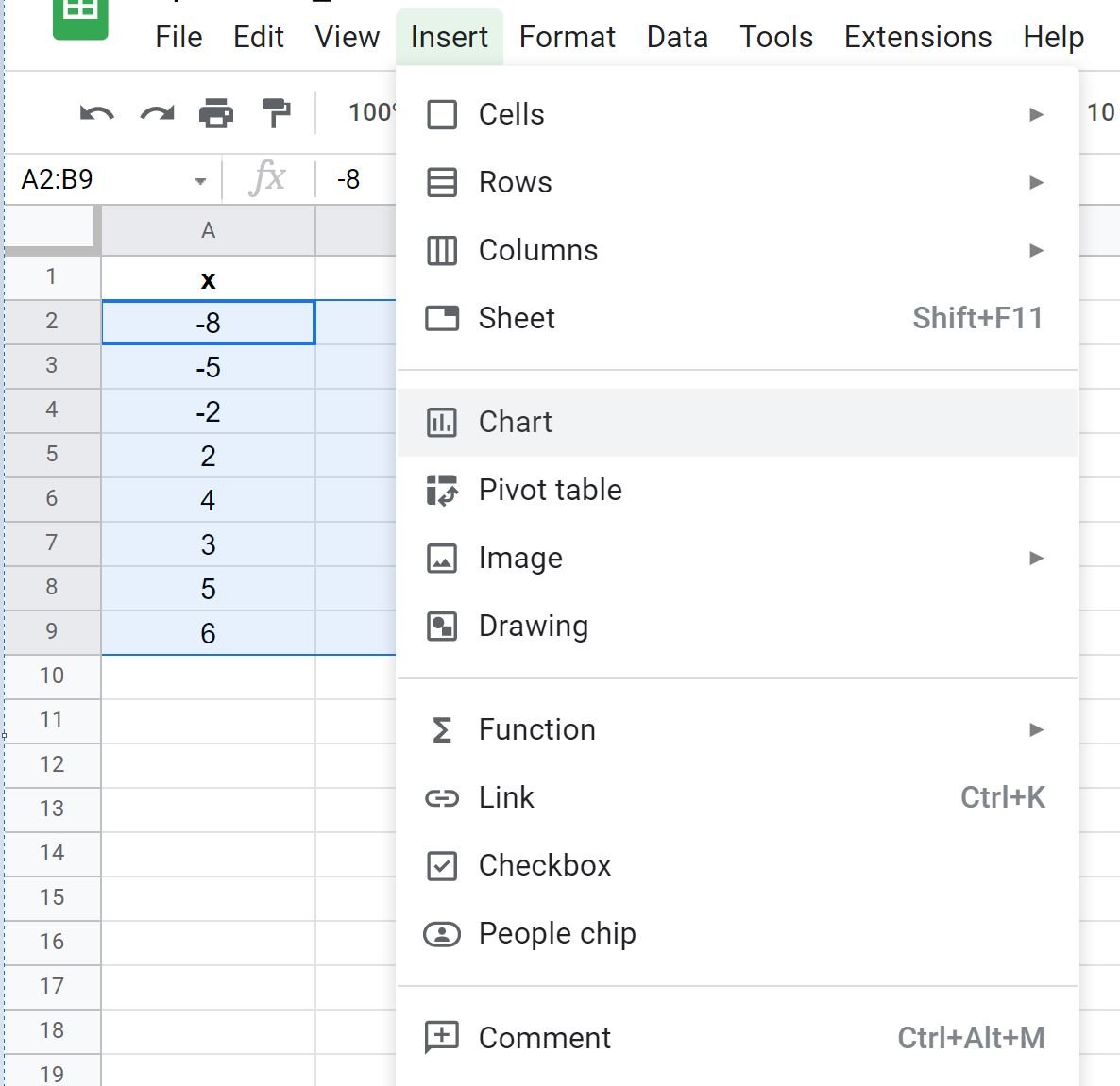
Next, highlight the cells in the range A2:B9, then click the Insert tab, then click Chart:
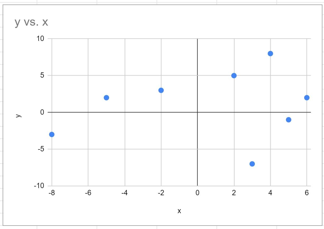
Google Sheets will automatically insert the following scatter plot:
Step 3: Create the Quadrant Chart
Notice that the x-axis of the scatter plot ranges from -8 to 6 and the y-axis ranges from -10 to 10.
However, a quadrant chart requires that each axis has the same range.
To change the range of the x-axis, double click anywhere on the chart.
In the Chart editor panel that appears on the right side of the screen, click the Customize tab, then click Horizontal axis, then change the Min and Max values to -10 and 10:
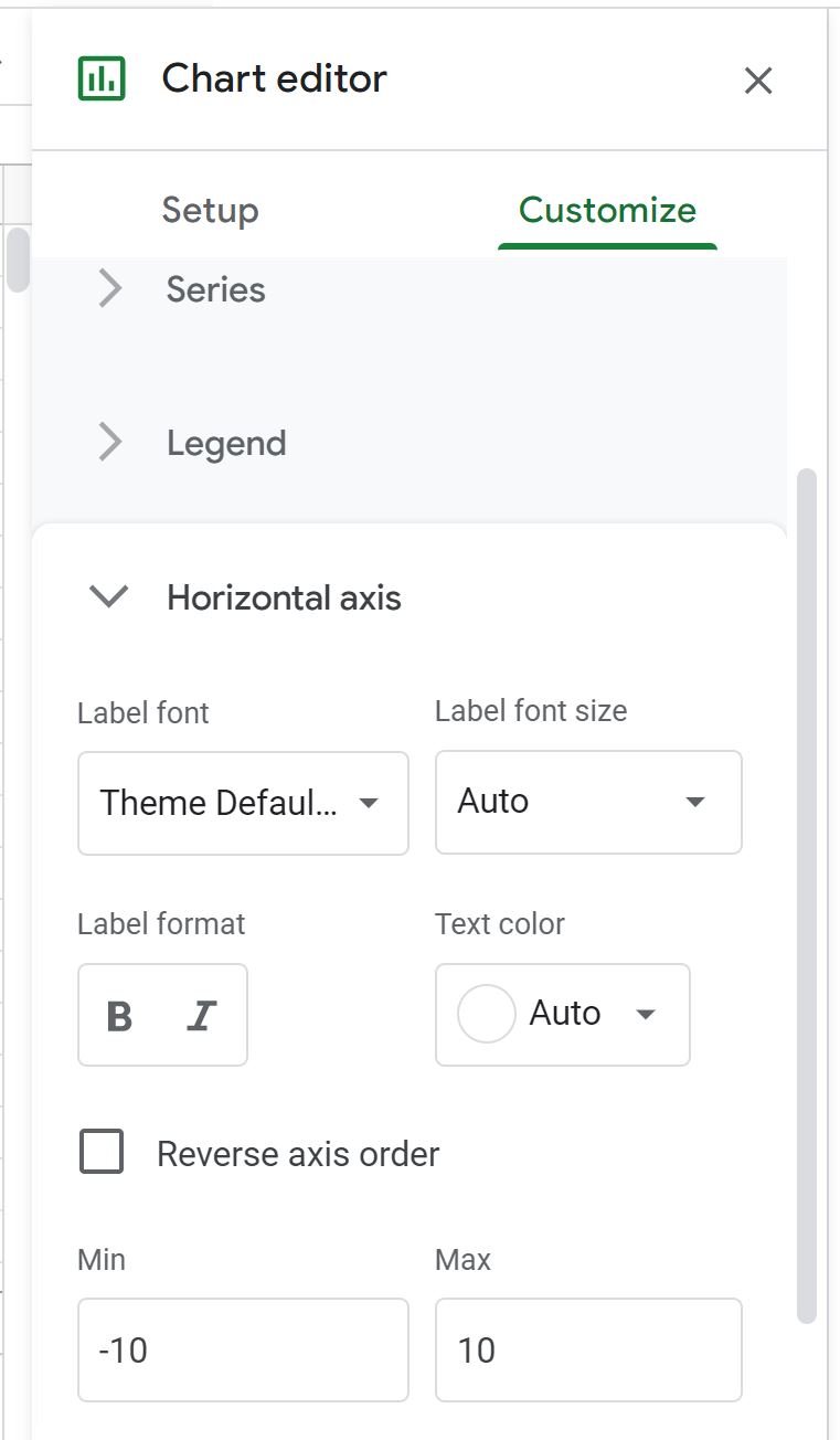
The range of the x-axis will automatically be modified to range from -10 to 10:
There are now four distinct quadrants in the chart that are each the same size and each point in the chart falls in one of the distinct quadrants.
Additional Resources
The following tutorials explain how to create other common visualizations in Google Sheets:
How to Make a Box Plot in Google Sheets
How to Create a Pareto Chart in Google Sheets
How to Create an Area Chart in Google Sheets
How to Create a Bubble Chart in Google Sheets