A linear regression model can be useful for two things:
(1) Quantifying the relationship between one or more predictor variables and a response variable.
(2) Using the model to predict future values.
In regards to (2), when we use a regression model to predict future values, we are often interested in predicting both an exact value as well as an interval that contains a range of likely values. This interval is known as a prediction interval.
For example, suppose we fit a simple linear regression model using hours studied as a predictor variable and exam score as the response variable. Using this model, we might predict that a student who studies for 6 hours will receive an exam score of 91.
However, because there is uncertainty around this prediction, we might create a prediction interval that says there is a 95% chance that a student who studies for 6 hours will receive an exam score between 85 and 97. This range of values is known as a 95% prediction interval and it’s often more useful to us than just knowing the exact predicted value.
How to Create a Prediction Interval in R
To illustrate how to create a prediction interval in R, we will use the built-in mtcars dataset, which contains information about characteristics of several different cars:
#view first six rows of mtcars
head(mtcars)

#                   mpg cyl disp  hp drat    wt  qsec vs am gear carb
#Mazda RX4         21.0   6  160 110 3.90 2.620 16.46  0  1    4    4
#Mazda RX4 Wag     21.0   6  160 110 3.90 2.875 17.02  0  1    4    4
#Datsun 710        22.8   4  108  93 3.85 2.320 18.61  1  1    4    1
#Hornet 4 Drive    21.4   6  258 110 3.08 3.215 19.44  1  0    3    1
#Hornet Sportabout 18.7   8  360 175 3.15 3.440 17.02  0  0    3    2
#Valiant           18.1   6  225 105 2.76 3.460 20.22  1  0    3    1
First, we’ll fit a simple linear regression model using disp as the predictor variable and mpg as the response variable.
#fit simple linear regression model
model #view summary of fitted model
summary(model)

#Call:
#lm(formula = mpg ~ disp, data = mtcars)
#
#Residuals:
#    Min      1Q  Median      3Q     Max
#-4.8922 -2.2022 -0.9631  1.6272  7.2305
#
#Coefficients:
#             Estimate Std. Error t value Pr(>|t|)
#(Intercept) 29.599855   1.229720  24.070
Then, we’ll use the fitted regression model to predict the value of mpg based on three new values for disp.
#create data frame with three new values for disp
new_disp
#use the fitted model to predict the value for mpg based on the three new values
#for disp
predict(model, newdata = new_disp)

#       1        2        3
#23.41759 21.35683 19.29607
The way to interpret these values is as follows:
- For a new car with a disp of 150, we predict that it will have a mpg of 23.41759.
- For a new car with a disp of 200, we predict that it will have a mpg of 21.35683 .
- For a new car with a disp of 250, we predict that it will have a mpg of 19.29607.
Next, we’ll use the fitted regression model to make prediction intervals around these predicted values:
#create prediction intervals around the predicted values
predict(model, newdata = new_disp, interval = "predict")

#       fit      lwr      upr
#1 23.41759 16.62968 30.20549
#2 21.35683 14.60704 28.10662
#3 19.29607 12.55021 26.04194
The way to interpret these values is as follows:
- The 95% prediction interval of the mpg for a car with a disp of 150 is between 16.62968 and 30.20549.
- The 95% prediction interval of the mpg for a car with a disp of 200 is between 14.60704 and 28.10662.
- The 95% prediction interval of the mpg for a car with a disp of 250 is between 12.55021 and 26.04194.
By default, R uses a 95% prediction interval. However, we can change this to whatever we’d like using the level command. For example, the following code illustrates how to create 99% prediction intervals:
#create 99% prediction intervals around the predicted values
predict(model, newdata = new_disp, interval = "predict", level = 0.99)

#       fit      lwr      upr
#1 23.41759 14.27742 32.55775
#2 21.35683 12.26799 30.44567
#3 19.29607 10.21252 28.37963
Note that the 99% prediction intervals are wider than the 95% prediction intervals. This makes sense because the wider the interval, the higher the likelihood that it will contain the predicted value.
How to Visualize a Prediction Interval in R
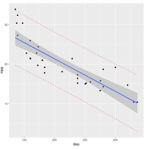
The following code illustrates how to create a chart with the following features:
- A scatterplot of the data points for disp and mpg
- A blue line for the fitted regression line
- Gray confidence bands
- Red prediction bands
#define dataset
data #create simple linear regression model
model #use model to create prediction intervals
predictions predict")

#create dataset that contains original data along with prediction intervals
all_data #load ggplot2 library
library(ggplot2)

#create plot
ggplot(all_data, aes(x = disp, y = mpg)) + #define x and y axis variables
  geom_point() + #add scatterplot points
  stat_smooth(method = lm) + #confidence bands
  geom_line(aes(y = lwr), col = "coral2", linetype = "dashed") + #lwr pred interval
  geom_line(aes(y = upr), col = "coral2", linetype = "dashed") #upr pred interval
When to Use a Confidence Interval vs. a Prediction Interval
A prediction interval captures the uncertainty around a single value. A confidence interval captures the uncertainty around the mean predicted values. Thus, a prediction interval will always be wider than a confidence interval for the same value.
You should use a prediction interval when you are interested in specific individual predictions because a confidence interval will produce too narrow of a range of values, resulting in a greater chance that the interval will not contain the true value.


