A population pyramid is a graph that shows the age and gender distribution of a given population. It’s useful for understanding the composition of a population and the trend in population growth.
This tutorial explains how to create the following population pyramid in Python:
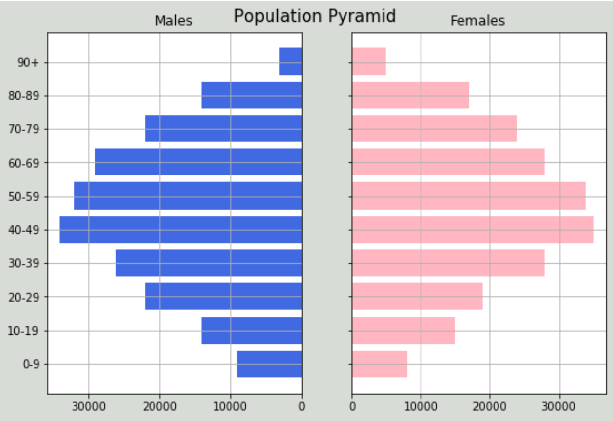
Population Pyramid in Python
Suppose we have the following dataset that displays the total population of males and females by age group for a given country:
#import libraries
import numpy as np
import pandas as pd
import matplotlib.pyplot as plt

#create dataframe
df = pd.DataFrame({'Age': ['0-9','10-19','20-29','30-39','40-49','50-59','60-69','70-79','80-89','90+'],
                    'Male': [9000, 14000, 22000, 26000, 34000, 32000, 29000, 22000, 14000, 3000],
                    'Female': [8000, 15000, 19000, 28000, 35000, 34000, 28000, 24000, 17000, 5000]})
#view dataframe
df

    Age  Male Female
0   0-9  9000   8000
1 10-19 14000  15000
2 20-29 22000  19000
3 30-39 26000  28000
4 40-49 34000  35000
5 50-59 32000  34000
6 60-69 29000  28000
7 70-79 22000  24000
8 80-89 14000  17000
9   90+  3000   5000
We can use the following code to create a population pyramid for the data:
#define x and y limits
y = range(0, len(df))
x_male = df['Male']
x_female = df['Female']

#define plot parameters
fig, axes = plt.subplots(ncols=2, sharey=True, figsize=(9, 6))

#specify background color and plot title
fig.patch.set_facecolor('xkcd:light grey')
plt.figtext(.5,.9,"Population Pyramid ", fontsize=15, ha='center')

#define male and female bars
axes[0].barh(y, x_male, align='center', color='royalblue')
axes[0].set(title='Males')
axes[1].barh(y, x_female, align='center', color='lightpink')
axes[1].set(title='Females')

#adjust grid parameters and specify labels for y-axis
axes[1].grid()
axes[0].set(yticks=y, yticklabels=df['Age'])
axes[0].invert_xaxis()
axes[0].grid()

#display plot
plt.show()
From the plot we can see that the distribution of males and females is fairly symmetrical, with most of the population falling in the middle-age brackets. By simply looking at this one plot, we can get a decent idea about the demographics of this particular country.
Note that you can adjust the colors of the plot background and the individual bars by specifying colors from the matplotlib color list.
For example, we could specify ‘hotpink’ and ‘dodgerblue’ to be used with a ‘beige’ background:
fig.patch.set_facecolor('xkcd:beige')

axes[0].barh(y, x_male, align='center', color='dodgerblue')

axes[1].barh(y, x_female, align='center', color='hotpink')

plt.show()
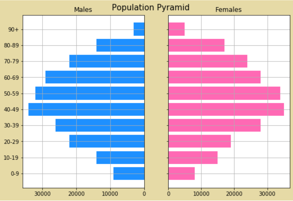
Feel free to modify the color scheme based on what you think looks best.