To plot a normal distribution in Python, you can use the following syntax:
#x-axis ranges from -3 and 3 with .001 steps
x = np.arange(-3, 3, 0.001)

#plot normal distribution with mean 0 and standard deviation 1
plt.plot(x, norm.pdf(x, 0, 1))
The x array defines the range for the x-axis and the plt.plot() produces the curve for the normal distribution with the specified mean and standard deviation.
The following examples show how to use these functions in practice.
Example 1: Plot a Single Normal Distribution
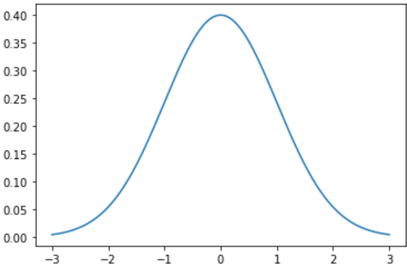
The following code shows how to plot a single normal distribution curve with a mean of 0 and a standard deviation of 1:
import numpy as np
import matplotlib.pyplot as plt
from scipy.stats import norm

#x-axis ranges from -3 and 3 with .001 steps
x = np.arange(-3, 3, 0.001)

#plot normal distribution with mean 0 and standard deviation 1
plt.plot(x, norm.pdf(x, 0, 1))
You can also modify the color and the width of the line in the graph:
plt.plot(x, norm.pdf(x, 0, 1), color='red', linewidth=3)

Example 2: Plot Multiple Normal Distributions
The following code shows how to plot multiple normal distribution curves with different means and standard deviations:
import numpy as np
import matplotlib.pyplot as plt
from scipy.stats import norm

#x-axis ranges from -5 and 5 with .001 steps
x = np.arange(-5, 5, 0.001)

#define multiple normal distributions
plt.plot(x, norm.pdf(x, 0, 1), label='μ: 0, σ: 1')
plt.plot(x, norm.pdf(x, 0, 1.5), label='μ:0, σ: 1.5')
plt.plot(x, norm.pdf(x, 0, 2), label='μ:0, σ: 2')

#add legend to plot
plt.legend()

Feel free to modify the colors of the lines and add a title and axes labels to make the chart complete:
import numpy as np
import matplotlib.pyplot as plt
from scipy.stats import norm

#x-axis ranges from -5 and 5 with .001 steps
x = np.arange(-5, 5, 0.001)

#define multiple normal distributions
plt.plot(x, norm.pdf(x, 0, 1), label='μ: 0, σ: 1', color='gold')
plt.plot(x, norm.pdf(x, 0, 1.5), label='μ:0, σ: 1.5', color='red')
plt.plot(x, norm.pdf(x, 0, 2), label='μ:0, σ: 2', color='pink')

#add legend to plot
plt.legend(title='Parameters')

#add axes labels and a title
plt.ylabel('Density')
plt.xlabel('x')
plt.title('Normal Distributions', fontsize=14)

Refer to the matplotlib documentation for an in-depth explanation of the plt.plot() function.