When we perform simple linear regression in R, it’s easy to visualize the fitted regression line because we’re only working with a single predictor variable and a single response variable.
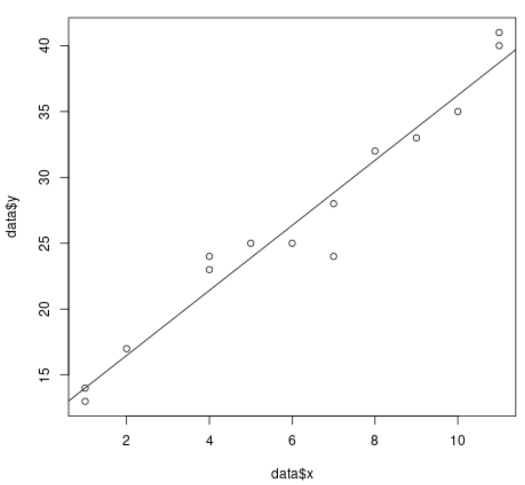
For example, the following code shows how to fit a simple linear regression model to a dataset and plot the results:
#create dataset
data #fit simple linear regression model
model #create scatterplot of data
plot(data$x, data$y)

#add fitted regression line
abline(model)
However, when we perform multiple linear regression it becomes difficult to visualize the results because there are several predictor variables and we can’t simply plot a regression line on a 2-D plot.
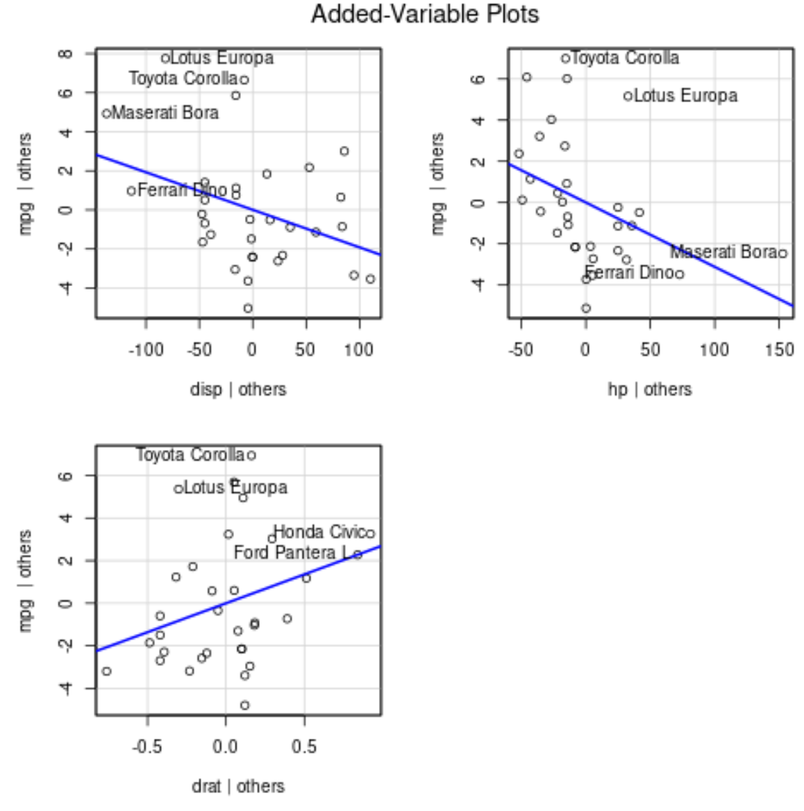
Instead, we can use added variable plots (sometimes called “partial regression plots”), which are individual plots that display the relationship between the response variable and one predictor variable, while controlling for the presence of other predictor variables in the model.
The following example shows how to perform multiple linear regression in R and visualize the results using added variable plots.
Example: Plotting Multiple Linear Regression Results in R
Suppose we fit the following multiple linear regression model to a dataset in R using the built-in mtcars dataset:
#fit multiple linear regression model
model
#view results of model
summary(model)

Call:
lm(formula = mpg ~ disp + hp + drat, data = mtcars)

Residuals:
    Min      1Q  Median      3Q     Max
-5.1225 -1.8454 -0.4456  1.1342  6.4958

Coefficients:
             Estimate Std. Error t value Pr(>|t|)
(Intercept) 19.344293   6.370882   3.036  0.00513 **
disp        -0.019232   0.009371  -2.052  0.04960 *
hp          -0.031229   0.013345  -2.340  0.02663 *
drat         2.714975   1.487366   1.825  0.07863 .
---
Signif. codes:  0 ‘***’ 0.001 ‘**’ 0.01 ‘*’ 0.05 ‘.’ 0.1 ‘ ’ 1

Residual standard error: 3.008 on 28 degrees of freedom
Multiple R-squared:  0.775,	Adjusted R-squared:  0.7509
F-statistic: 32.15 on 3 and 28 DF,  p-value: 3.28e-09
From the results we can see that the p-values for each of the coefficients is less than 0.1. For the sake of simplicity, we’ll assume that each of the predictor variables are significant and should be included in the model.
To produce added variable plots, we can use the avPlots() function from the car package:
#load car package
library(car)

#produce added variable plots
avPlots(model)
Here is how to interpret each plot:
- The x-axis displays a single predictor variable and the y-axis displays the response variable.
- The blue line shows the association between the predictor variable and the response variable, while holding the value of all other predictor variables constant.
- The points that are labelled in each plot represent the 2 observations with the largest residuals and the 2 observations with the largest partial leverage.
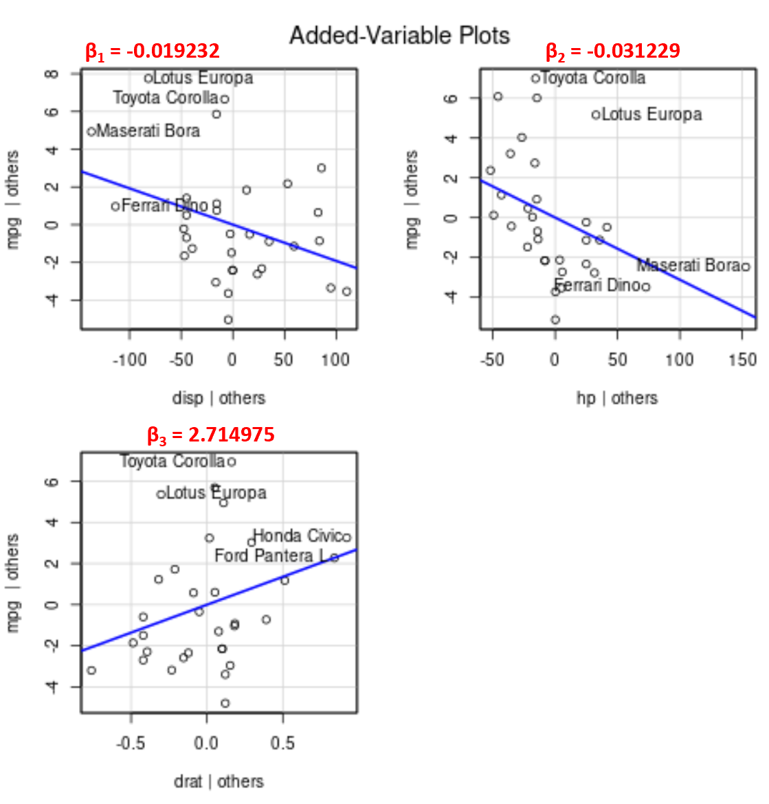
Note that the angle of the line in each plot matches the sign of the coefficient from the estimated regression equation.
For example, here are the estimated coefficients for each predictor variable from the model:
- disp: -0.019232
- hp: -0.031229
- drat: 2.714975
Notice that the angle of the line is positive in the added variable plot for drat while negative for both disp and hp, which matches the signs of their estimated coefficients:
Although we can’t plot a single fitted regression line on a 2-D plot since we have multiple predictor variables, these added variable plots allow us to observe the relationship between each individual predictor variable and the response variable while holding other predictor variables constant.


