A confidence interval is a range of values that is likely to contain a population parameter with a certain level of confidence.
This tutorial explains how to plot a confidence interval for a dataset in Python using the seaborn visualization library.
Plotting Confidence Intervals Using lineplot()
The first way to plot a confidence interval is by using the lineplot() function, which connects all of the data points in a dataset with a line and displays a confidence band around each point:
import numpy as np
import seaborn as sns
import matplotlib.pyplot as plt

#create some random data
np.random.seed(0)
x = np.random.randint(1, 10, 30)
y = x+np.random.normal(0, 1, 30)

#create lineplot
ax = sns.lineplot(x, y)
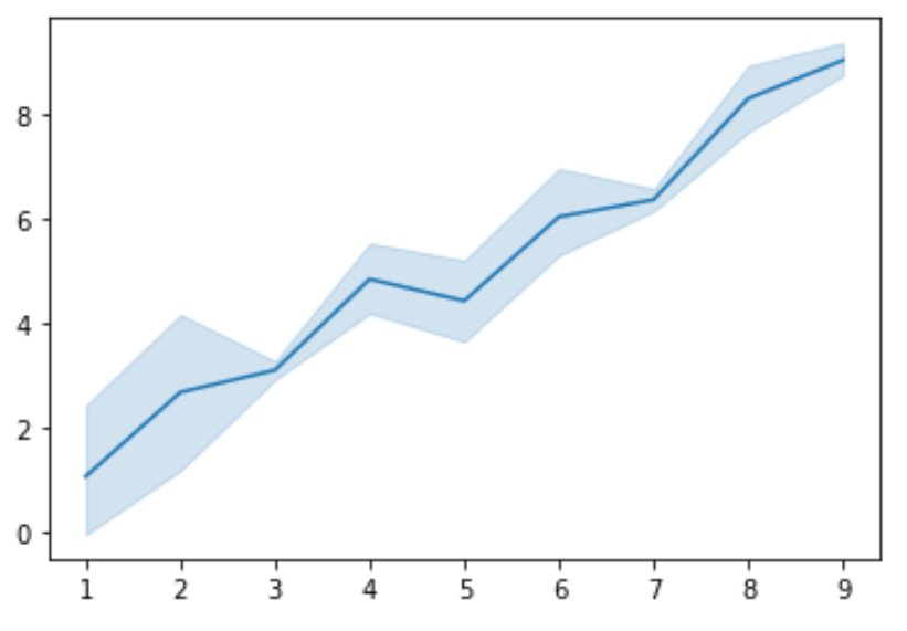
By default, the lineplot() function uses a 95% confidence interval but can specify the confidence level to use with the ci command.
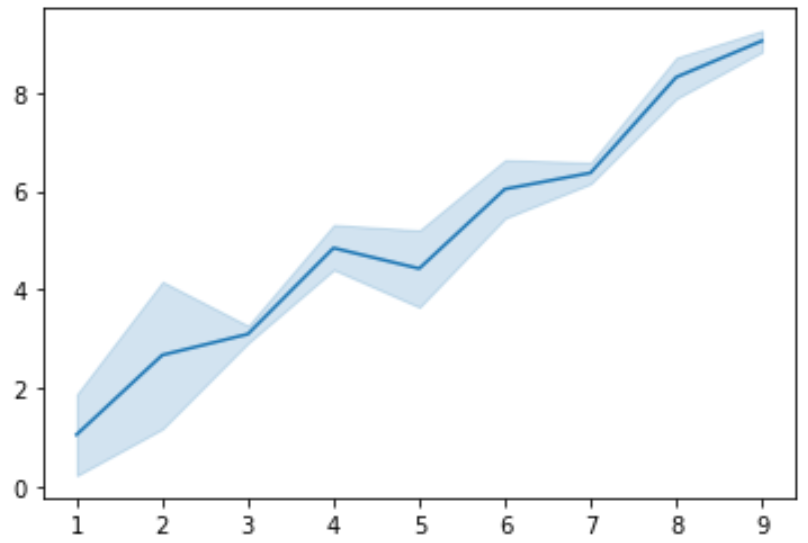
The smaller the confidence level, the more narrow the confidence interval will be around the line. For example, here’s what an 80% confidence interval looks like for the exact same dataset:
#create lineplot
ax = sns.lineplot(x, y, ci=80)
Plotting Confidence Intervals Using regplot()
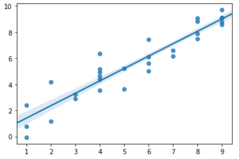
You can also plot confidence intervals by using the regplot() function, which displays a scatterplot of a dataset with confidence bands around the estimated regression line:
import numpy as np
import seaborn as sns
import matplotlib.pyplot as plt

#create some random data
np.random.seed(0)
x = np.random.randint(1, 10, 30)
y = x+np.random.normal(0, 1, 30)

#create regplot
ax = sns.regplot(x, y)

Similar to lineplot(), the regplot() function uses a 95% confidence interval by default but can specify the confidence level to use with the ci command.
Again, the smaller the confidence level the more narrow the confidence interval will be around the regression line. For example, here’s what an 80% confidence interval looks like for the exact same dataset:
#create regplot
ax = sns.regplot(x, y, ci=80)
Additional Resources
What are Confidence Intervals?
How to Calculate Confidence Intervals in Python