A confidence interval represents a range of values that is likely to contain some population parameter with a certain level of confidence.
This tutorial explains how to plot confidence intervals on bar charts in Excel.
Example 1: Plot Confidence Intervals on Bar Graph
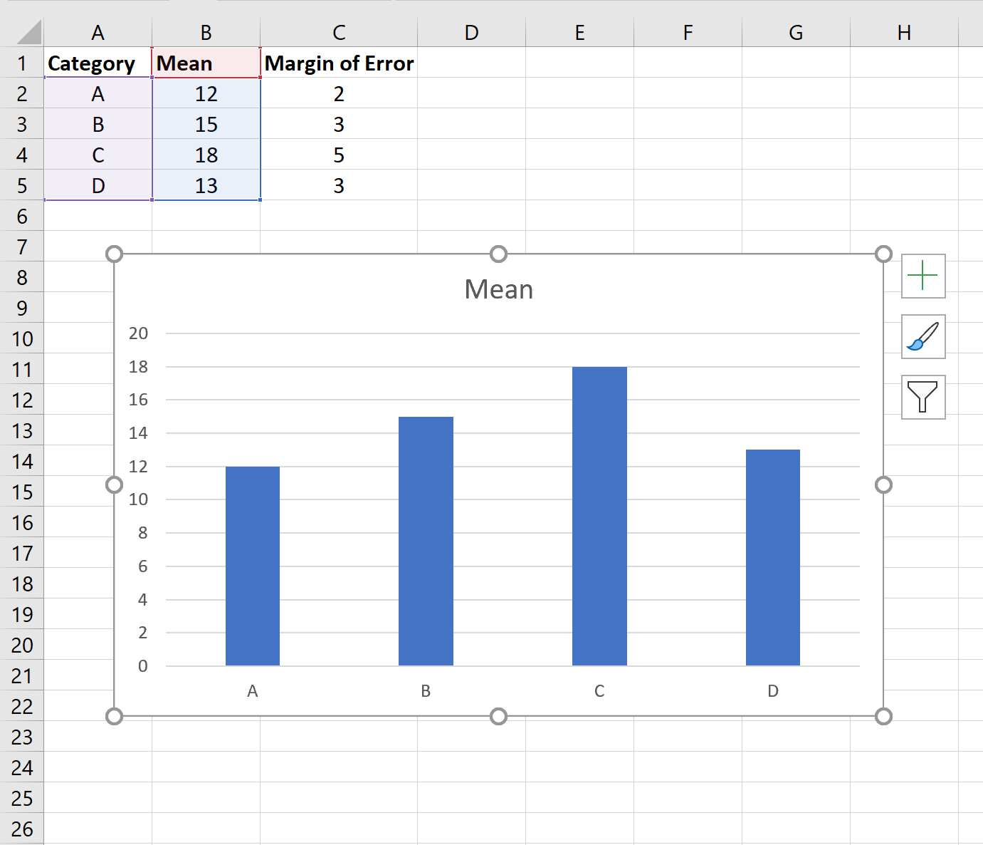
Suppose we have the following data in Excel that shows the mean of four different categories along with the corresponding margin of error for the 95% confidence intervals:

To create a bar chart to visualize the category means, highlight cells in the range A1:B5 and then click the Insert tab along the top ribbon. Then click Insert Column or Bar Chart within the Charts group.
This will produce the following bar chart:
To add confidence interval bands, click the plus sign (+) in the top right corner of the bar chart, then click Error Bars, then More Options:
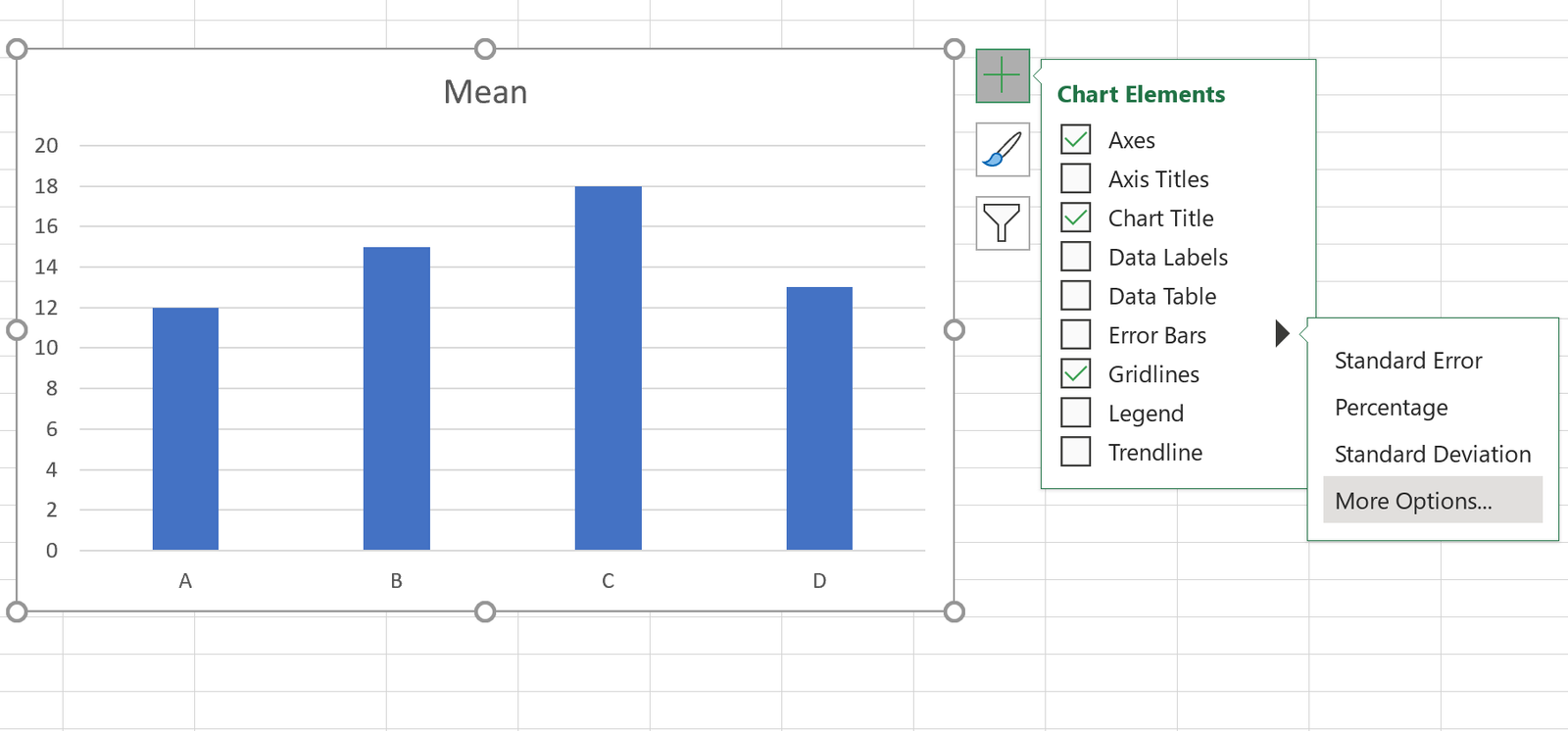
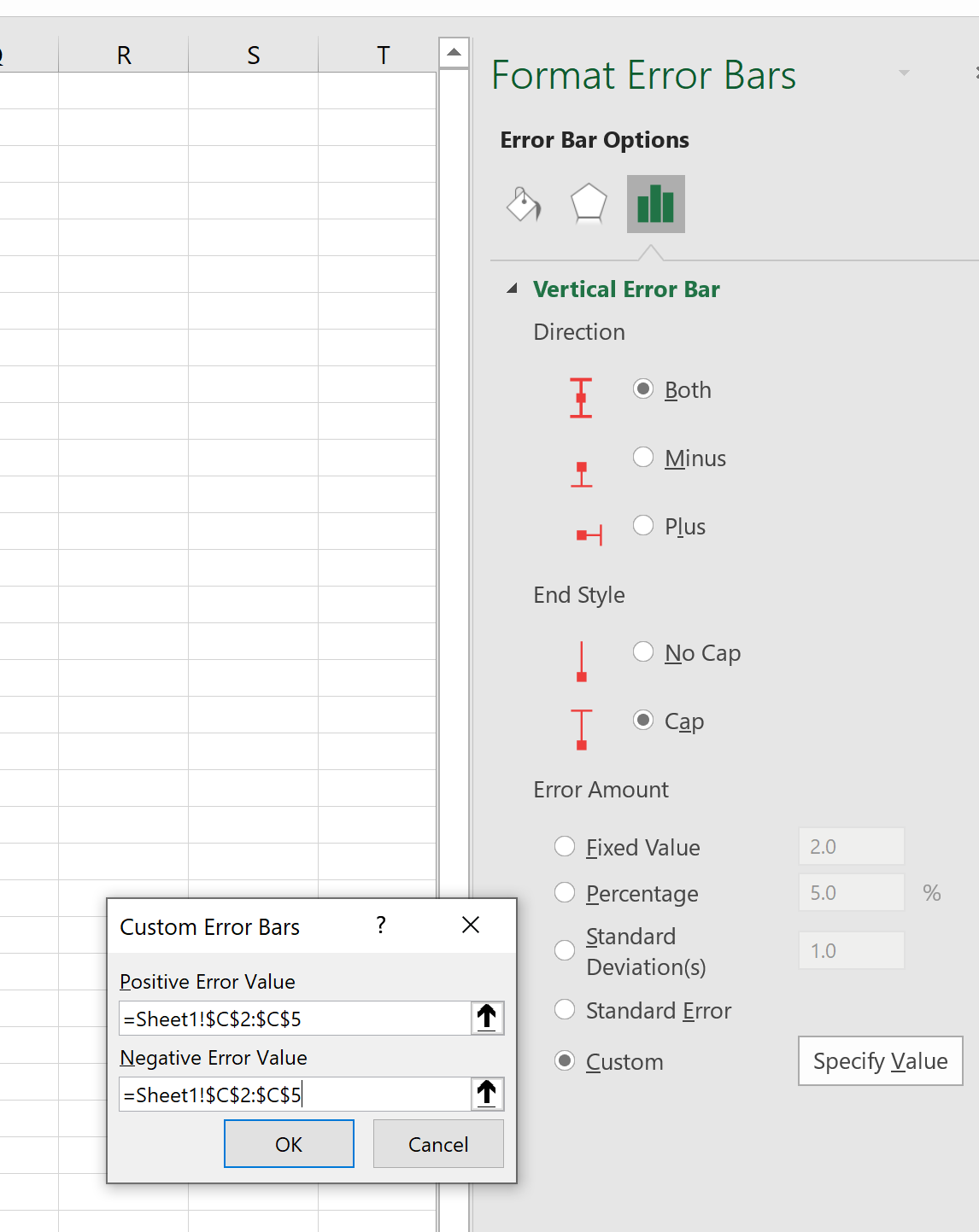
In the window that appears to the right, click the Custom button at the bottom. In the new window that appears, choose =Sheet1!$C$2:$C$5 for both the positive error value and negative error value. Then click OK.
This will produce the following confidence interval bands in the bar chart:
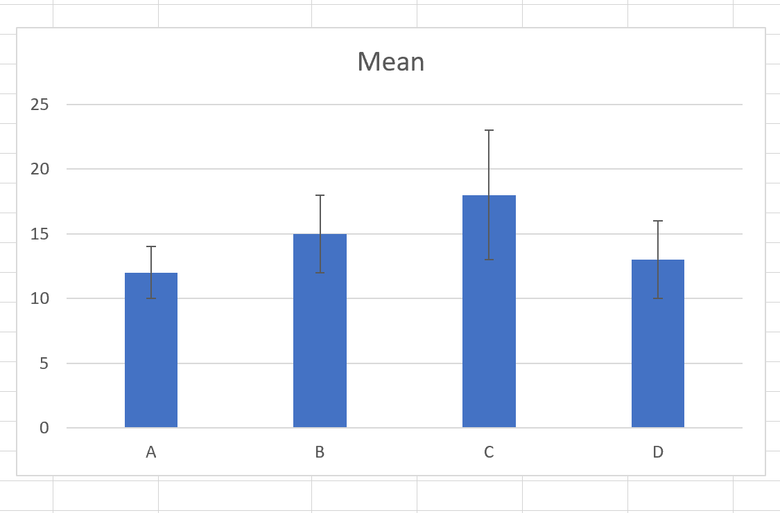
Feel free to change the color of the bars as well to make the confidence interval bands easier to see:
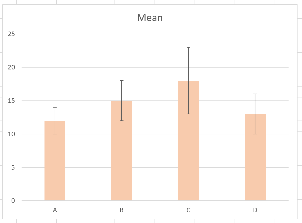
The top of the bar represents the mean value for each category and the error bars show the range of the confidence interval for each mean.
For example:
- The mean value for category A is 12 and the 95% confidence interval for this mean ranges from 10 to 14.
- The mean value for category B is 15 and the 95% confidence interval for this mean ranges from 12 to 18.
- The mean value for category C is 18 and the 95% confidence interval for this mean ranges from 13 to 23.
- The mean value for category D is 13 and the 95% confidence interval for this mean ranges from 10 to 16.
Additional Resources
An Introduction to Confidence Intervals
How to Calculate Confidence Intervals in Excel
Margin of Error vs. Confidence Interval: What’s the Difference?