In statistics, categorical data represents data that can take on names or labels.
Examples include:
- Smoking status (“smoker”, “non-smoker”)
- Eye color (“blue”, “green”, “hazel”)
- Level of education (e.g. “high school”, “Bachelor’s degree”, “Master’s degree”)
Three plots that are commonly used to visualize this type of data include:
- Bar Charts
- Mosaic Plots
- Boxplots by Group
The following examples show how to create each of these plots in R.
Example 1: Bar Charts
The following code shows how to create a bar chart to visualize the frequency of teams in a certain data frame:
library(ggplot2)

#create data frame
df frame(result = c('W', 'L', 'W', 'W', 'W', 'L', 'W', 'L', 'W', 'L'),
                 team = c('B', 'B', 'B', 'B', 'D', 'A', 'A', 'A', 'C', 'C'),
                 points = c(12, 28, 19, 22, 32, 45, 22, 28, 13, 19),
                 rebounds = c(5, 7, 7, 12, 11, 4, 10, 7, 8, 8))

#create bar chart of teams
ggplot(df, aes(x=team)) +
  geom_bar()

The x-axis displays each team name and the y-axis shows the frequency of each team in the data frame.
We can also use the following code to order the bars in the chart from largest to smallest:
#create bar chart of teams, ordered from large to small
ggplot(df, aes(x=reorder(team, team, function(x)-length(x)))) +
  geom_bar(fill='steelblue') +
  labs(x='Team')

Example 2: Boxplots by Group
Grouped boxplots are a useful way to visualize a numeric variable, grouped by a categorical variable.
For example, the following code shows how to create boxplots that show the distribution of points scored, grouped by team:
library(ggplot2)

#create data frame
df frame(result = c('W', 'L', 'W', 'W', 'W', 'L', 'W', 'L', 'W', 'L'),
                 team = c('B', 'B', 'B', 'B', 'D', 'A', 'A', 'A', 'C', 'C'),
                 points = c(12, 28, 19, 22, 32, 45, 22, 28, 13, 19),
                 rebounds = c(5, 7, 7, 12, 11, 4, 10, 7, 8, 8))

#create boxplots of points, grouped by team
ggplot(df, aes(x=team, y=points)) +
  geom_boxplot(fill='steelblue')

The x-axis displays the teams and the y-axis displays the distribution of points scored by each team.
Example 3: Mosaic Plot
A mosaic plot is a type of plot that displays the frequencies of two different categorical variables in one plot.
For example, the following code shows how to create a mosaic plot that shows the frequency of the categorical variables ‘result’ and ‘team’ in one plot:
#create data frame
df frame(result = c('W', 'L', 'W', 'W', 'W', 'L', 'W', 'L', 'W', 'L'),
                 team = c('B', 'B', 'B', 'B', 'D', 'A', 'A', 'A', 'C', 'C'),
                 points = c(12, 28, 19, 22, 32, 45, 22, 28, 13, 19),
                 rebounds = c(5, 7, 7, 12, 11, 4, 10, 7, 8, 8))

#create table of counts
counts #create mosaic plot
mosaicplot(counts, xlab='Game Result', ylab='Team',
           main='Wins by Team', col='steelblue')
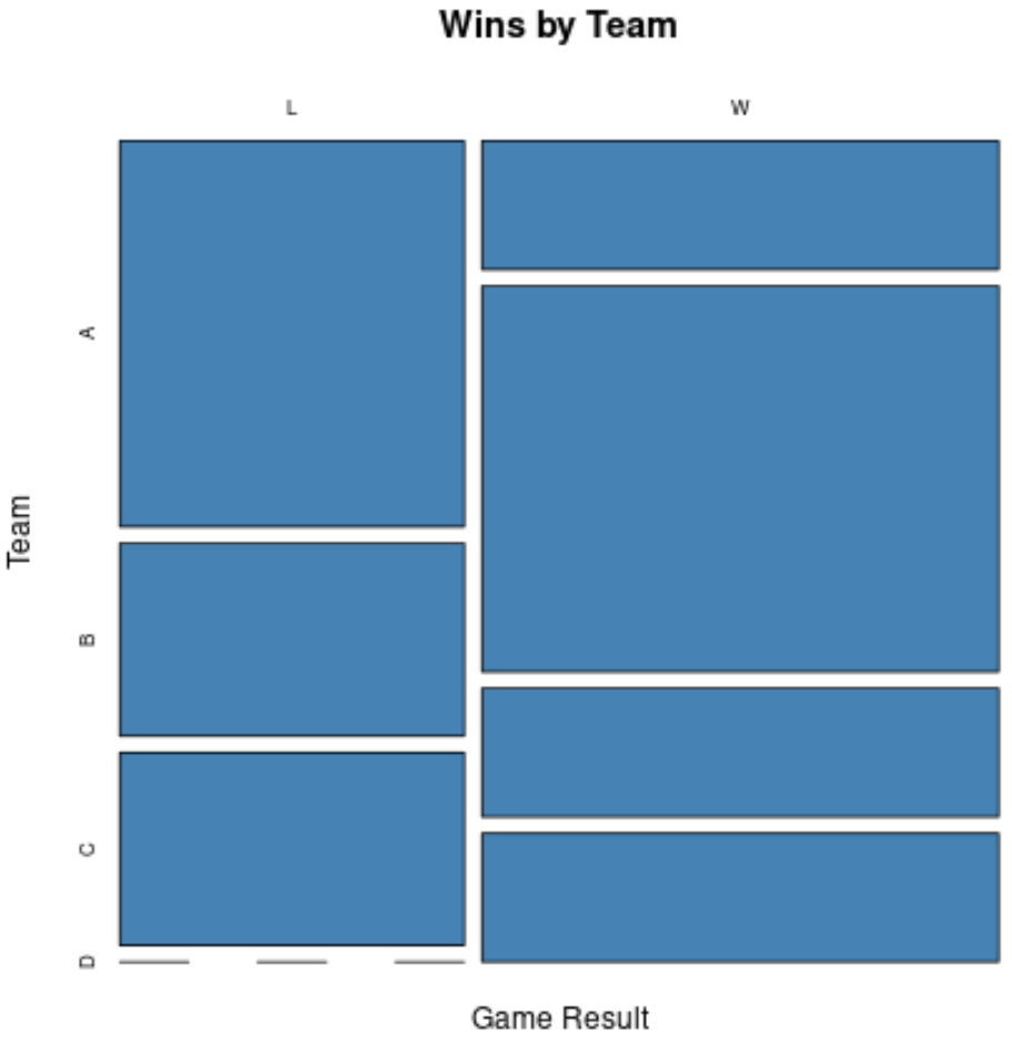
The x-axis displays the game result and the y-axis displays the four different teams.
Additional Resources
The following tutorials explain how to create other common plots in R:
How to Create a Stacked Barplot in R
How to Create a Grouped Barplot in R
How to Create a Stacked Dot Plot in R