You can use one of the following methods to use the values in the index of a pandas DataFrame as the x-axis values in a plot:
Method 1: Use plot()
df.plot(y='my_column')
If you don’t specify a variable to use for the x-axis then pandas will use the index values by default.
Method 2: Use plot() with use_index=True
df.plot(y='my_column', use_index=True)
The use_index=True argument explicitly tells pandas to use the index values for the x-axis.
Both of these methods will produce the same result.
The following examples show how to use each method in practice with the following pandas DataFrame:
import pandas as pd

#create DatFrame
df = pd.DataFrame({'sales': [8, 8, 9, 12, 13, 14, 22, 26, 25, 22]},
                   index=pd.date_range('1/1/2020', periods=10, freq='m'))

#view DataFrame
print(df)

            sales
2020-01-31      8
2020-02-29      8
2020-03-31      9
2020-04-30     12
2020-05-31     13
2020-06-30     14
2020-07-31     22
2020-08-31     26
2020-09-30     25
2020-10-31     22
Example 1: Use plot()
The following code shows how to use the plot() function in pandas to create a line chart that uses the index values in the DataFrame as the x-axis and the values in the sales column as the y-axis values:
#create line chart and use index values as x-axis values
df.plot(y='sales')
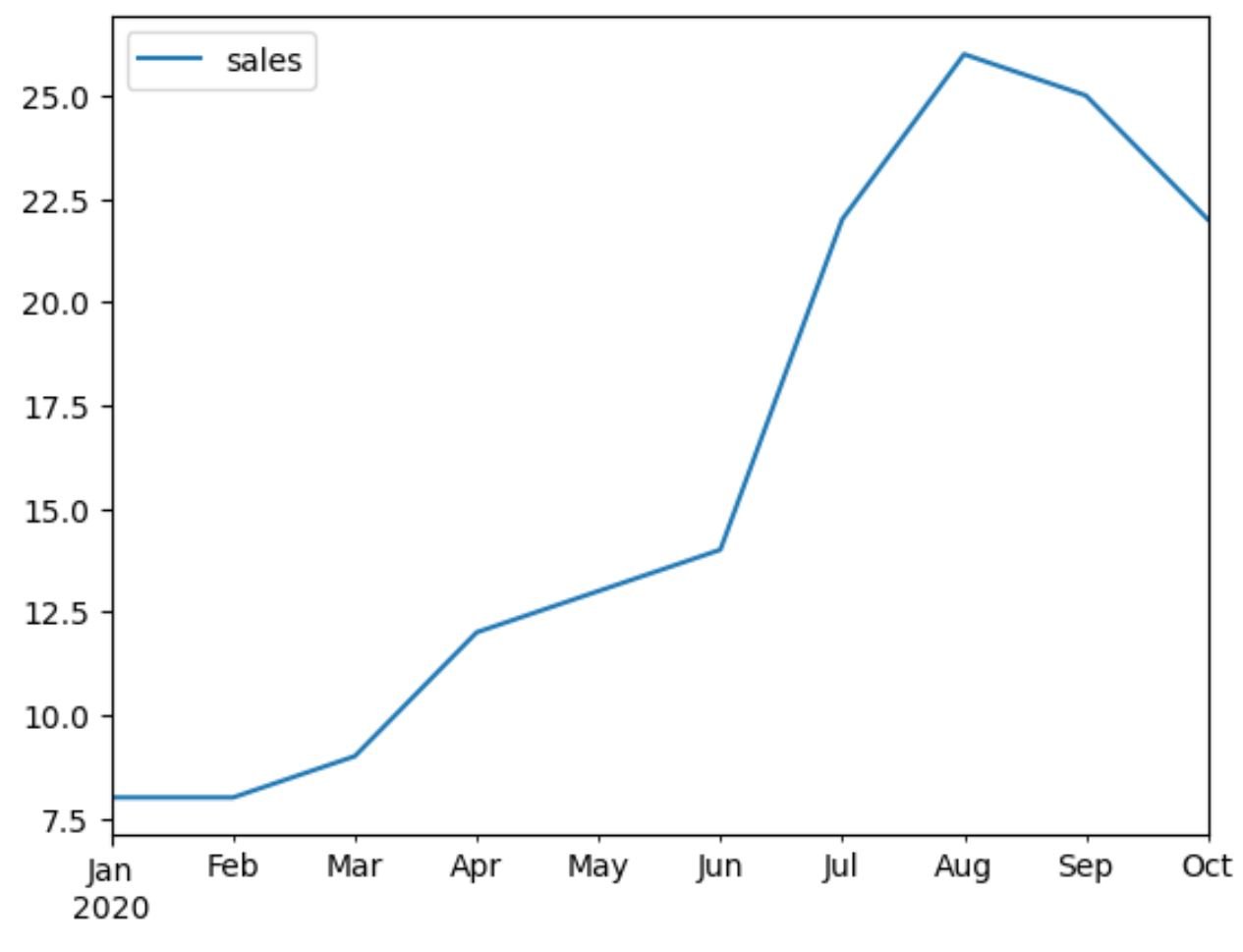
Notice that the plot automatically uses the dates in the index of the DataFrame as the values on the x-axis of the line chart.
Since we didn’t specify a variable to use on the x-axis, pandas used the index values by default.
Example 2: Use plot() with use_index=True
The following code shows how to use the plot() function with the argument use_index=True to create a line chart that uses the index values in the DataFrame as the x-axis and the values in the sales column as the y-axis values:
#create line chart and use index values as x-axis values
df.plot(y='sales', use_index=True)
Once again the plot uses the dates in the index of the DataFrame as the values on the x-axis of the line chart.
Notice that this chart matches the previous chart.
Additional Resources
The following tutorials explain how to perform other common tasks in pandas:
Pandas: How to Add Titles to Plots
Pandas: How to Create Plot Legends
Pandas: How to Create Bar Plot from GroupBy