You can use the following basic syntax to create a pie chart from a pandas DataFrame:
df.groupby(['group_column']).sum().plot(kind='pie', y='value_column')
The following examples show how to use this syntax in practice.
Example 1: Create Basic Pie Chart
Suppose we have the following two pandas DataFrame:
import pandas as pd

#create DataFrame
df = pd.DataFrame({'team': ['A', 'A', 'B', 'B', 'B', 'B', 'C', 'C'],
                   'points': [25, 12, 25, 14, 19, 53, 25, 29]})

#view DataFrame
print(df)

  team  points
0    A      25
1    A      12
2    B      25
3    B      14
4    B      19
5    B      53
6    C      25
7    C      29
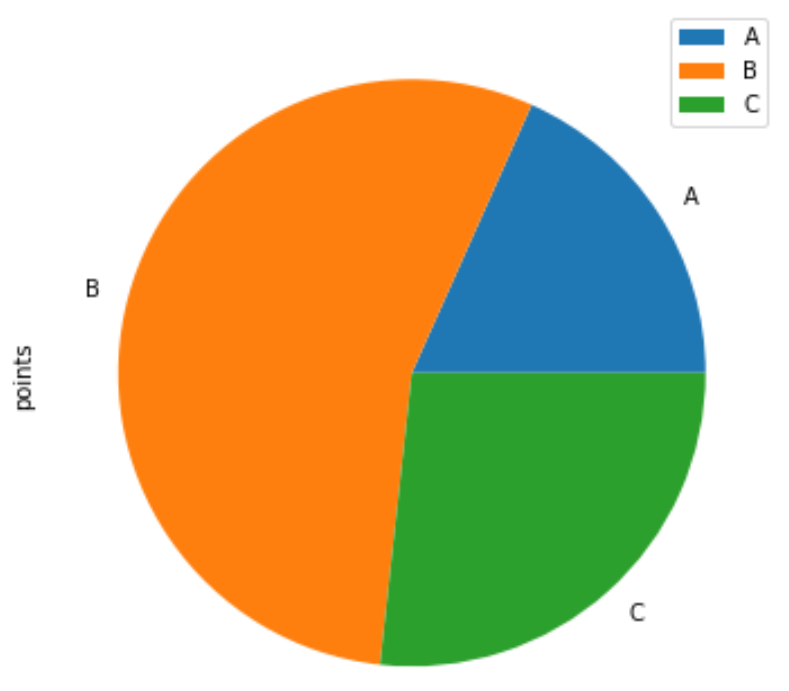
We can use the following syntax to create a pie chart that displays the portion of total points scored by each team:
df.groupby(['team']).sum().plot(kind='pie', y='points')
Example 2: Create Custom Pie Chart
We can use the following arguments to customize the appearance of the pie chart:
- autopct: Display percentages in pie chart
- colors: Specify colors to use in pie chart
- title: Add title to pie chart
The following code shows how to use these arguments in practice:
df.groupby(['team']).sum().plot(kind='pie', y='points', autopct='%1.0f%%',
                                colors = ['red', 'pink', 'steelblue'],
                                title='Points Scored by Team'))

Note that the colors will be assigned to the categories as they appear in the DataFrame.
For example, team ‘A’ appears first in the DataFrame, which is why it received the color ‘red’ in the pie chart.
Additional Resources
The following tutorials explain how to create other common plots using a pandas DataFrame:
How to Create a Scatter Matrix from Pandas DataFrame
How to Create a Histogram from Pandas DataFrame
How to Create Boxplot from Pandas DataFrame