A pairs plot is a matrix of scatterplots that lets you understand the pairwise relationship between different variables in a dataset.
The easiest way to create a pairs plot in Python is to use the seaborn.pairplot(df) function.
The following examples show how to use this function in practice.
Example 1: Pairs Plot for All Variables
The following code shows how to create a pairs plot for every numeric variable in the seaborn dataset called iris:
import pandas as pd
import matplotlib.pyplot as plt
import seaborn as sns

#define dataset
iris = sns.load_dataset("iris")

#create pairs plot for all numeric variables
sns.pairplot(iris)
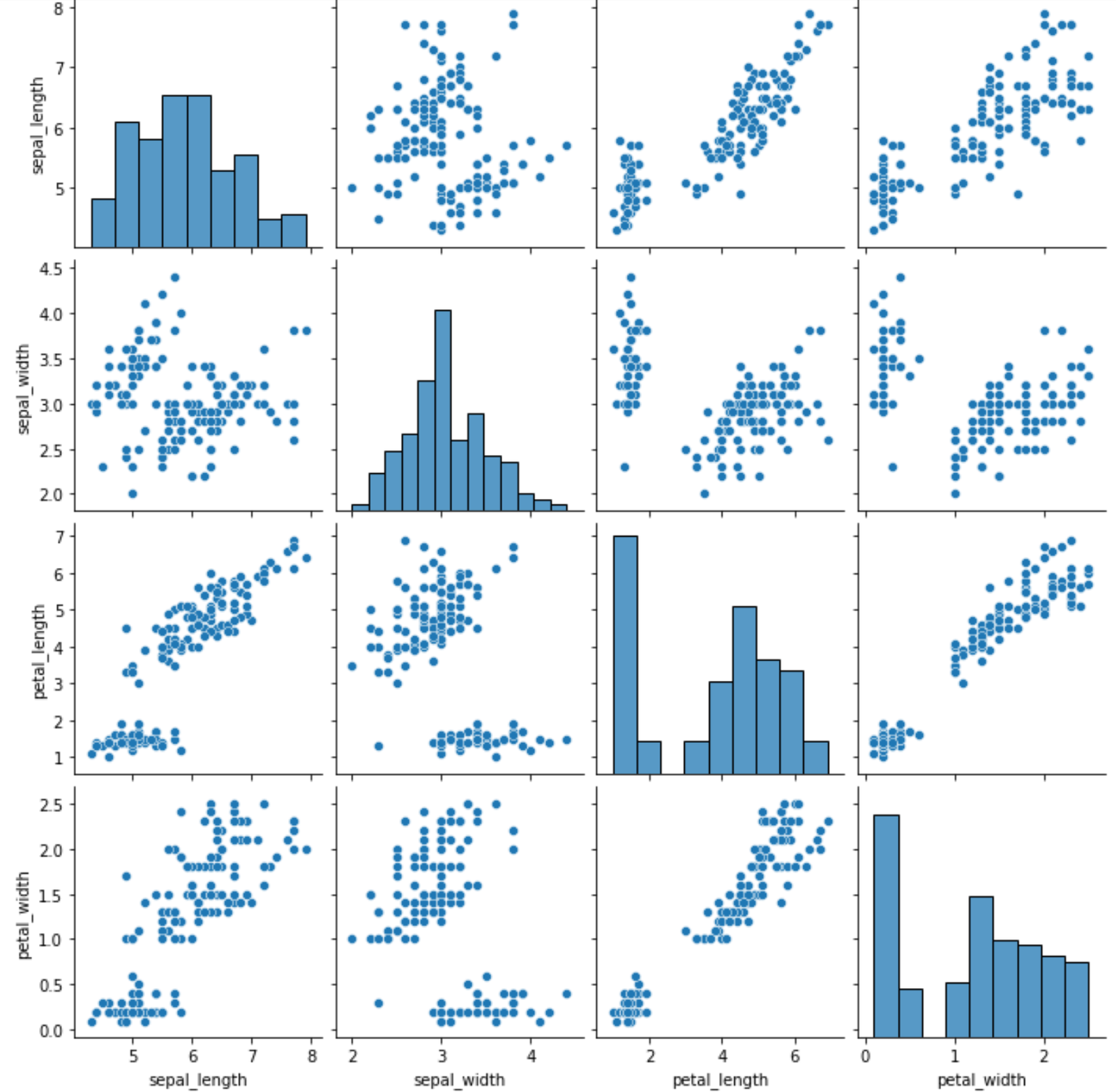
The way to interpret the matrix is as follows:
- The distribution of each variable is shown as a histogram along the diagonal boxes.
- All other boxes display a scatterplot of the relationship between each pairwise combination of variables. For example, the box in the bottom left corner of the matrix displays a scatterplot of values for petal_width vs. sepal_length.
This single plot gives us an idea of the relationship between each pair of variables in our dataset.
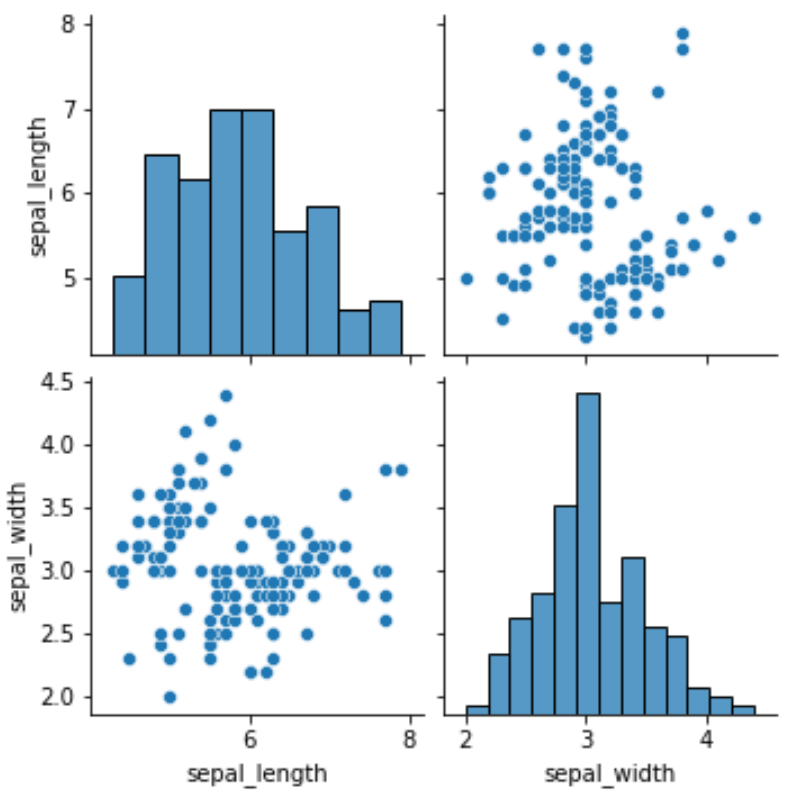
Example 2: Pairs Plot for Specific Variables
We can also specify only certain variables to include in the pairs plot:
sns.pairplot(iris[['sepal_length', 'sepal_width']])
Example 3: Pairs Plot with Color by Category
We can also create a pairs plot that colors each point in each plot based on some categorical variable using the hue argument:
sns.pairplot(iris, hue='species')
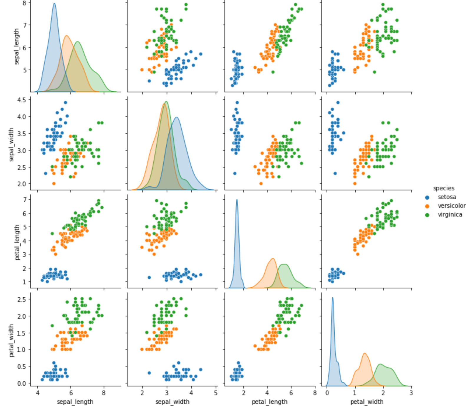
By using the hue argument, we can gain an even better understanding of the data.
Additional Resources
How to Make Barplots with Seaborn
How to Make Heatmaps with Seaborn
How to Add a Title to Seaborn Plots