An ogive is a graph that shows how many data values lie above or below a certain value in a dataset. This tutorial explains how to create an ogive in Python.
Example: How to Create an Ogive in Python
Perform the following steps to create an ogive for a dataset in Python.
Step 1: Create a dataset.
First, we can create a simple dataset.
import numpy as np

#create array of 1,000 random integers between 0 and 10
np.random.seed(1)
data = np.random.randint(0, 10, 1000)

#view first ten values
data[:10]

array([5, 8, 9, 5, 0, 0, 1, 7, 6, 9])
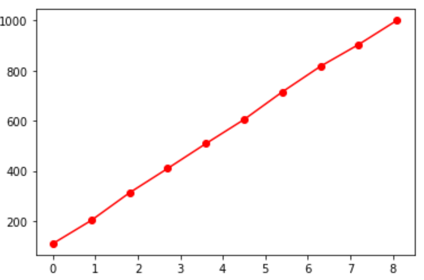
Step 2: Create an ogive.
Next, we can use the numpy.histogram function to automatically find the classes and the class frequencies. Then we can use matplotlib to actually create the ogive:
import numpy as np
import matplotlib.pyplot as plt

#obtain histogram values with 10 bins
values, base = np.histogram(data, bins=10)

#find the cumulative sums
cumulative = np.cumsum(values)

# plot the ogive
plt.plot(base[:-1], cumulative, 'ro-')
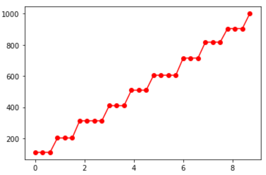
The ogive chart will look different based on the number of bins that we specify in the numpy.histogram function. For example, here’s what the chart would look like if we used 30 bins:
#obtain histogram values with 30 bins
values, base = np.histogram(data, bins=10)

#find the cumulative sums
cumulative = np.cumsum(values)

# plot the ogive
plt.plot(base[:-1], cumulative, 'ro-')
The argument ‘ro-‘ specifies:
- Use the color red (r)
- Use circles at each class break (o)
- Use lines to connect the circles (-)
Feel free to change these options to change the aesthetics of the chart.