The easiest way to create a Matplotlib plot with two y axes is to use the twinx() function.
The following example shows how to use this function in practice.
Example: Create Matplotlib Plot with Two Y Axes
Suppose we have the following two pandas DataFrames:
import pandas as pd

#create DataFrames
df1 = pd.DataFrame({'year': [1, 2, 3, 4, 5, 6, 7, 8, 9, 10],
                    'sales': [14, 16, 19, 22, 24, 25, 24, 24, 27, 30]})

df2 = pd.DataFrame({'year': [1, 2, 3, 4, 5, 6, 7, 8, 9, 10],
                    'leads': [4, 4, 4, 5, 4, 5, 7, 8, 5, 3]})
Both DataFrames share the ‘year’ variable that ranges from 1 to 10, but the first DataFrame displays the total sales each year while the second DataFrame displays the total leads each year.
We can use the following code to create a Matplotlib plot that displays the sales and the leads on one chart with two y axes:
import matplotlib.pyplot as plt

#define colors to use
col1 = 'steelblue'
col2 = 'red'

#define subplots
fig,ax = plt.subplots()

#add first line to plot
ax.plot(df1.year, df1.sales, color=col1)

#add x-axis label
ax.set_xlabel('Year', fontsize=14)

#add y-axis label
ax.set_ylabel('Sales', color=col1, fontsize=16)

#define second y-axis that shares x-axis with current plot
ax2 = ax.twinx()

#add second line to plot
ax2.plot(df2.year, df2.leads, color=col2)

#add second y-axis label
ax2.set_ylabel('Leads', color=col2, fontsize=16)
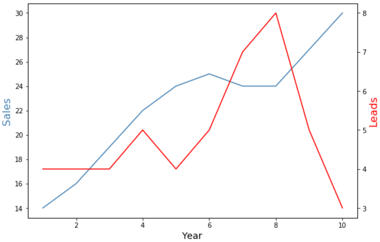
The y-axis on the left side of the plot shows the total sales by year and the y-axis on the right side of the plot shows the total leads by year.
The blue line in the plot represents the total sales by year and the red line represents the total leads by year.
Feel free to use the marker and linewidth arguments to change the appearance of the lines in the chart:
import matplotlib.pyplot as plt

#define colors to use
col1 = 'steelblue'
col2 = 'red'

#define subplots
fig,ax = plt.subplots()

#add first line to plot
ax.plot(df1.year, df1.sales, color=col1, marker='o', linewidth=3)

#add x-axis label
ax.set_xlabel('Year', fontsize=14)

#add y-axis label
ax.set_ylabel('Sales', color=col1, fontsize=16)

#define second y-axis that shares x-axis with current plot
ax2 = ax.twinx()

#add second line to plot
ax2.plot(df2.year, df2.leads, color=col2, marker='o', linewidth=3)

#add second y-axis label
ax2.set_ylabel('Leads', color=col2, fontsize=16)
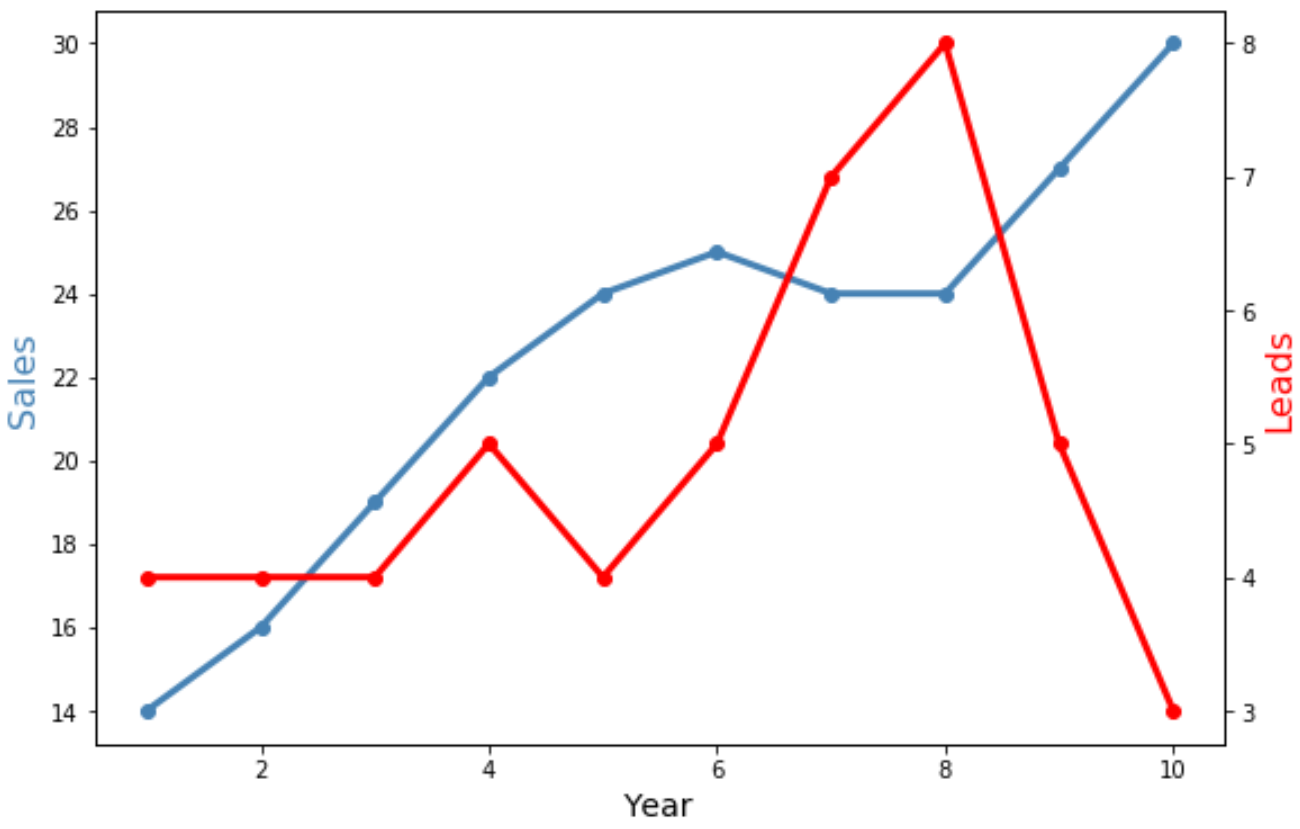
Notice that both lines are now wider and contain ‘o’ markers to display individual data points.
Additional Resources
The following tutorials explain how to perform other common operations in Matplotlib:
How to Adjust Axis Label Position in Matplotlib
How to Set Axis Ranges in Matplotlib
How to Set X-Axis Values in Matplotlib