Often you may want to shade the color of points within a matplotlib scatterplot based on some third variable. Fortunately this is easy to do using the matplotlib.pyplot.scatter() function, which takes on the following syntax:
matplotlib.pyplot.scatter(x, y, s=None, c=None, cmap=None)
where:
- x: Array of values to use for the x-axis positions in the plot.
- y: Array of values to use for the y-axis positions in the plot.
- s: The marker size.
- c: Array of values to use for marker colors.
- cmap: A map of colors to use in the plot.
You can use c to specify a variable to use for the color values and you can use cmap to specify the actual colors to use for the markers in the scatterplot.
This tutorial explains several examples of how to use this function in practice.
Example 1: Color Scatterplot Points by Value
Suppose we have the following pandas DataFrame:
import pandas as pd

#create DataFrame
df = pd.DataFrame({'x': [25, 12, 15, 14, 19, 23, 25, 29],
                   'y': [5, 7, 7, 9, 12, 9, 9, 4],
                   'z': [3, 4, 4, 5, 7, 8, 8, 9]})

#view DataFrame
df

        x	y	z
0	25	5	3
1	12	7	4
2	15	7	4
3	14	9	5
4	19	12	7
5	23	9	8
6	25	9	8
7	29	4	9
The following code shows how to create a scatterplot using a gray colormap and using the values for the variable z as the shade for the colormap:
import matplotlib.pyplot as plt

#create scatterplot
plt.scatter(df.x, df.y, s=200, c=df.z, cmap='gray')
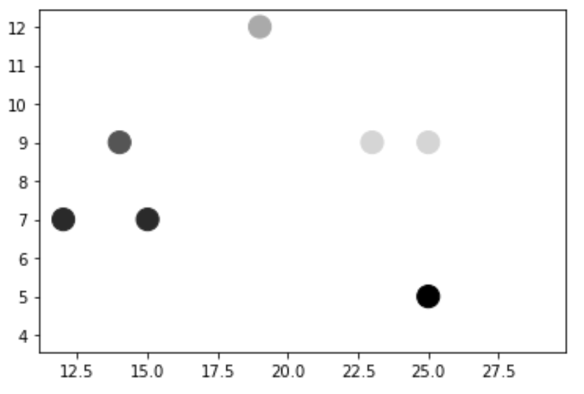
For this particular example we chose the colormap ‘gray’ but you can find a complete list of colormaps available to use in the matplotlib colormap documentation.
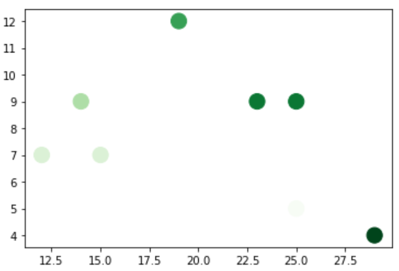
For example, we could instead specify ‘Greens’ as the colormap:
plt.scatter(df.x, df.y, s=200, c=df.z, cmap='Greens')
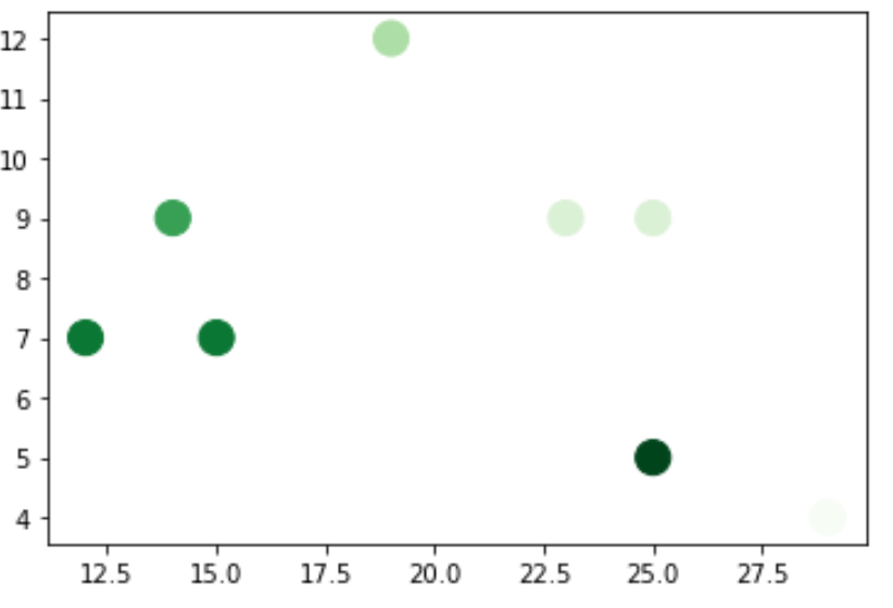
By default, markers with larger values for the c argument are shaded darker, but you can reverse this by simply appending _r to the cmap name:
plt.scatter(df.x, df.y, s=200, c=df.z, cmap='Greens_r')
Example 2: Color Scatterplot Points by Category
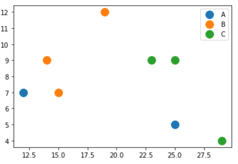
Suppose we have the following pandas DataFrame:
import pandas as pd

#create DataFrame
df = pd.DataFrame({'x': [25, 12, 15, 14, 19, 23, 25, 29],
                   'y': [5, 7, 7, 9, 12, 9, 9, 4],
                   'z': ['A', 'A', 'B', 'B', 'B', 'C', 'C', 'C']})

#view DataFrame
df

	x	y	z
0	25	5	A
1	12	7	A
2	15	7	B
3	14	9	B
4	19	12	B
5	23	9	C
6	25	9	C
7	29	4	C
The following code shows how to create a scatterplot using the variable z to color the markers based on category:
import matplotlib.pyplot as plt

groups = df.groupby('z')
for name, group in groups:
    plt.plot(group.x, group.y, marker='o', linestyle='', markersize=12, label=name)

plt.legend()
You can find more Python tutorials here.