A relative frequency histogram is a graph that displays the relative frequencies of values in a dataset.
You can use the following syntax to create a relative frequency histogram in Matplotlib in Python:
import matplotlib.pyplot as plt
import numpy as np

#define plotting area
fig = plt.figure()
ax = fig.add_subplot(111)

#create relative frequency histogram
ax.hist(data, edgecolor='black', weights=np.ones_like(data) / len(data))
The following example shows how to use this syntax in practice.
Example: Create Relative Frequency Histogram in Matplotlib
The following code shows how to create a regular frequency histogram in Matplotlib:
import numpy as np
import matplotlib.pyplot as plt

#define data values
data = [8, 8, 9, 12, 13, 13, 14, 14, 15, 18, 22, 23, 24, 25, 30]

#create frequency histogram
fig = plt.figure()
ax = fig.add_subplot(111)
ax.hist(data, edgecolor='black')
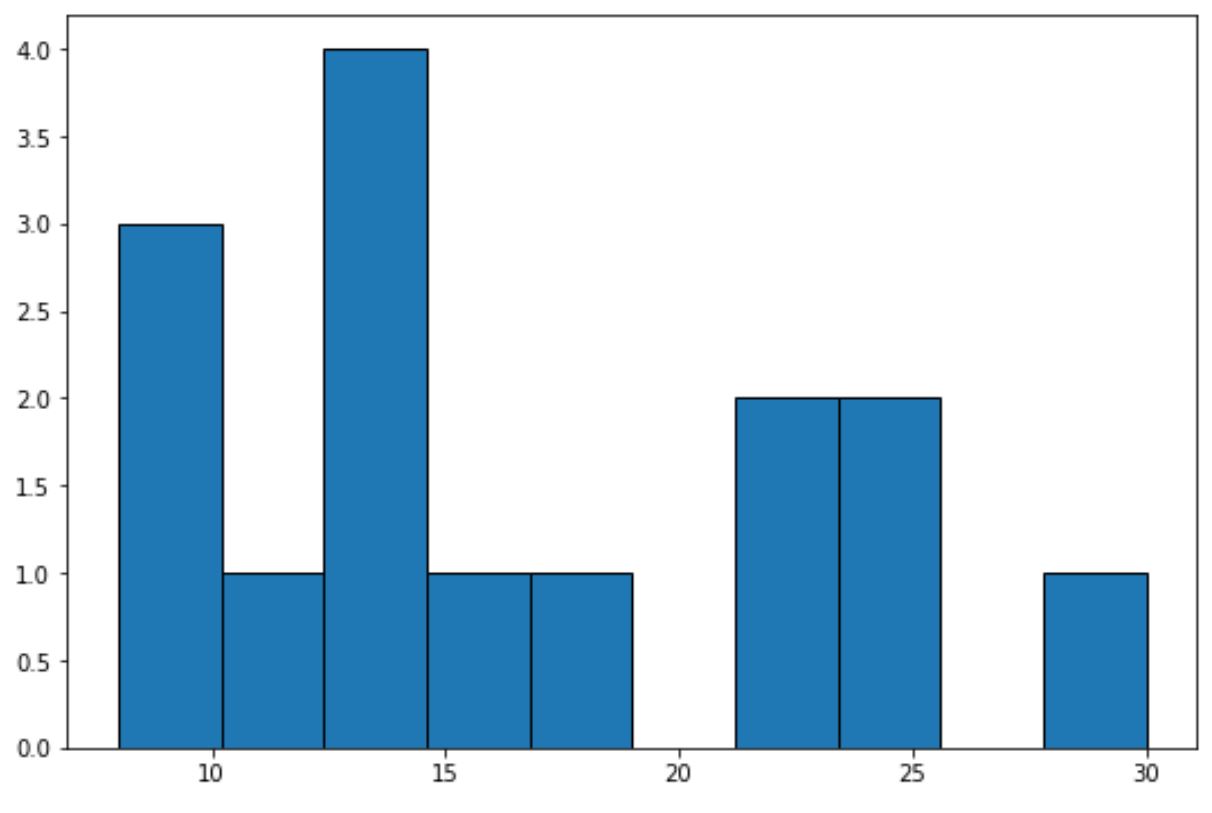
The x-axis shows the bins for the data values and the y-axis shows the frequency for each bin.
We can use the following code to instead display relative frequencies on the y-axis:
import numpy as np
import matplotlib.pyplot as plt

#define data values
data = [8, 8, 9, 12, 13, 13, 14, 14, 15, 18, 22, 23, 24, 25, 30]

#create relative frequency histogram
fig = plt.figure()
ax = fig.add_subplot(111)
ax.hist(data, edgecolor='black', weights=np.ones_like(data) / len(data))
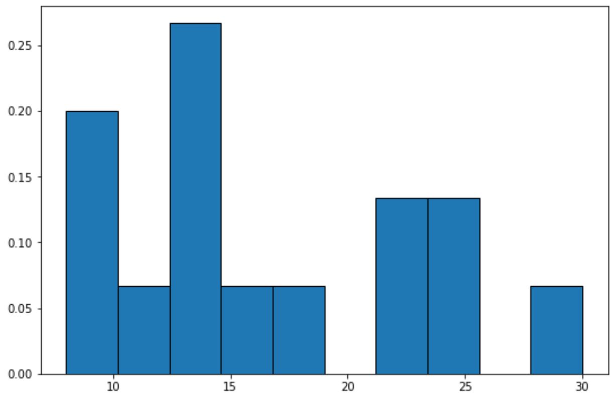
The y-axis now displays relative frequencies.
For example, there are 15 total values in the dataset.
So instead of showing a frequency of 4 on the y-axis for the tallest bar in the graph, the y-axis now shows 4/15 = 0.2667.
We can also use the PercentFormatter() function from Matplotlib to display the values on the y-axis as percentages:
import numpy as np
import matplotlib.pyplot as plt
from matplotlib.ticker import PercentFormatter

#define data values
data = [8, 8, 9, 12, 13, 13, 14, 14, 15, 18, 22, 23, 24, 25, 30]

#create relative frequency histogram with percentages on y-axis
fig = plt.figure()
ax = fig.add_subplot(111)
ax.hist(data, edgecolor='black', weights=np.ones_like(data)*100 / len(data))
ax.yaxis.set_major_formatter(PercentFormatter())
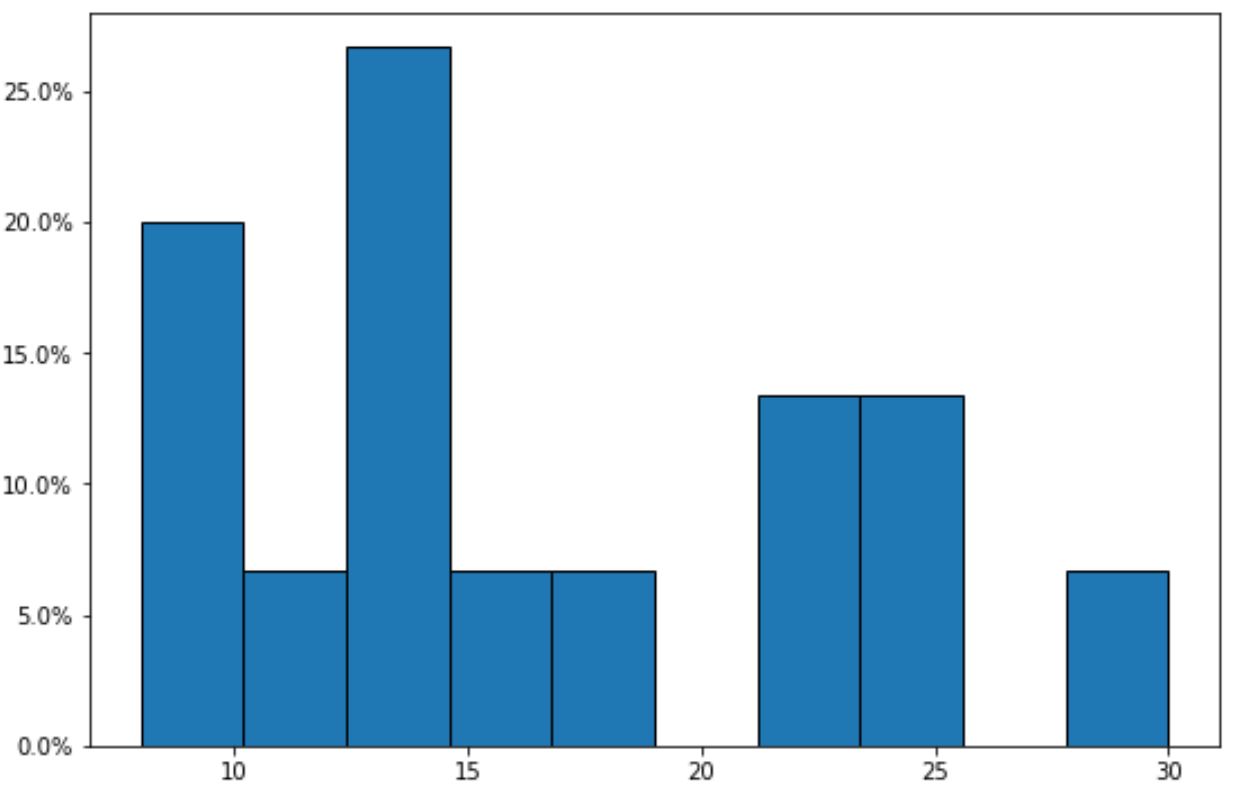
Notice that the y-axis now displays the relative frequencies as percentages.
Additional Resources
The following tutorials explain how to create other common charts in Matplotlib:
How to Modify a Matplotlib Histogram Color
How to Adjust Bin Size in Matplotlib Histograms
How to Create a Histogram from Pandas DataFrame