You can use the following basic syntax to only plot horizontal gridlines in Matplotlib:
ax.grid(axis='y')
The following example shows how to use this syntax in practice.
Example: Plot Only Horizontal Gridlines in Matplotlib
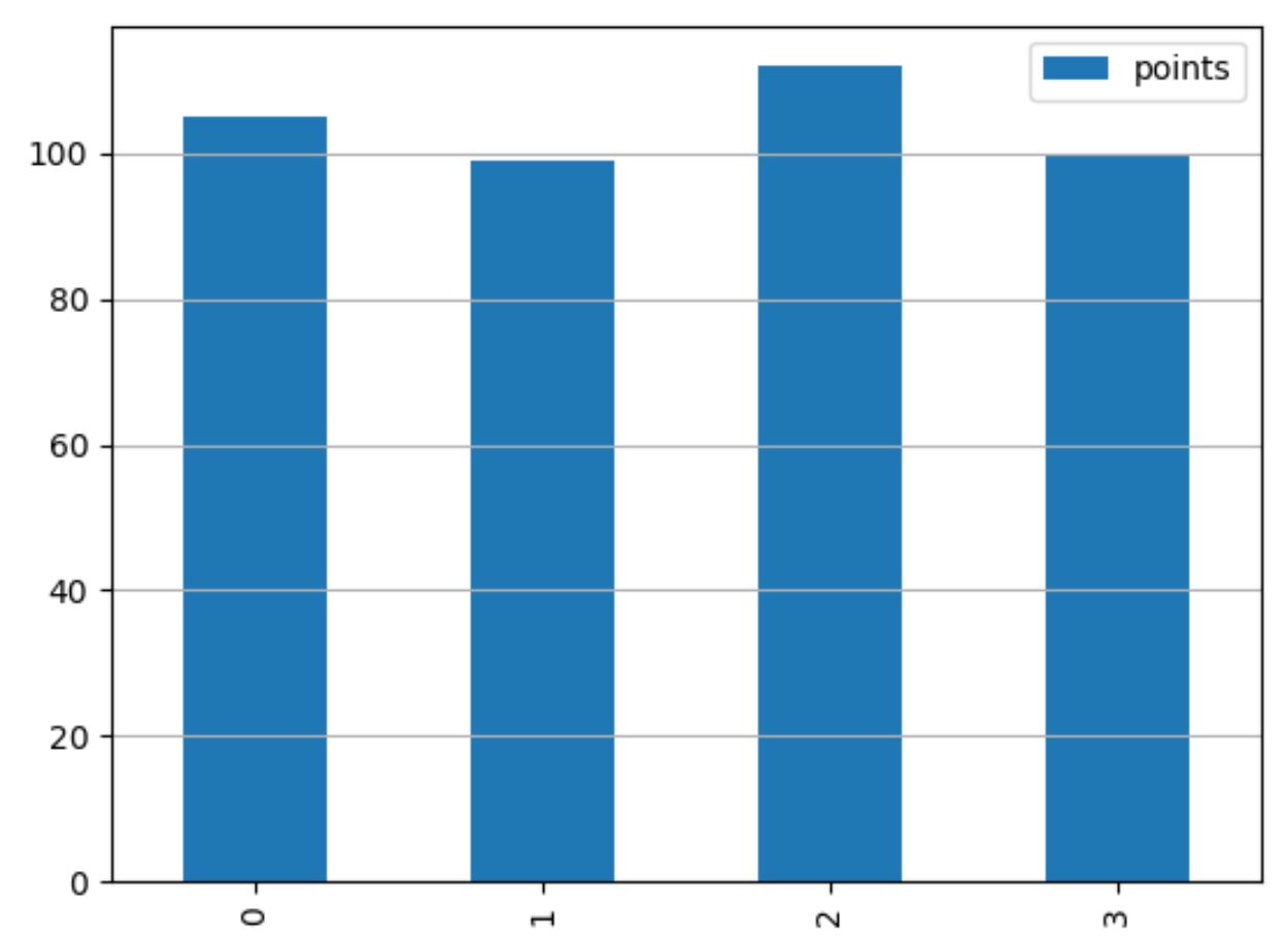
The following code shows how to create a bar plot in Matplotlib with only horizontal gridlines shown in the plot:
import pandas as pd
import matplotlib.pyplot as plt

#create DataFrame
df = pd.DataFrame({'team':['Mavs', 'Nets', 'Spurs', 'Warriors'],
                   'points':[105, 99, 112, 100]})

#define plot
fig, ax = plt.subplots()

#create bar plot
df.plot(kind='bar', ax=ax)

#add horizontal gridlines
ax.grid(axis='y')

#display plot
plt.show()
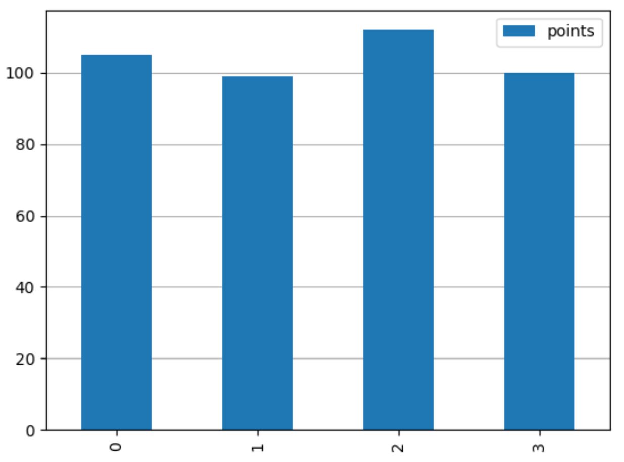
Feel free to use ax.set_axisbelow(True) to display the horizontal gridlines behind the bars in the plot:
import pandas as pd
import matplotlib.pyplot as plt

#create DataFrame
df = pd.DataFrame({'team':['Mavs', 'Nets', 'Spurs', 'Warriors'],
                   'points':[105, 99, 112, 100]})

#define plot
fig, ax = plt.subplots()

#create bar plot
df.plot(kind='bar', ax=ax)

#add horizontal gridlines behind bars in the plot
ax.set_axisbelow(True)
ax.grid(axis='y')

#display plot
plt.show()
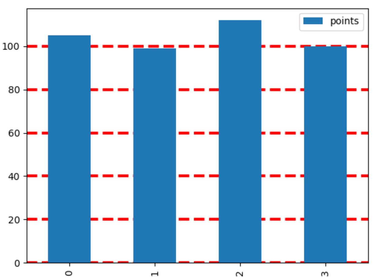
And feel free to use the color, linestyle, and linewidth arguments within the grid() function to customize the appearance of the gridlines:
import pandas as pd
import matplotlib.pyplot as plt

#create DataFrame
df = pd.DataFrame({'team':['Mavs', 'Nets', 'Spurs', 'Warriors'],
                   'points':[105, 99, 112, 100]})

#define plot
fig, ax = plt.subplots()

#create bar plot
df.plot(kind='bar', ax=ax)

#add horizontal gridlines with custom appearance
ax.set_axisbelow(True)
ax.grid(axis='y', color='red', linestyle='dashed', linewidth=3)

#display plot
plt.show()
You can find a complete list of ways to customize the gridlines in the Matplotlib documentation.
Additional Resources
The following tutorials explain how to perform other common tasks in Matplotlib:
How to Remove Ticks from Matplotlib Plots
How to Change Font Sizes on a Matplotlib Plot
How to Add an Average Line to Plot in Matplotlib