The easiest way to create a density plot in Matplotlib is to use the kdeplot() function from the seaborn visualization library:
import seaborn as sns

#define data
data = [value1, value2, value3, ...]

#create density plot of data
sns.kdeplot(data)
The following examples show how to use this function in practice.
Example 1: Create Basic Density Plot
The following code shows how to create a basic density plot in seaborn:
import seaborn as sns

#define data
data = [2, 2, 3, 5, 6, 6, 7, 8, 9, 10, 12, 12, 13, 15, 16]

#create density plot of data
sns.kdeplot(data)
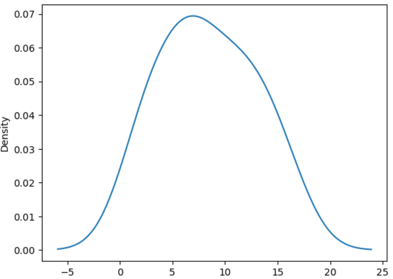
The x-axis shows the data values and the y-axis shows the corresponding probability density values.
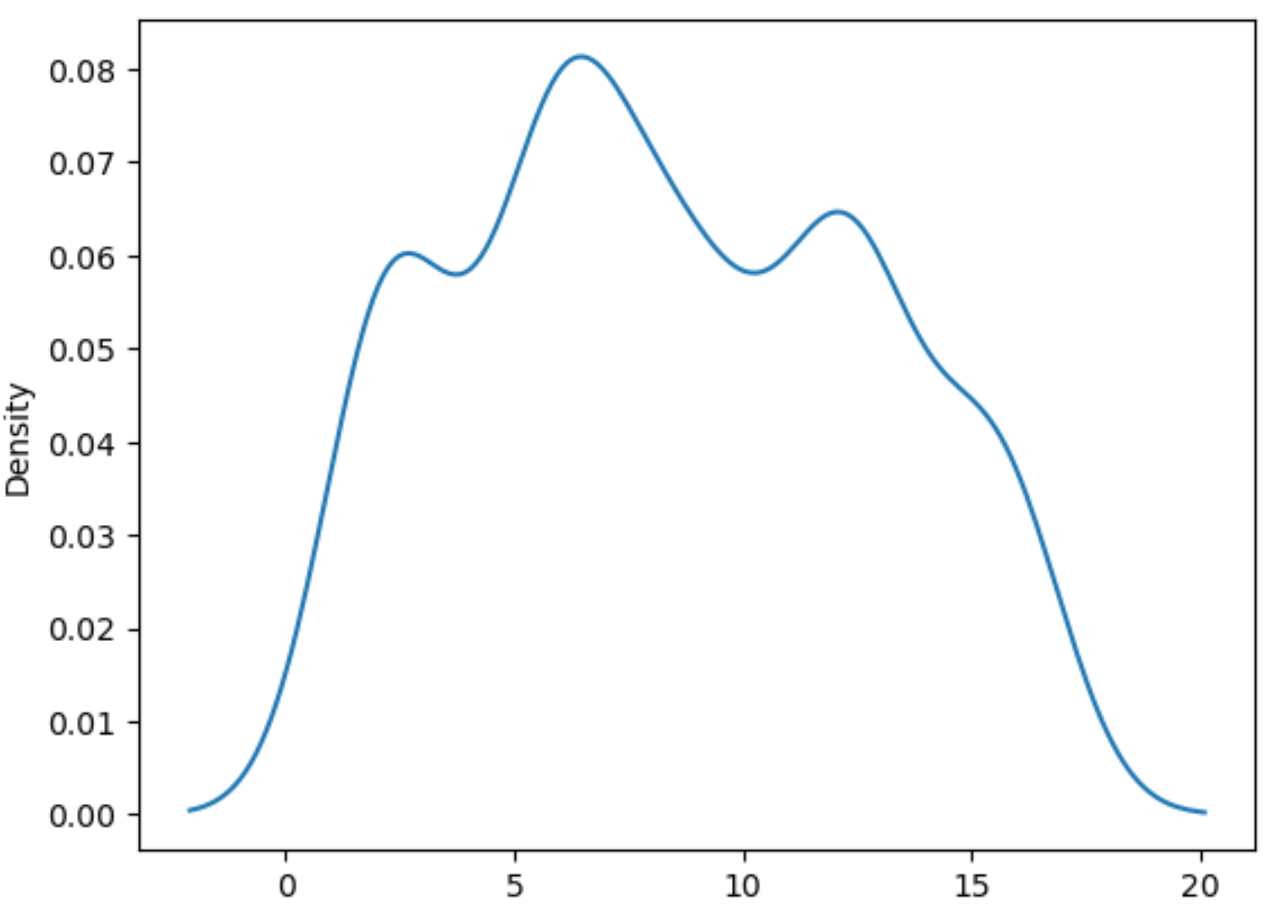
Example 2: Adjust Smoothness of Density Plot
You can use the bw_method argument to adjust the smoothness of the density plot. Lower values lead to a more “wiggly” plot.
import seaborn as sns

#define data
data = [2, 2, 3, 5, 6, 6, 7, 8, 9, 10, 12, 12, 13, 15, 16]

#create density plot of data with low bw_method value
sns.kdeplot(data, bw_method = .3)
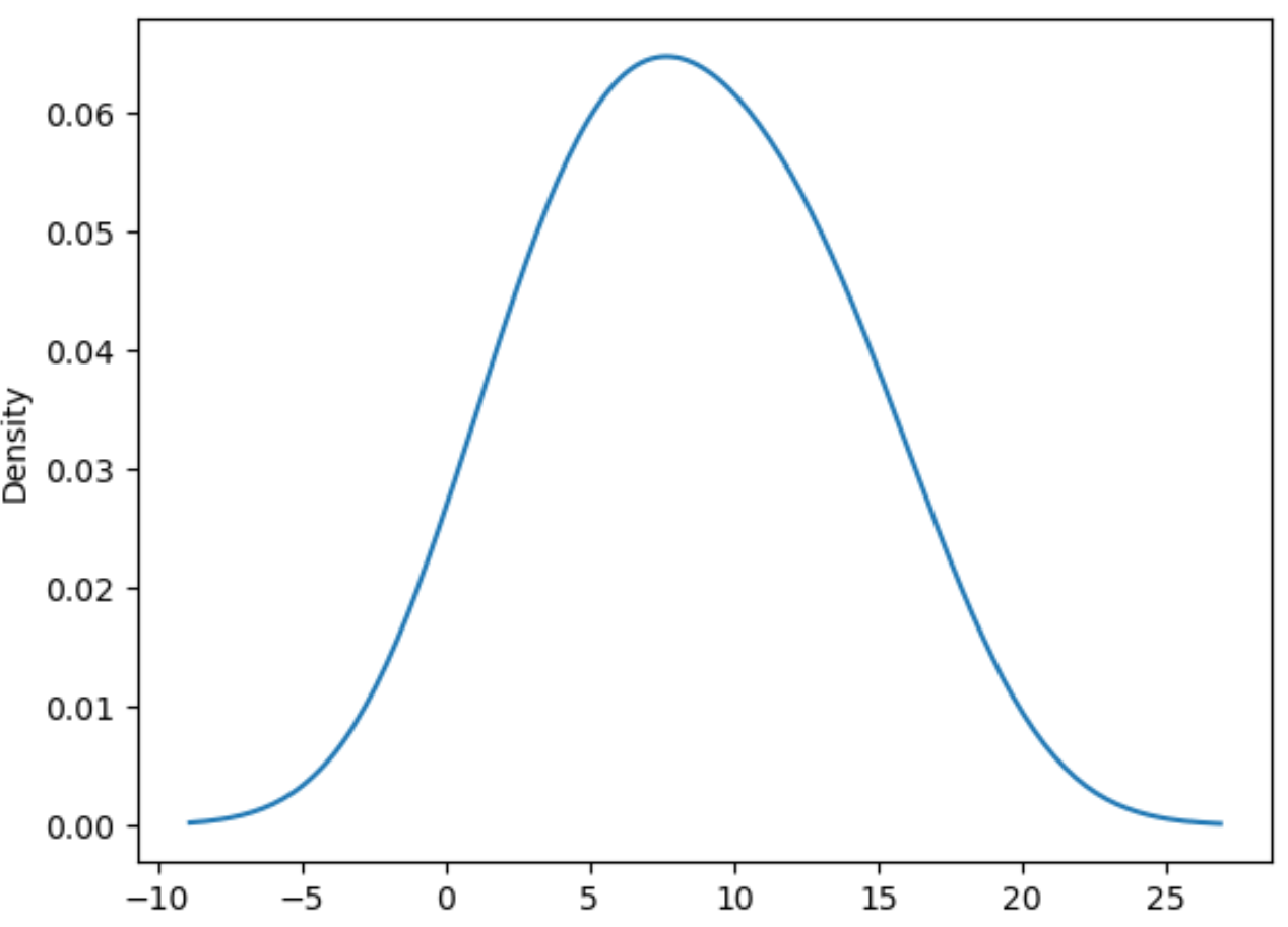
Conversely, higher values for bw_method lead to a smoother plot:
import seaborn as sns

#define data
data = [2, 2, 3, 5, 6, 6, 7, 8, 9, 10, 12, 12, 13, 15, 16]

#create density plot of data with high bw_method value
sns.kdeplot(data, bw_method = .8)
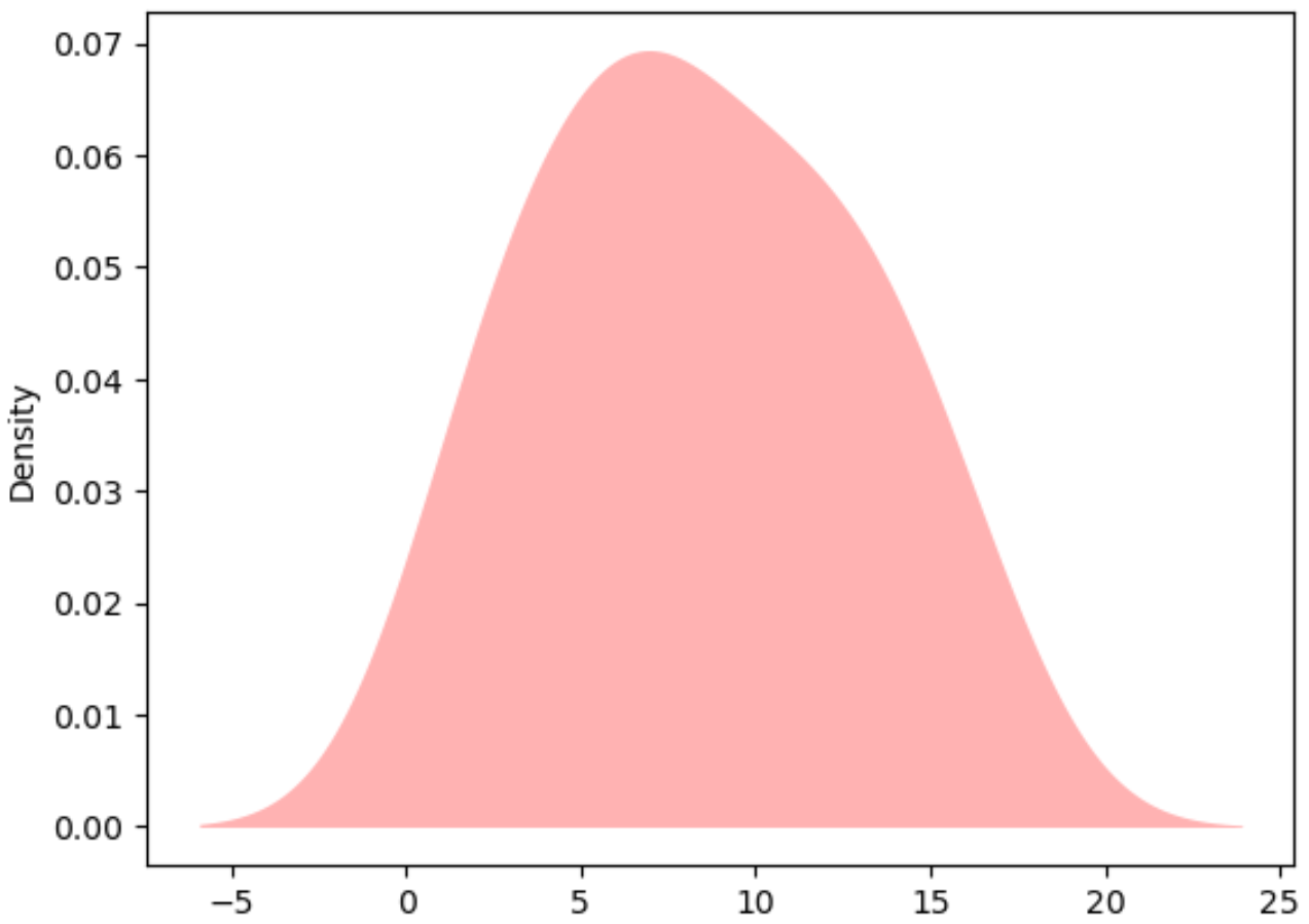
Example 3: Customize Density Plot
You can also customize the color and style of the density plot:
import seaborn as sns

#define data
data = [2, 2, 3, 5, 6, 6, 7, 8, 9, 10, 12, 12, 13, 15, 16]

#create density plot of data with high bw_method value
sns.kdeplot(data, color='red', fill=True, alpha=.3, linewidth=0)
Additional Resources
An Introduction to Density Curves
How to Plot Multiple Lines in Matplotlib
How to Plot Histogram from List of Data in Python