A log-log plot is a scatterplot that uses logarithmic scales on both the x-axis and the y-axis.
This type of plot is useful for visualizing two variables when the true relationship between them follows a power law. This phenomenon occurs in many fields in real life including astronomy, biology, chemistry, and physics.
This tutorial shows how to create a log-log plot for two variables in Excel.
Example: Log-Log Plot in Excel
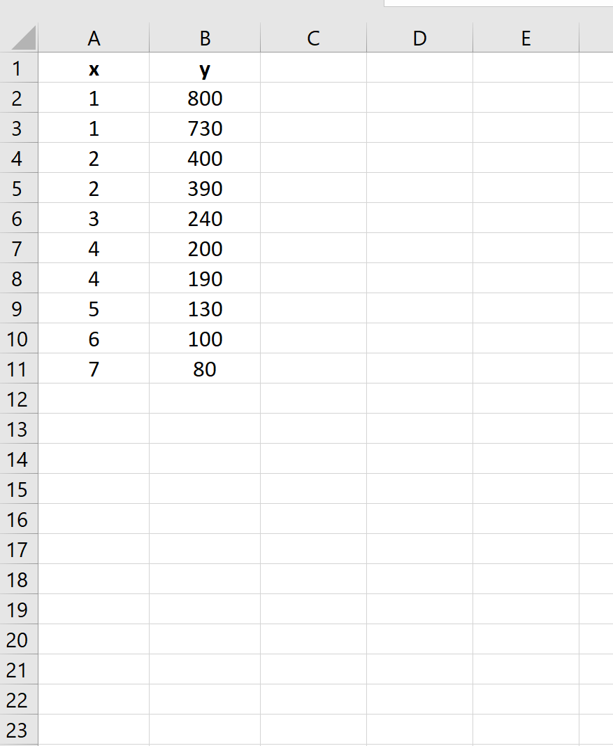
Suppose we have the following dataset in Excel that shows the values for two variables, x and y:
Use the following steps to create a log-log plot for this dataset:
Step 1: Create a scatterplot.
Highlight the data in the range A2:B11.
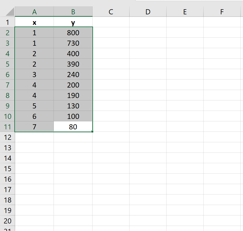
Along the top ribbon, click the Insert tab. Within the Charts group, click on Scatter.

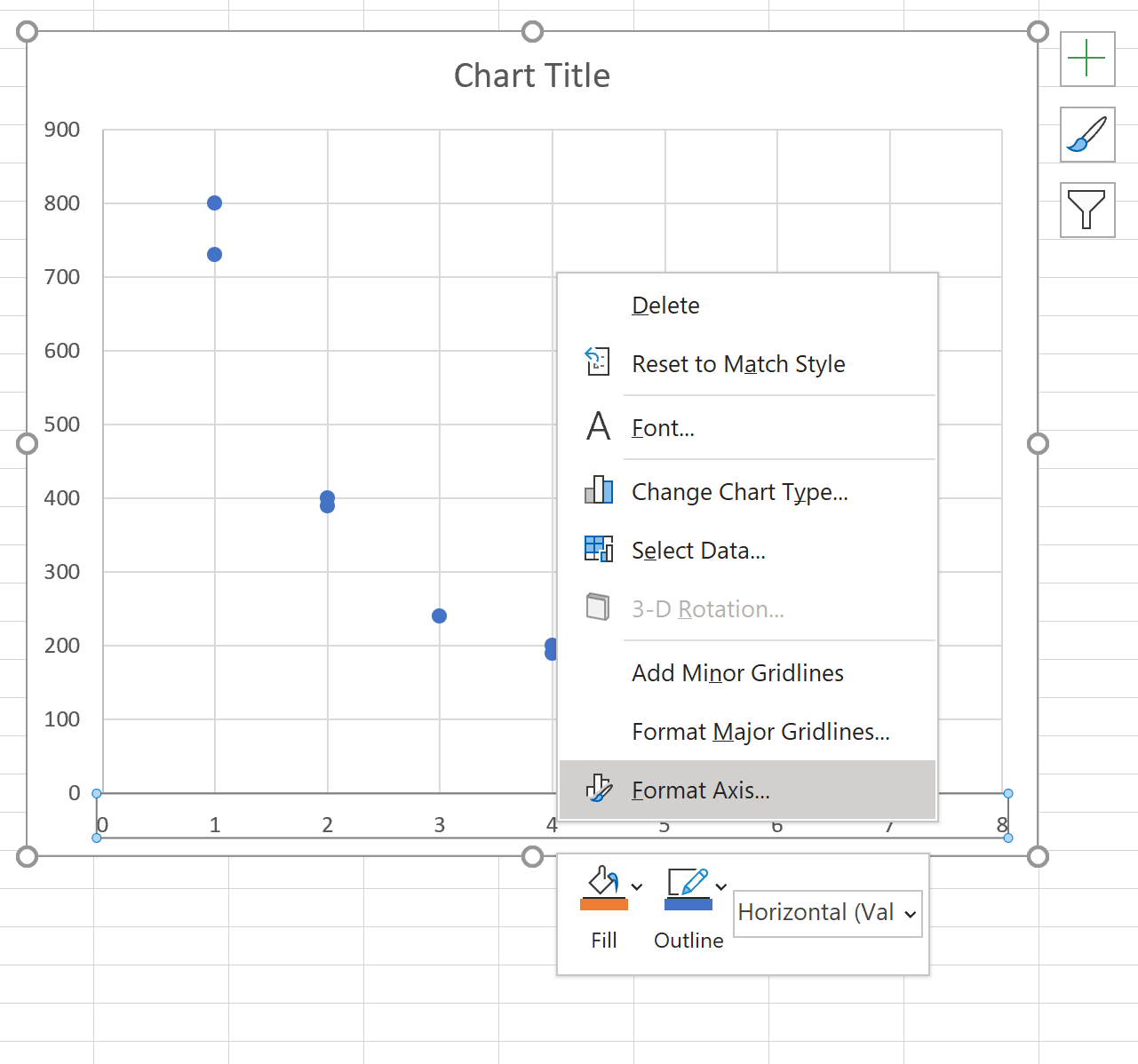
The following scatterplot will automatically appear:

Step 2: Change the x-axis scale to logarithmic.
Right click on the values along the x-axis and click Format Axis.
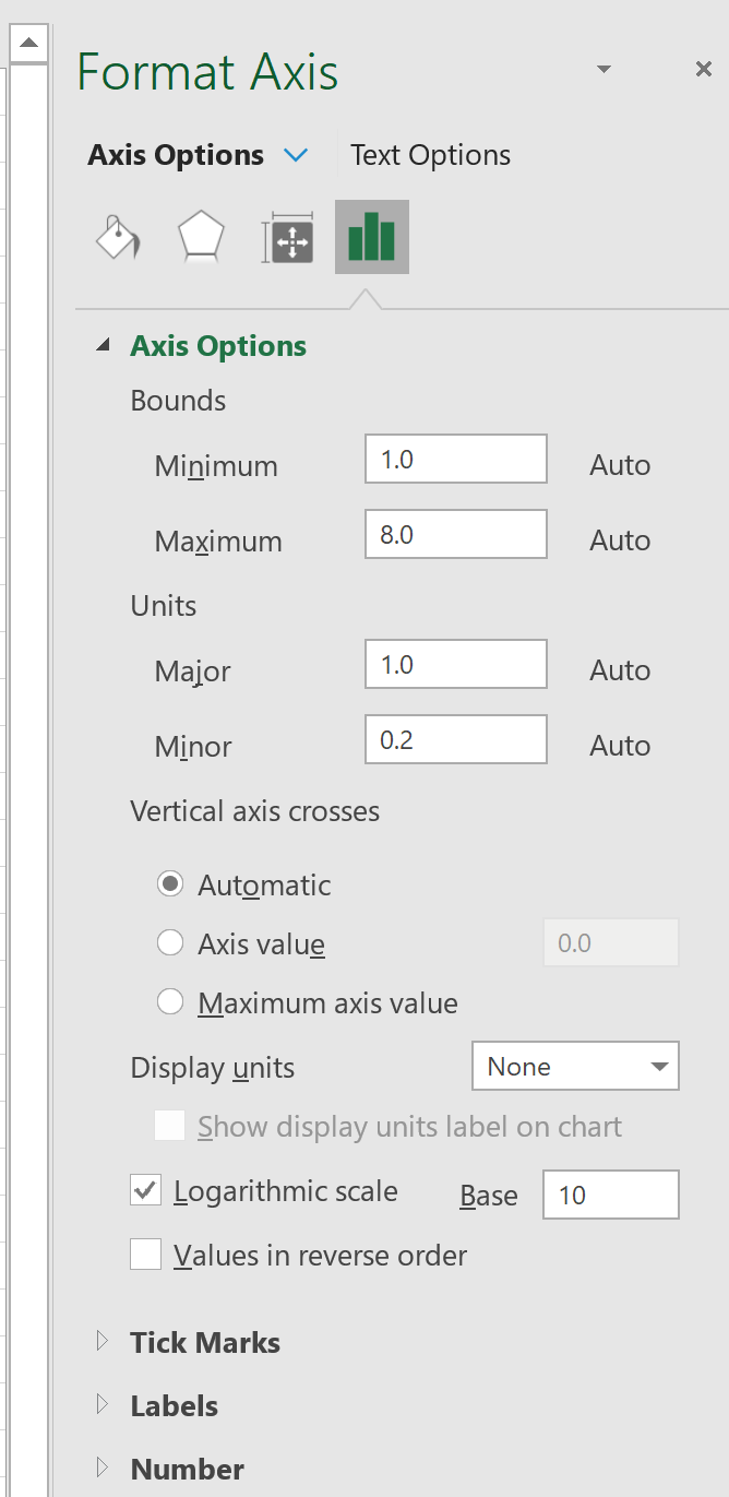
In the new window that pops up, check the box next to Logarithmic scale to change the x-axis scale.
Step 3: Change the y-axis scale to logarithmic.
Next, click on the y-axis and repeat the same step to change the y-axis scale to logarithmic. The resulting plot will look like this:
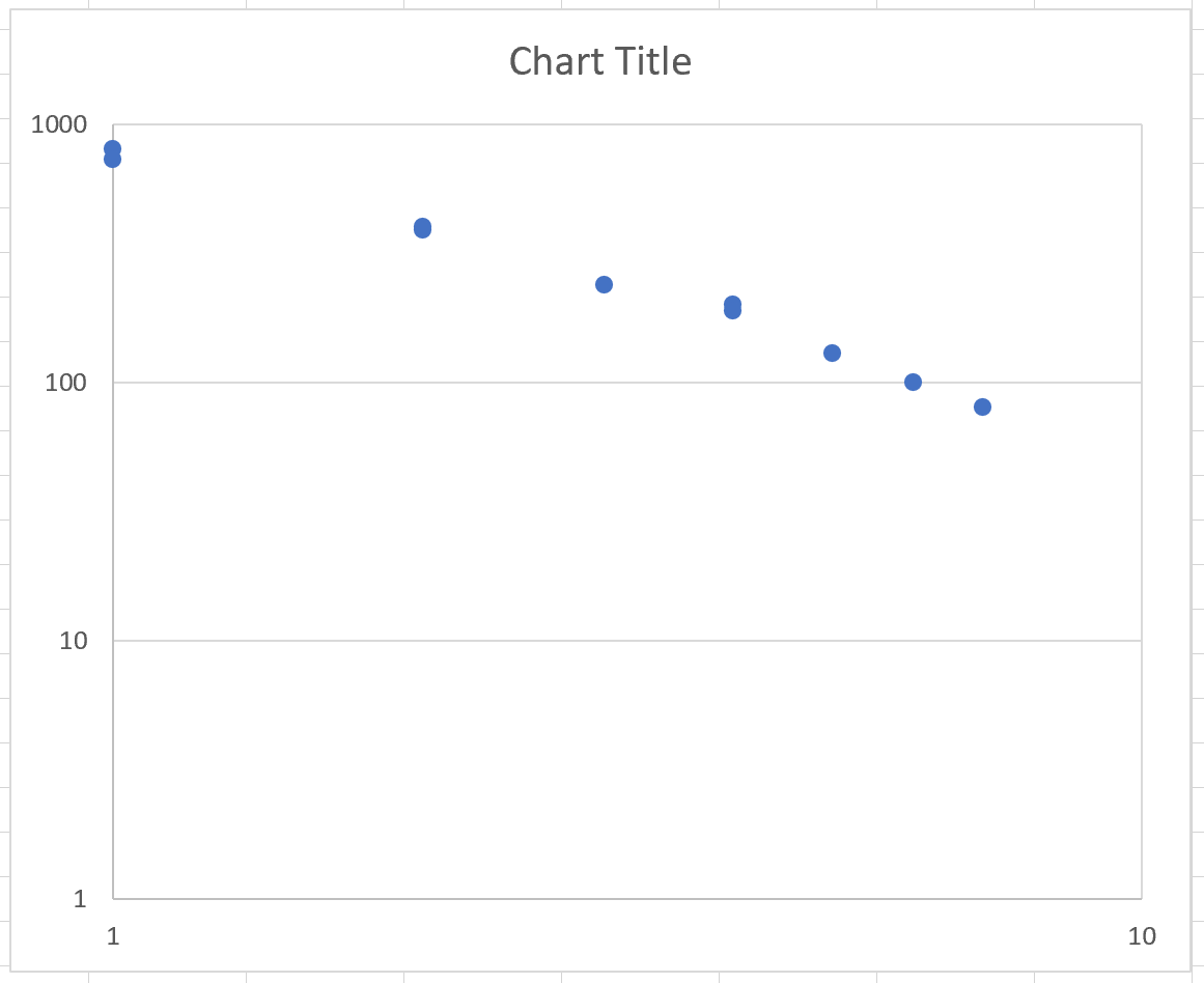
Notice that the x-axis now spans from 1 to 10 while the y-axis spans from 1 to 1,000. Also notice how the relationship between the variables x and y now appears more linear. This is an indication that the two variables do indeed have a power law relationship.
You can find more Excel tutorials here.