This tutorial explains when and how to use the jitter function in R for scatterplots.
When to Use Jitter
Scatterplots are excellent for visualizing the relationship between two continuous variables. For example, the following scatterplot helps us visualize the relationship between height and weight for 100 athletes:
#define vectors of heights and weights
weights #create data frame of heights and weights
data #view first six rows of data frame
head(data)

#   weights  heights
#1 170.8859 57.20745
#2 183.2481 62.01162
#3 235.6884 77.93126
#4 231.9864 77.12520
#5 200.8562 67.93486
#6 169.6987 57.54977
#create scatterplot of heights vs weights
plot(data$weights, data$heights, pch = 16, col = 'steelblue')
However, on some occasions we may want to visualize the relationship between one continuous variable and another variable that is almost continuous.
For example, suppose we have the following dataset that shows the number of games a basketball player has started out of the first 10 games in a season as well as their average points per game:
#create data frame
games_started #view first six rows of data frame
head(data)

#  games_started points_per_game
#1             9       25.831554
#2             9       26.673983
#3            10       29.850948
#4             4       12.024353
#5             4       11.534192
#6             1        4.383127
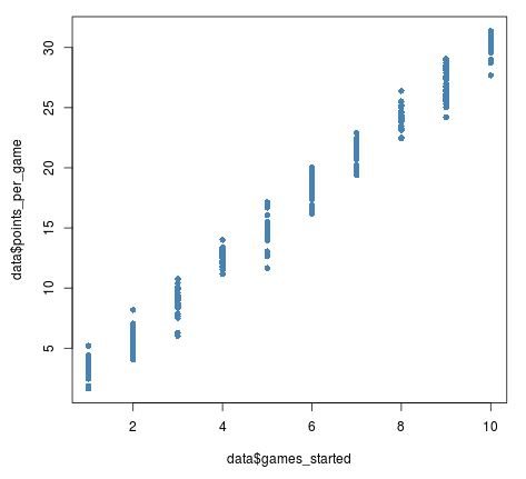
Points per game is a continuous variable, but games started is a discrete variable. If we attempt to create a scatterplot of these two variables, here is what it would look like:
#create scatterplot of games started vs average points per game
plot(data$games_started, data$points_per_game, pch = 16, col = 'steelblue')
From this scatterplot, we can tell that games started and average points per game has a positive relationship, but it’s a bit hard to see the individual points in the plot because so many of them overlap with each other.
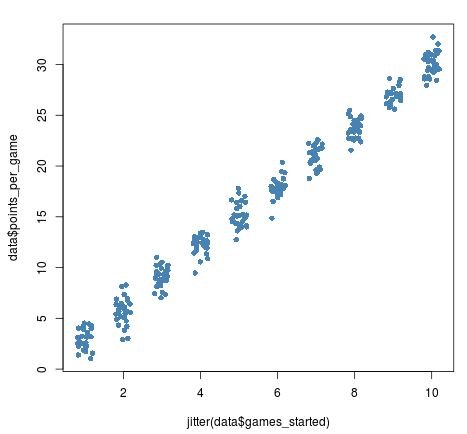
By using the jitter function, we can add a bit of “noise” to the x-axis variable games started so that we can see the individual points on the plot more clearly:
#add jitter to games started
plot(jitter(data$games_started), data$points_per_game, pch = 16, col = 'steelblue')
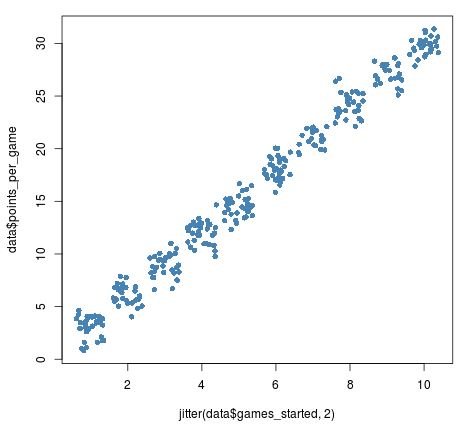
We can optionally add a numeric argument to jitter to add even more noise to the data:
#add jitter to games started
plot(jitter(data$games_started, 2), data$points_per_game, pch = 16, col = 'steelblue')
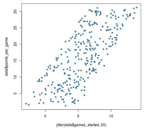
We should be careful not to add too much jitter, though, as this can distort the original data too much:
plot(jitter(data$games_started, 20), data$points_per_game, pch = 16, col = 'steelblue')
Jittering Provides a Better View of the Data
Jittering is particularly useful when one of the levels of the discrete variable has far more values than the other levels.
For example, in the following dataset there are three hundred basketball players who started 2 out of the first 5 games in the season, but just one hundred players who started 1, 3, 4, or 5 games:
games_started
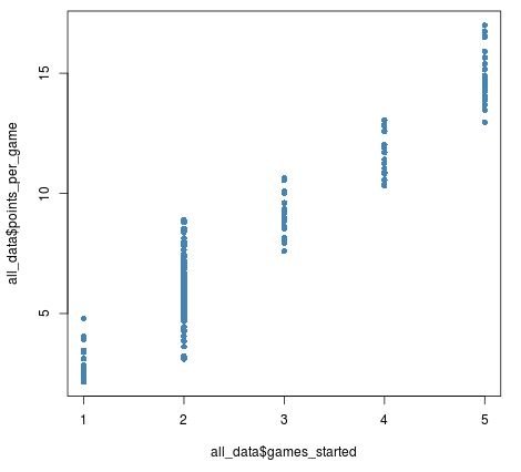
When we visualize the number of games played vs average points per game, we can tell that there are more players who have played 2 games, but it’s hard to tell exactly how many more have played 2 games:
plot(all_data$games_started, all_data$points_per_game, pch = 16, col = 'steelblue')
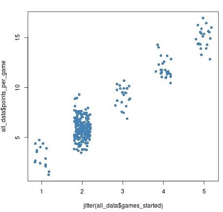
Once we add jitter to the games started variable, though, we can see just how many more players there are who have started 2 games:
plot(jitter(all_data$games_started), all_data$points_per_game,
     pch = 16, col = 'steelblue')
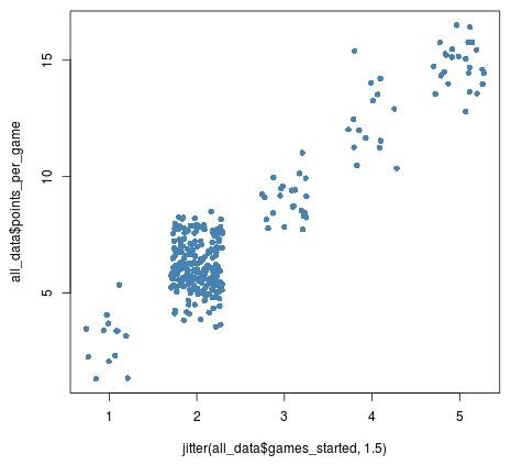
Increasing the amount of jitter by a little bit reveals this difference even more:
plot(jitter(all_data$games_started, 1.5), all_data$points_per_game,
     pch = 16, col = 'steelblue')

Jittering for Visualizations Only
As mentioned before, jittering adds some random noise to data, which can be beneficial when we want to visualize data in a scatterplot. By using the jitter function, we can get a better picture of the true underlying relationship between two variables in a dataset.
However, when using a statistical analysis like regression, it doesn’t make sense to add random noise to variables in a dataset since this would impact the results of an analysis.
Thus, jitter is only meant to be used for data visualization, not for data analysis.


