Suppose we have the following dataset in Python that displays the number of sales a certain shop makes during each weekday for five weeks:
import numpy as np
import pandas as pd
import seaborn as sns

#create a dataset
np.random.seed(0)
data = {'day': np.tile(['Mon', 'Tue', 'Wed', 'Thur', 'Fri'], 5),
        'week': np.repeat([1, 2, 3, 4, 5], 5),
        'sales': np.random.randint(0, 50, size=25)
        }

df = pd.DataFrame(data,columns=['day','week','sales'])
df = df.pivot('day', 'week', 'sales')

view first ten rows of dataset
df[:10]

week	 1	 2	 3	 4	 5
day
Fri	 3	36	12	46	13
Mon	44	39	23	 1	24
Thur	 3	21	24	23	25
Tue	47	 9	 6	38	17
Wed	 0	19	24	39	37
Create Basic Heatmap
We can create a basic heatmap using the sns.heatmap() function:
sns.heatmap(df)
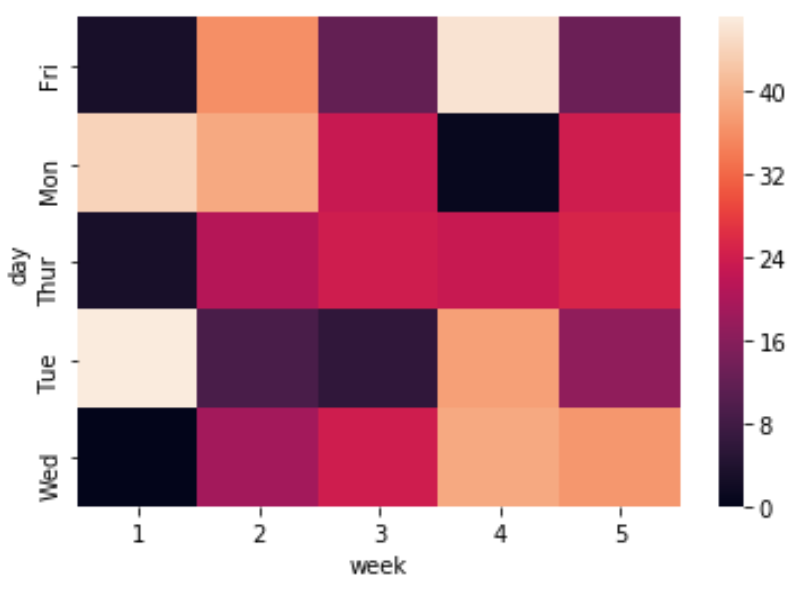
The colorbar on the righthand side displays a legend for what values the various colors represent.
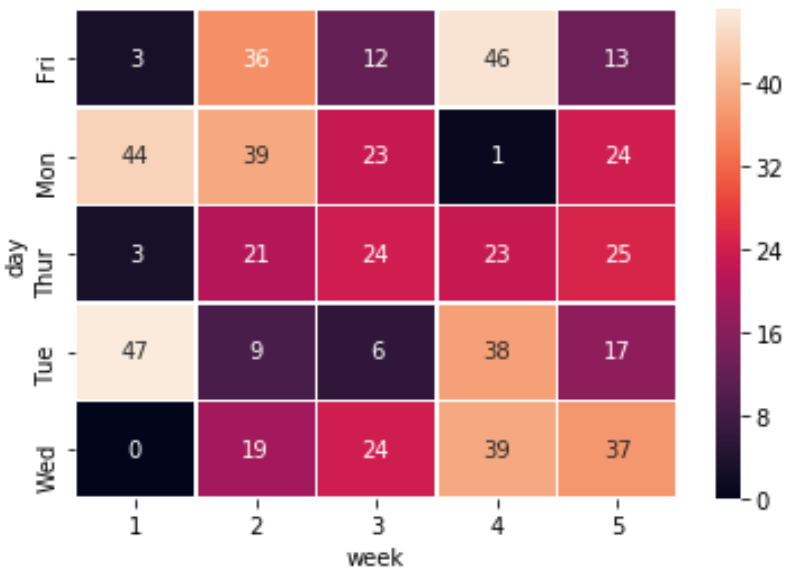
Add Lines to Heatmap
You can add lines between the squares in the heatmap using the linewidths argument:
sns.heatmap(df, linewidths=.5)

Add Annotations to Heatmap
You can also add annotations to the heatmap using the annot=True argument:
sns.heatmap(df, linewidths=.5, annot=True)
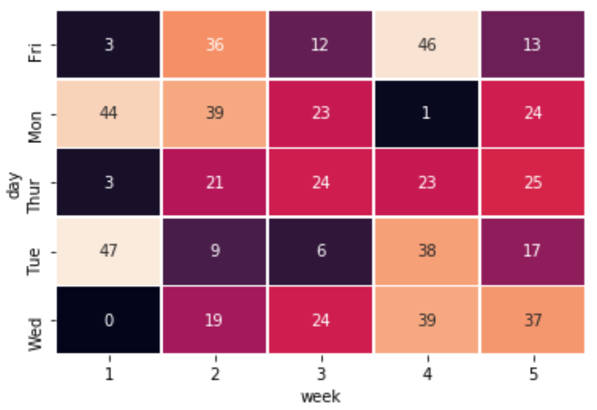
Hide Colorbar from Heatmap
You can also hide the colorbar entirely using the cbar=False option:
sns.heatmap(df, linewidths=.5, annot=True, cbar=False)
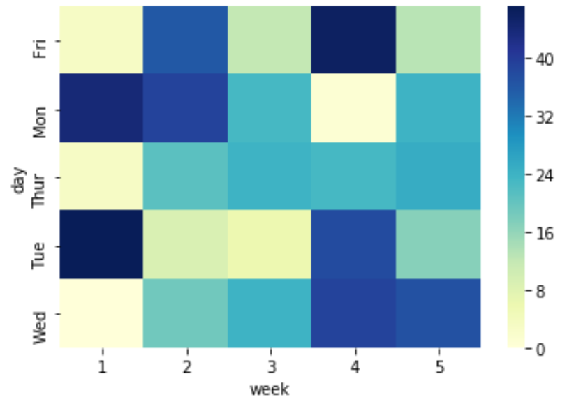
Change Color Theme of Heatmap
You can also change the color theme using the cmap argument. For example, you could set the colors to range from yellow to green to blue:
sns.heatmap(df, cmap='YlGnBu')
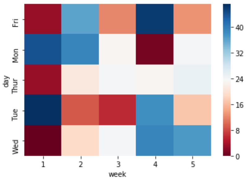
Or you could have the colors range from red to blue:
sns.heatmap(df, cmap='RdBu')
For a complete list of colormaps, refer to the matplotlib documentation.