Boxplots are useful for visualizing the five-number summary of a dataset, which includes:
- The minimum
- The first quartile
- The median
- The third quartile
- The maximum
Related: A Gentle Introduction to Boxplots
Fortunately it’s easy to create boxplots in R using the visualization library ggplot2.
It’s also to create boxplots grouped by a particular variable in a dataset. For example, suppose we have the following dataset that displays the increase in efficiency for 150 basketball players on three different teams based on two different training programs:
#define variables
team=rep(c('A', 'B', 'C'), each=50)
program=rep(c('low', 'high'), each=25)
increase=seq(1:150)+sample(1:100, 100, replace=TRUE)

#create dataset using variables
data=data.frame(team, program, increase)

#view first six rows of dataset
head(data)

  team program increase
1    A     low       62
2    A     low       37
3    A     low       49
4    A     low       60
5    A     low       64
6    A     low      105
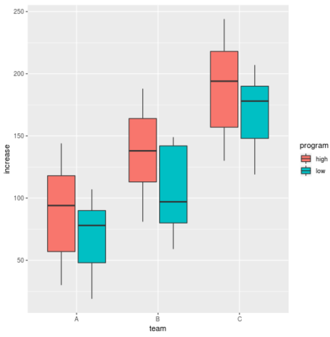
We can use the following code to create boxplots that display the increase in efficiency for players, grouped by team and filled in based on the training program:
library(ggplot2)

ggplot(data, aes(x=team, y=increase, fill=program)) +
  geom_boxplot()
We can use similar syntax to create boxplots that display the increase in efficiency for players, grouped by training program and filled in based on the team:
library(ggplot2)

ggplot(data, aes(x=program, y=increase, fill=team)) +
  geom_boxplot()

A similar alternative is to use faceting, in which each subgroup is shown in its own panel:
library(ggplot2)

ggplot(data, aes(x=team, y=increase, fill=program)) +
  geom_boxplot() +
  facet_wrap(~program)
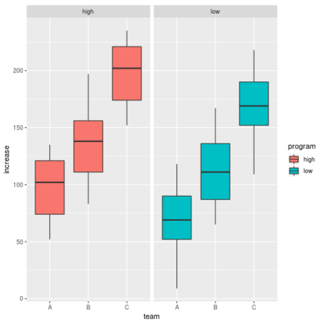
Depending on the data you’re working with, faceting may or may not make sense for your visualization needs.
Additional Resources
How to Remove Outliers in Boxplots in R
How to Create Side-by-Side Plots in ggplot2
A Complete Guide to the Best ggplot2 Themes