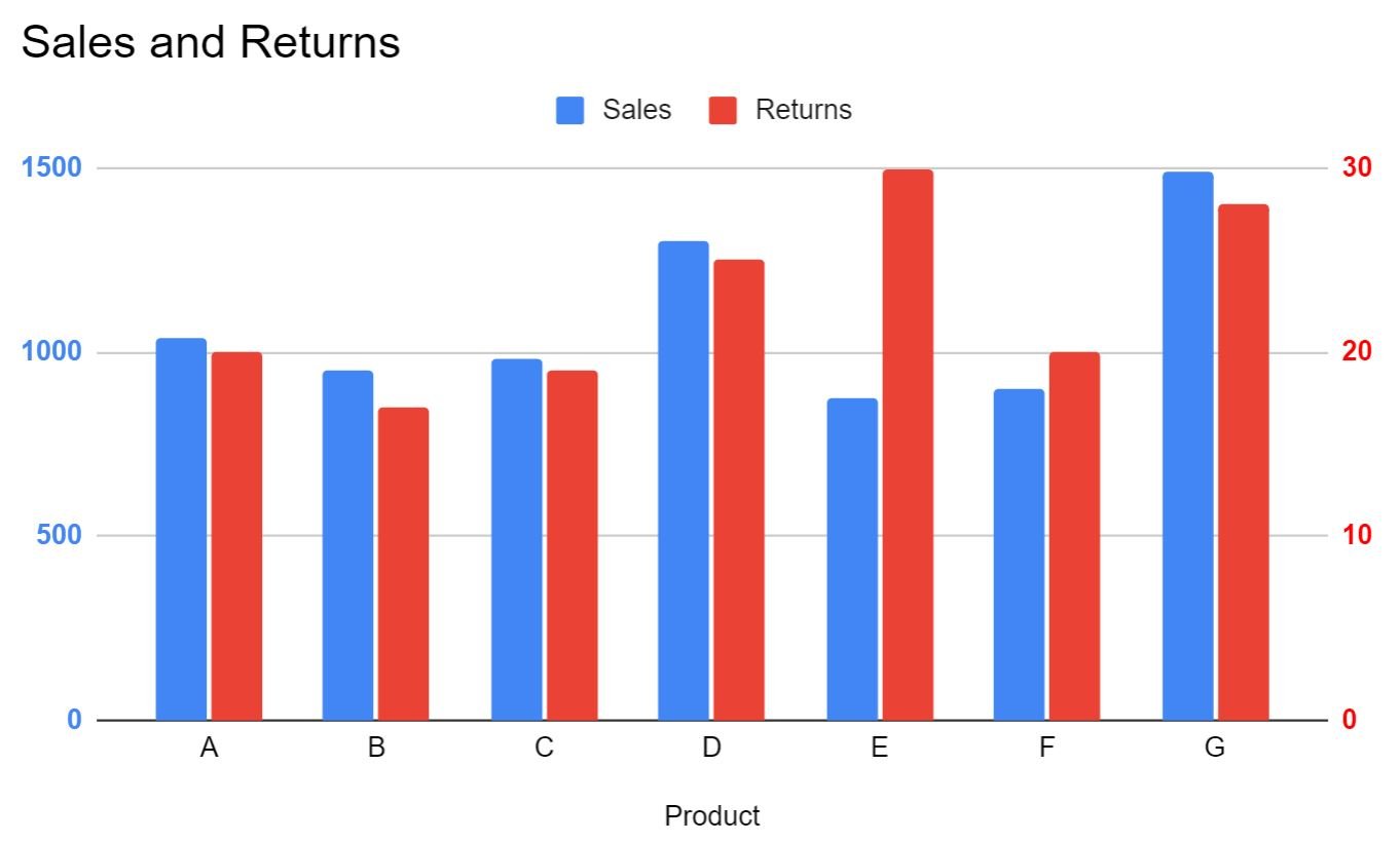
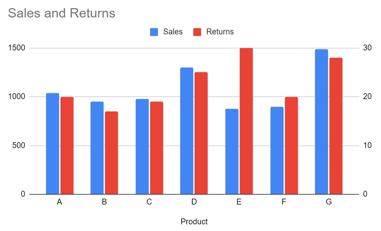
This tutorial provides a step-by-step example of how to create the following chart in Google Sheets with a secondary y-axis:
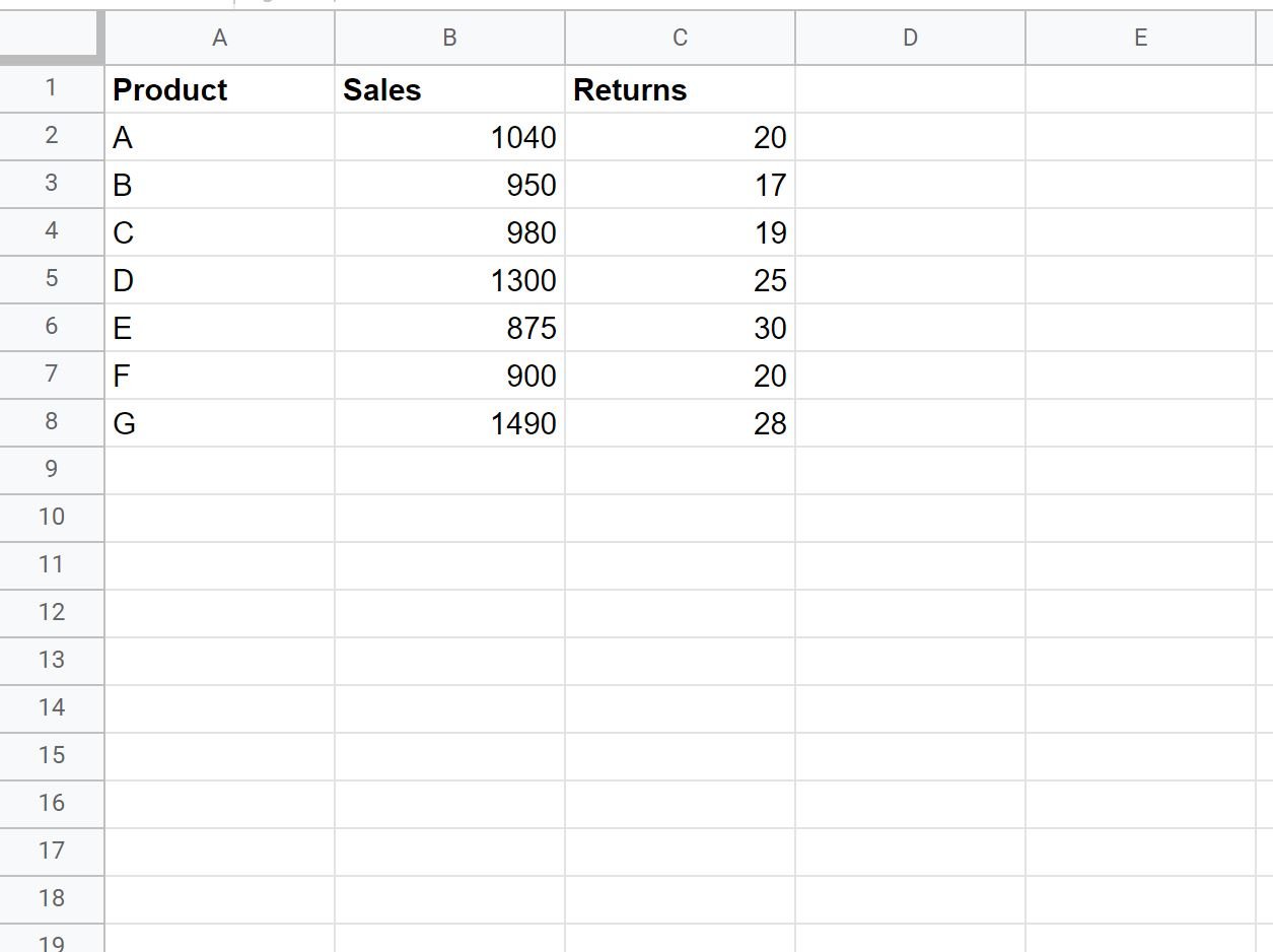
Step 1: Create the Data
First, let’s enter the following data that shows the total sales and total returns for various products:
Step 2: Create the Chart
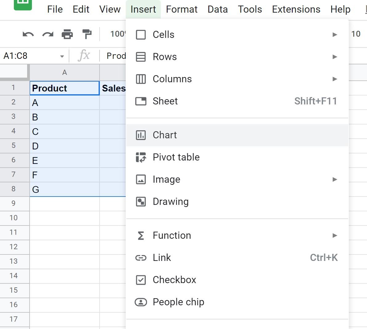
Next, highlight the cells in the range A1:C8, then click the Insert tab, then click Chart:
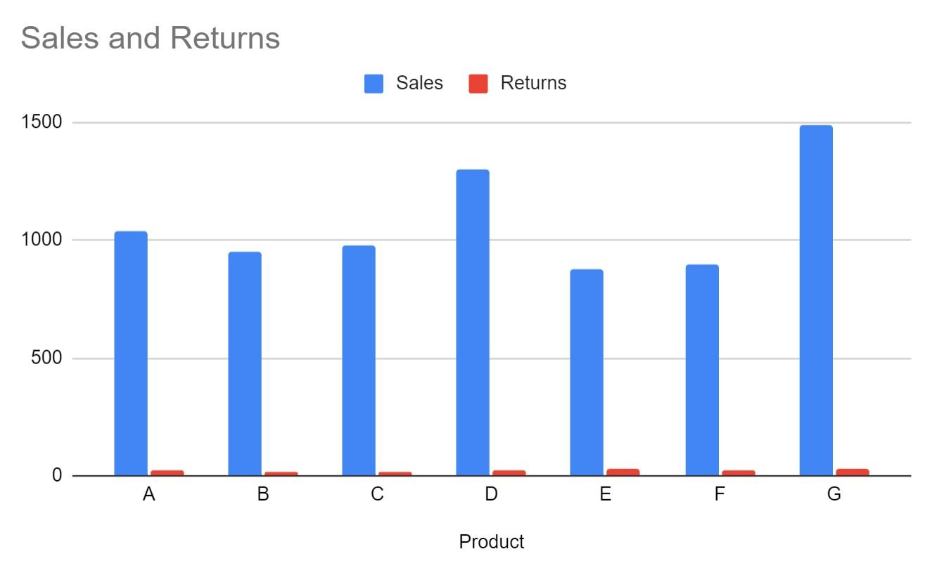
Google Sheets will automatically insert the following bar chart:
Step 3: Add the Second Y-Axis
Use the following steps to add a second y-axis on the right side of the chart:
- Click the Chart editor panel on the right side of the screen.
- Then click the Customize tab.
- Then click the Series dropdown menu.
- Then choose “Returns” as the series.
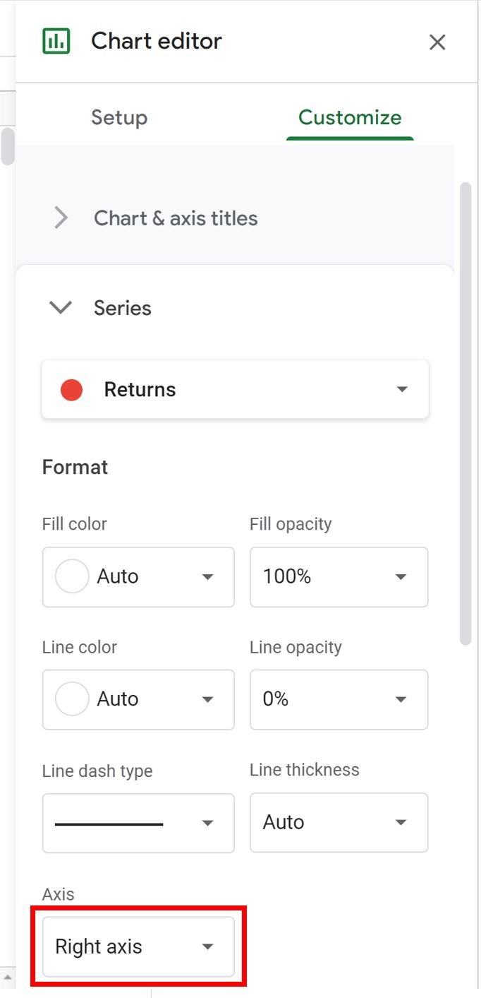
- Then click the dropdown arrow under Axis and choose Right axis:
The following axis will automatically appear on the right side of the chart:
The axis on the right shows the values for the Returns while the axis on the left shows the values for the Sales.
To make it more obvious which axis represents which data series, double click on the right axis.
In the Chart editor panel, click the “B” under the Label format to make the axis values bold, then choose red as the Text color:
Repeat the process for the left axis, but choose blue as the Text color.
The axis colors will automatically be updated on the chart:
It’s now obvious that the axis on the left represents the values for the Sales while the axis on the right represents the values for the Returns.
Additional Resources
The following tutorials explain how to create other common visualizations in Google Sheets:
How to Make a Box Plot in Google Sheets
How to Create a Pareto Chart in Google Sheets
How to Create an Area Chart in Google Sheets
How to Create a Bubble Chart in Google Sheets


