A scatterplot is a useful way to visualize the relationship between two numerical variables.
Fortunately it’s easy to create scatterplots in Google Sheets. However, the points in the plot do not automatically come with labels.
The following step-by-step example shows how to add labels to scatterplot points in Google Sheets.
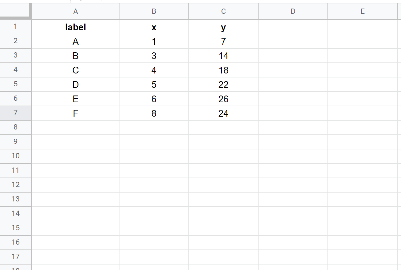
Step 1: Enter the Data
First, let’s enter some values for a dataset:
Step 2: Create the Scatterplot
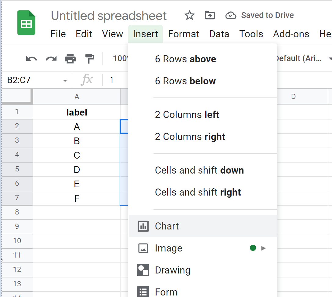
To create a scatterplot, highlight the values in the range B2:C7. Then click the Insert tab and then click Chart:
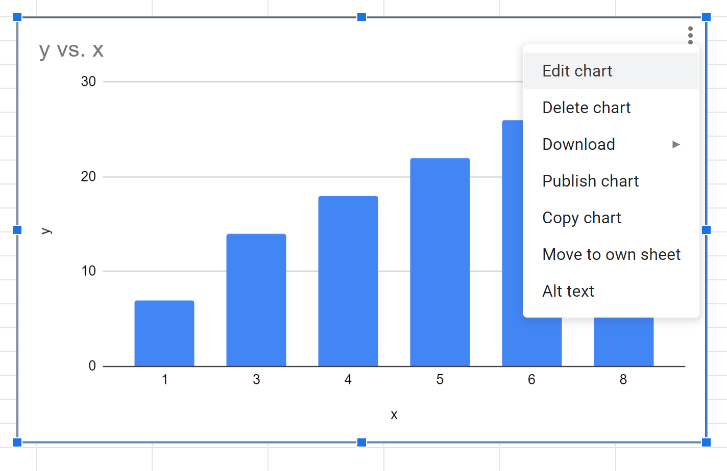
By default, Google Sheets will insert a column chart.
To change this to a scatterplot, click anywhere on the chart. Then click the three vertical dots in the top right corner of the chart and click Edit chart.
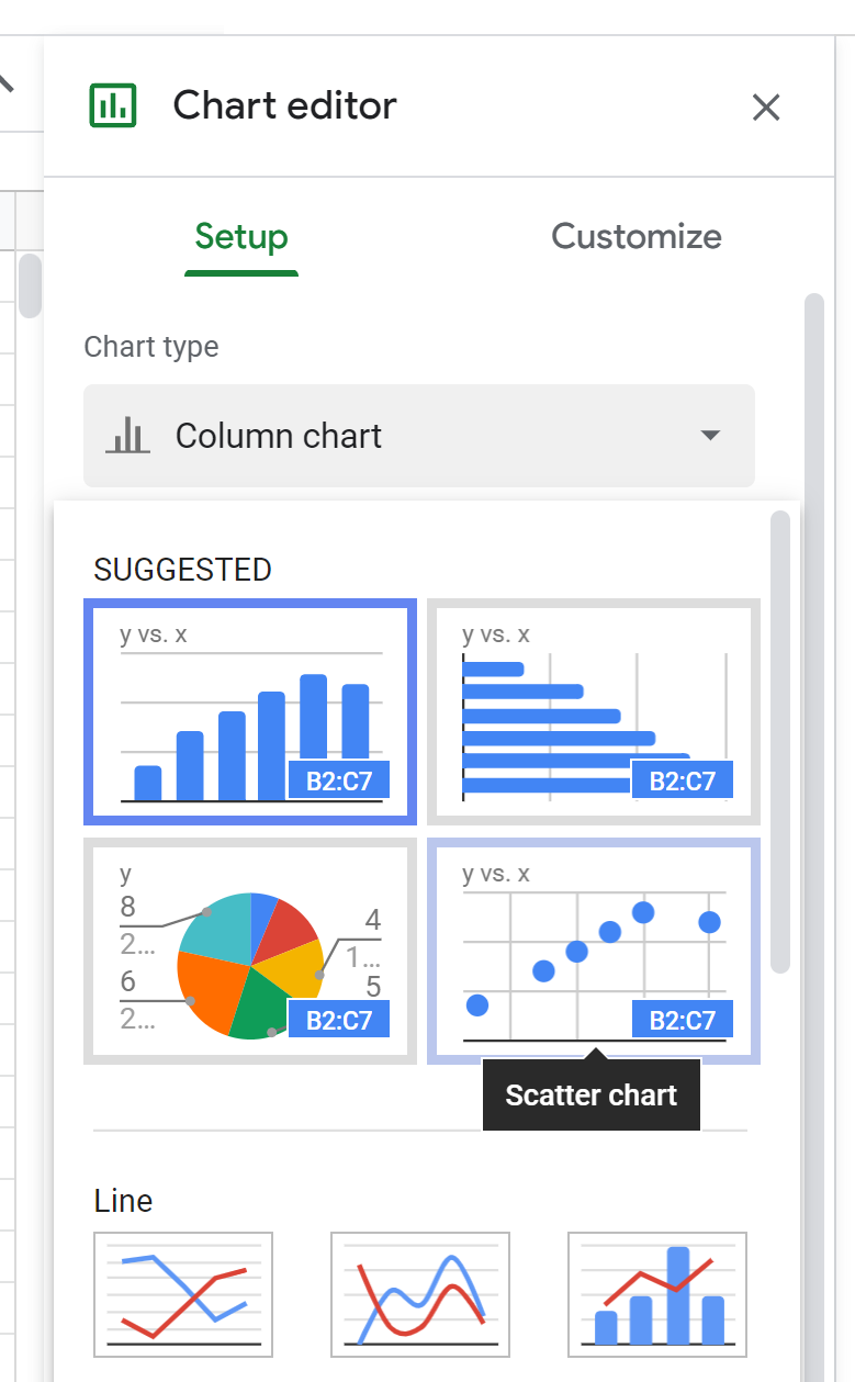
In the Chart editor window that appears on the right side of the screen, click Chart type and then select the option that says Scatter chart:
The following scatterplot will be inserted:
Step 3: Add Labels to Scatterplot Points
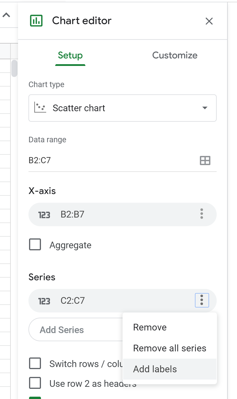
To add labels to the points in the scatterplot, click the three vertical dots next to Series and then click Add labels:
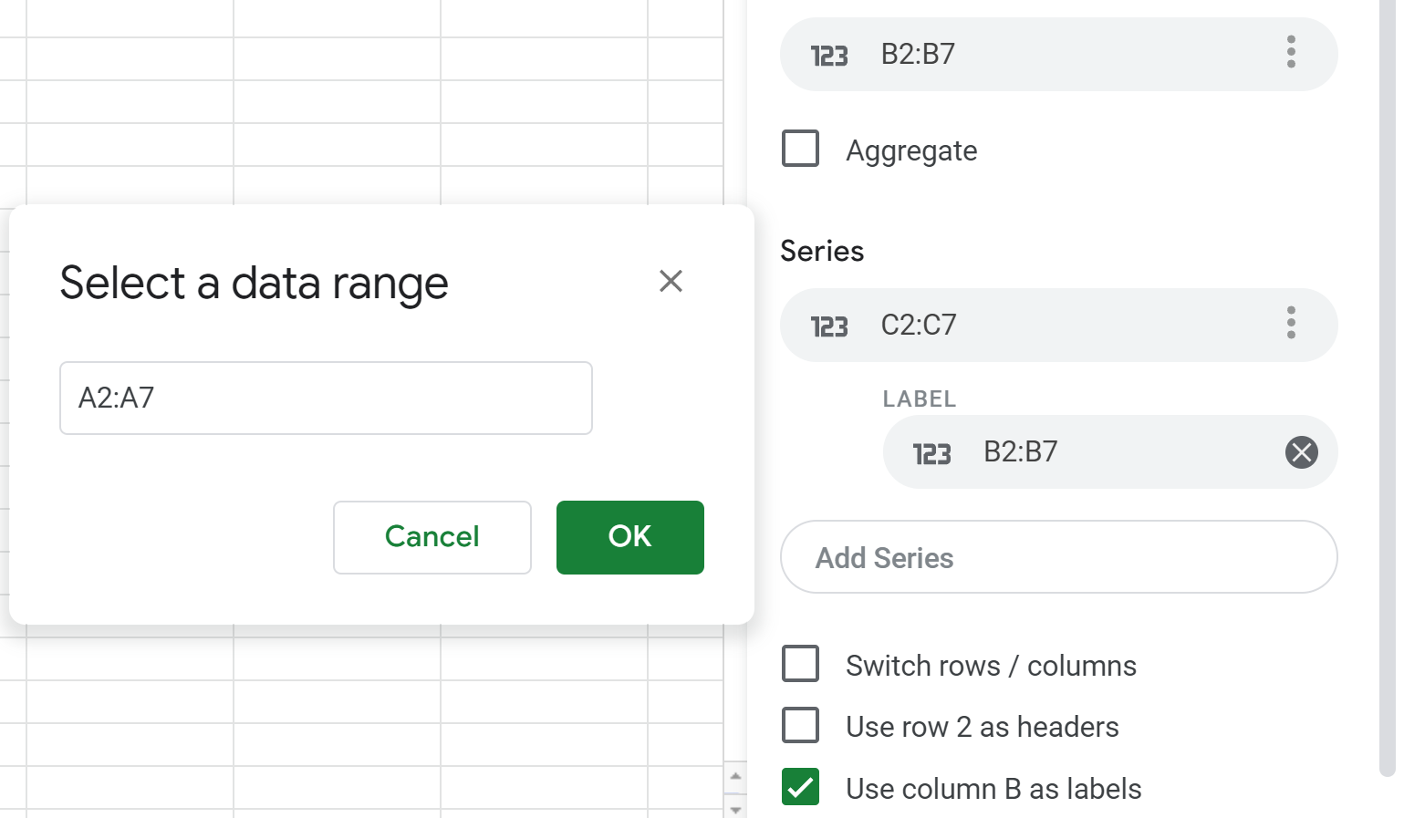
Click the label box and type in A2:A7 as the data range. Then click OK:
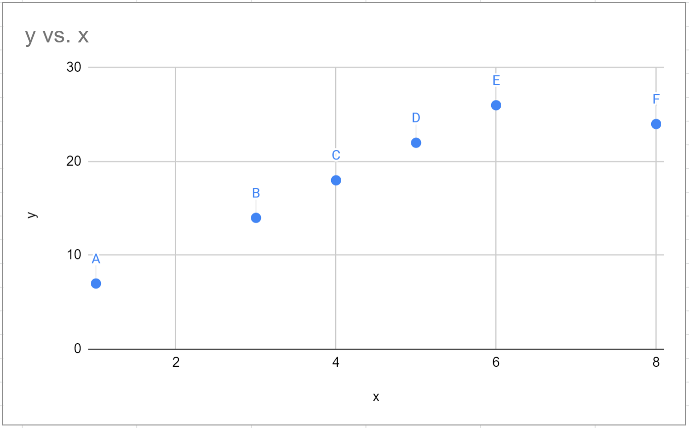
The following labels will be added to the points in the scatterplot:
You can then double click on any of the labels and modify the font color, font family, font size, etc.
Additional Resources
The following tutorials explain how to create other common charts in Google Sheets:
How to Create a Box Plot in Google Sheets
How to Create a Bubble Chart in Google Sheets
How to Create a Pie Chart in Google Sheets
How to Create a Pareto Chart in Google Sheets


