You can plot multiple lines on the same graph in Google Sheets by simply highlighting several rows (or columns) and creating a line plot.
The following examples show how to do so.
Example 1: Plot Multiple Lines with Data Arranged by Columns
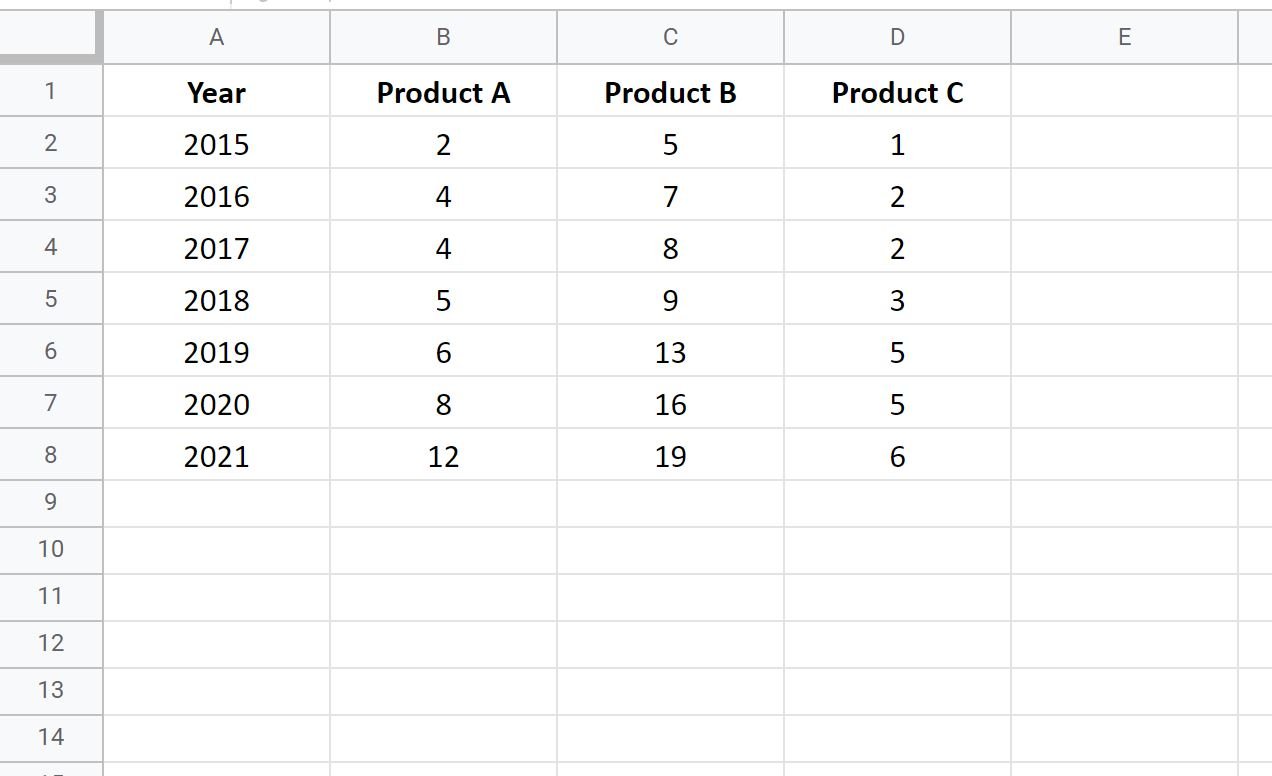
Suppose we have the following dataset that displays the total sales for three different products during different years:
To plot each of the product sales as a line on the same graph, simply highlight the cells in the range A1:D8 and then click the Insert tab along the top ribbon and then click Chart:
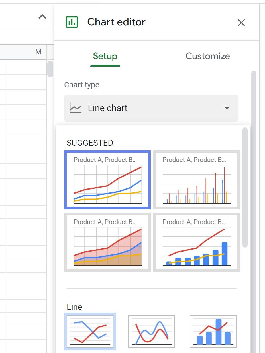
In the Chart Editor window that appears on the right side of the screen, click the dropdown arrow under Chart Type and click on Line chart.
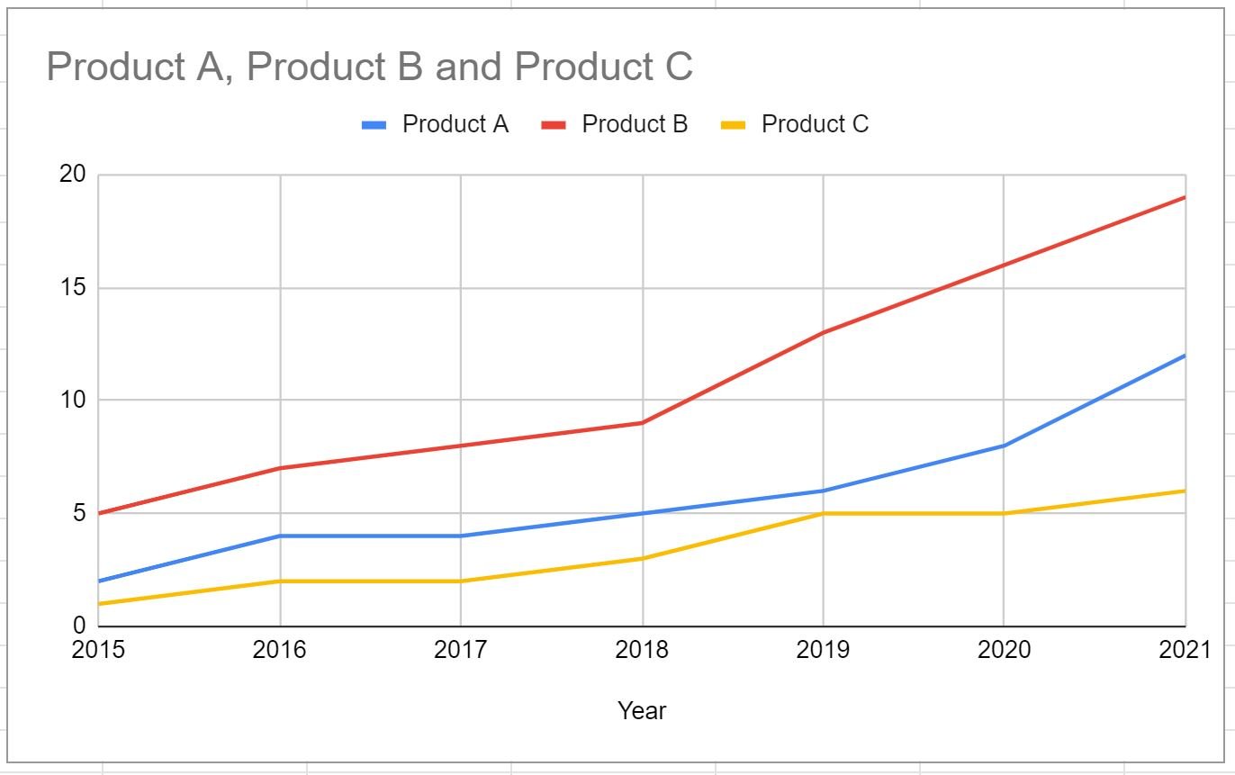
The following line chart will automatically appear:
The x-axis displays the years, the y-axis displays the total sales, and the three individual lines represent the sales for each of the three products.
Feel free to click on specific elements in the plot to change the colors of the lines, the legend location, the title, and the axis labels.
Example 2: Plot Multiple Lines with Data Arranged by Rows
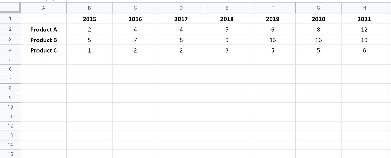
Suppose we have the following dataset that displays the total sales for three different products during different years, arranged by rows:
To plot each of the product sales as a line on the same graph, simply highlight the cells in the range A1:H4 and then click the Insert tab along the top ribbon and then click Chart.
In the Chart Editor window that appears on the right side of the screen, click the dropdown arrow under Chart Type and click on Line chart.
The following chart will appear:
Notice that this line chart matches the one we created in the previous example.
Additional Resources
How to Create a Stem-and-Leaf Plot in Excel
How to Create a Dot Plot in Excel
How to Create Side-by-Side Boxplots in Excel
How to Create an Ogive Graph in Excel


