A histogram is a plot that can be used to quickly visualize the distribution of values in a dataset.
This tutorial provides a step-by-step example of how to create a histogram in Google Sheets and how to modify the number of bins so that the histogram looks exactly how you’d like.
Step 1: Create the Data
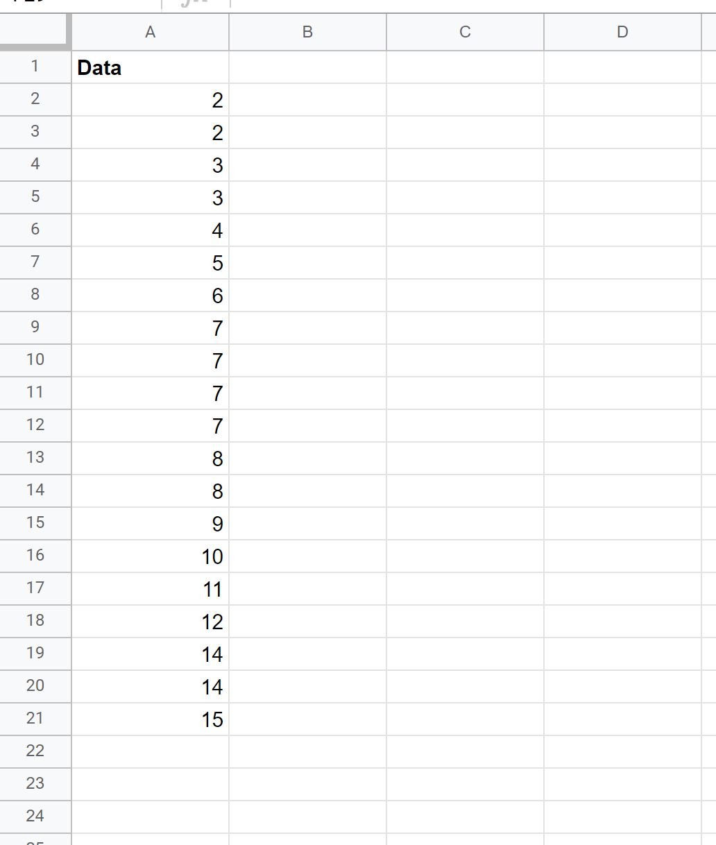
First, let’s create the following dataset:
Step 2: Create the Histogram
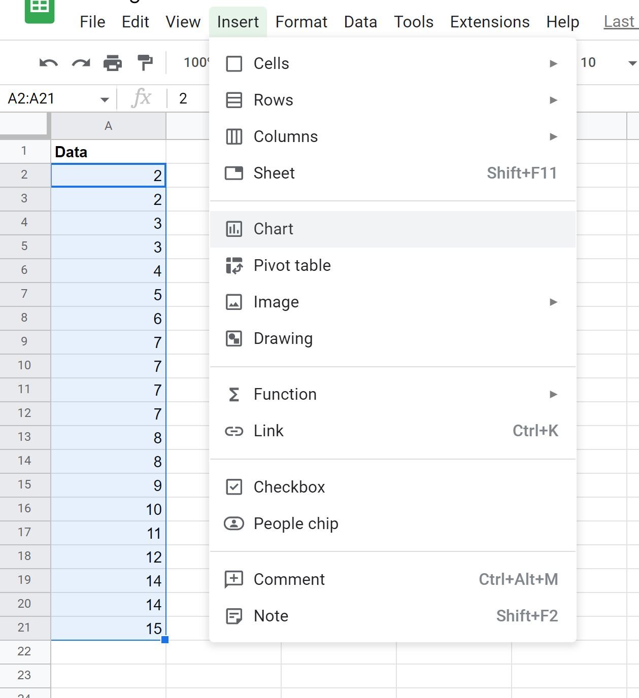
Next, highlight the cells in the range A2:A21, then click the Insert tab, then click Chart:
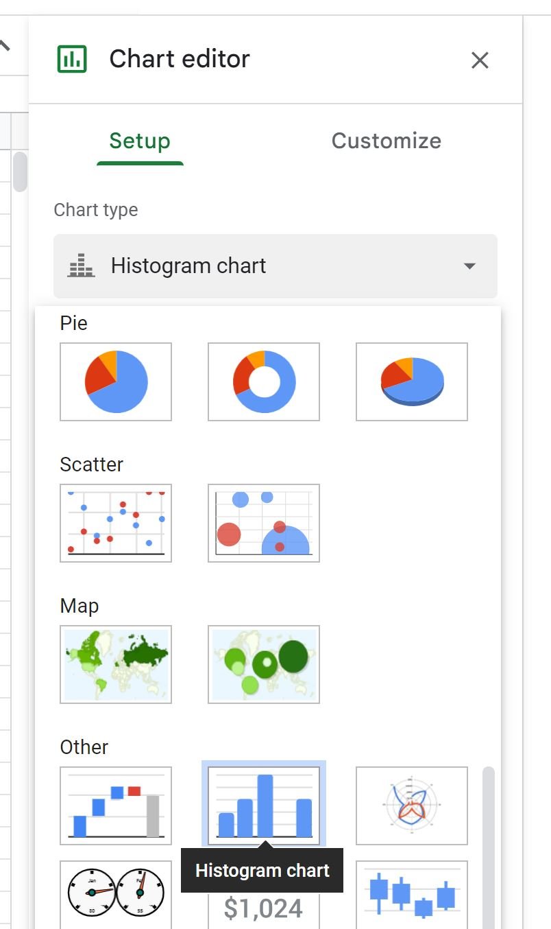
In the Chart editor panel that appears on the right side of the screen, click the dropdown arrow under Chart type and choose Histogram chart:
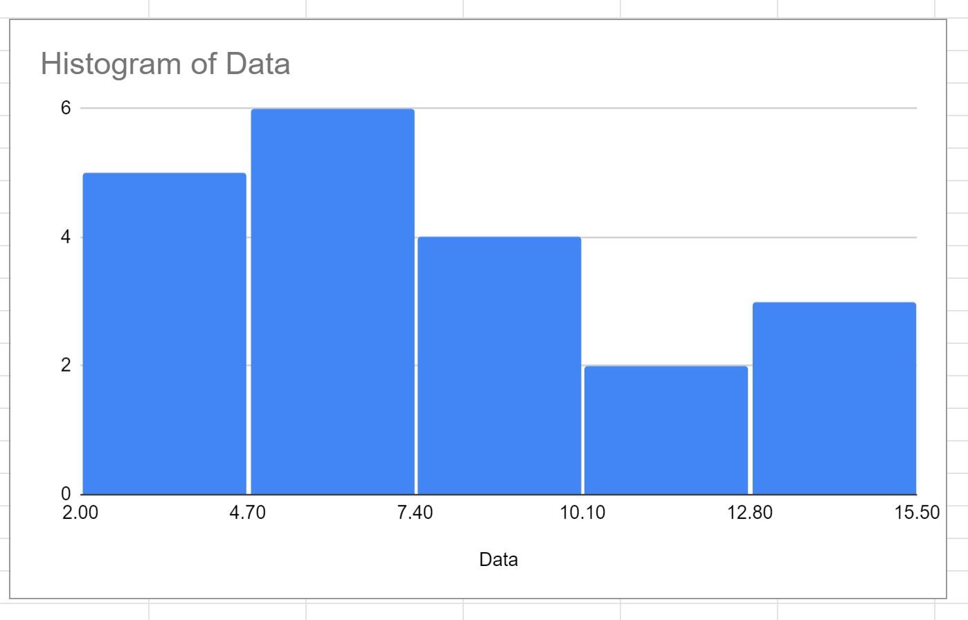
The following histogram will appear:
Step 3: Adjust the Number of Bins
To adjust the number of bins in the histogram, click the Customize tab within the Chart editor panel, then click the dropdown arrow next to Histogram.
Click the dropdown arrow under Bucket size to bring up a list of potential bucket sizes you can use:
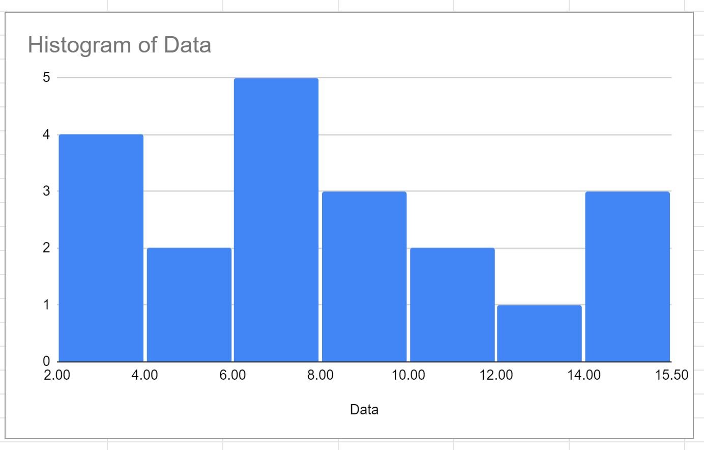
If we click 2, then this will change the bucket size to 2 in the histogram:
The first bucket tells us how many values in the original dataset are greater than or equal to 2 but less than 4.
The second bucket tells us how many values in the original dataset are greater than or equal to 4 but less than 6.
And so on.
If we instead choose a bucket size of 10, the buckets will have a width of 10:
Feel free to modify the number of bins to whatever value you’d like and keep in mind the following rules of thumb:
- Increasing the bucket size decreases the number of total bins in the histogram and leads to fatter and fewer bins.
- Decreasing the bucket size increases the number of total bins in the histogram and leads to narrower and more bins.
Additional Resources
The following tutorials explain how to perform other common tasks in Google Sheets:
How to Create a Bubble Chart in Google Sheets
How to Create a Pie Chart in Google Sheets
How to Create a Cumulative Sum Chart in Google Sheets


