Two of the most popular data visualization libraries in all of data science are ggplot2 and Matplotlib.
The ggplot2 library is used in the R statistical programming language while Matplotlib is used in Python.
Although both libraries allow you to create highly customized data visualizations, ggplot2 generally allows you to do so in fewer lines of code compared to Matplotlib.
To illustrate this point, we’ll show how to create the same types of charts using both libraries.
Line Charts: ggplot2 vs. Matplotlib
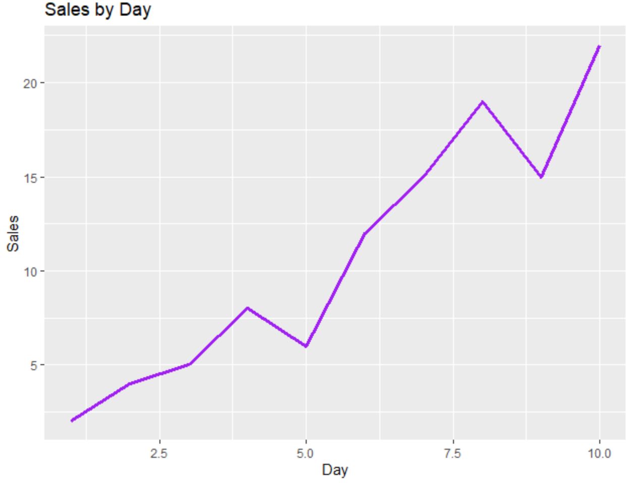
The following code shows how to create a line chart using ggplot2:
library(ggplot2)

#create data frame
df frame(day=c(1, 2, 3, 4, 5, 6, 7, 8, 9, 10),
                 sales=c(2, 4, 5, 8, 6, 12, 15, 19, 15, 22))

#create line chart
ggplot(df, aes(x=day, y=sales)) +
  geom_line(size=1.2, col='purple') +
  ggtitle('Sales by Day') +
  xlab('Day') +
  ylab('Sales')
And the following code shows how to create the same line chart using Matplotlib:
import pandas as pd
import matplotlib.pyplot as plt

#create DataFrame
df = pd.DataFrame({'day': [1, 2, 3, 4, 5, 6, 7, 8, 9, 10],
                   'sales': [2, 4, 5, 8, 6, 12, 15, 19, 15, 22]})

#create line chart
plt.plot(df.day, df.sales, color='purple')
plt.title('Sales by Day', loc='left')
plt.ylabel('Sales')
plt.xlabel('Day')
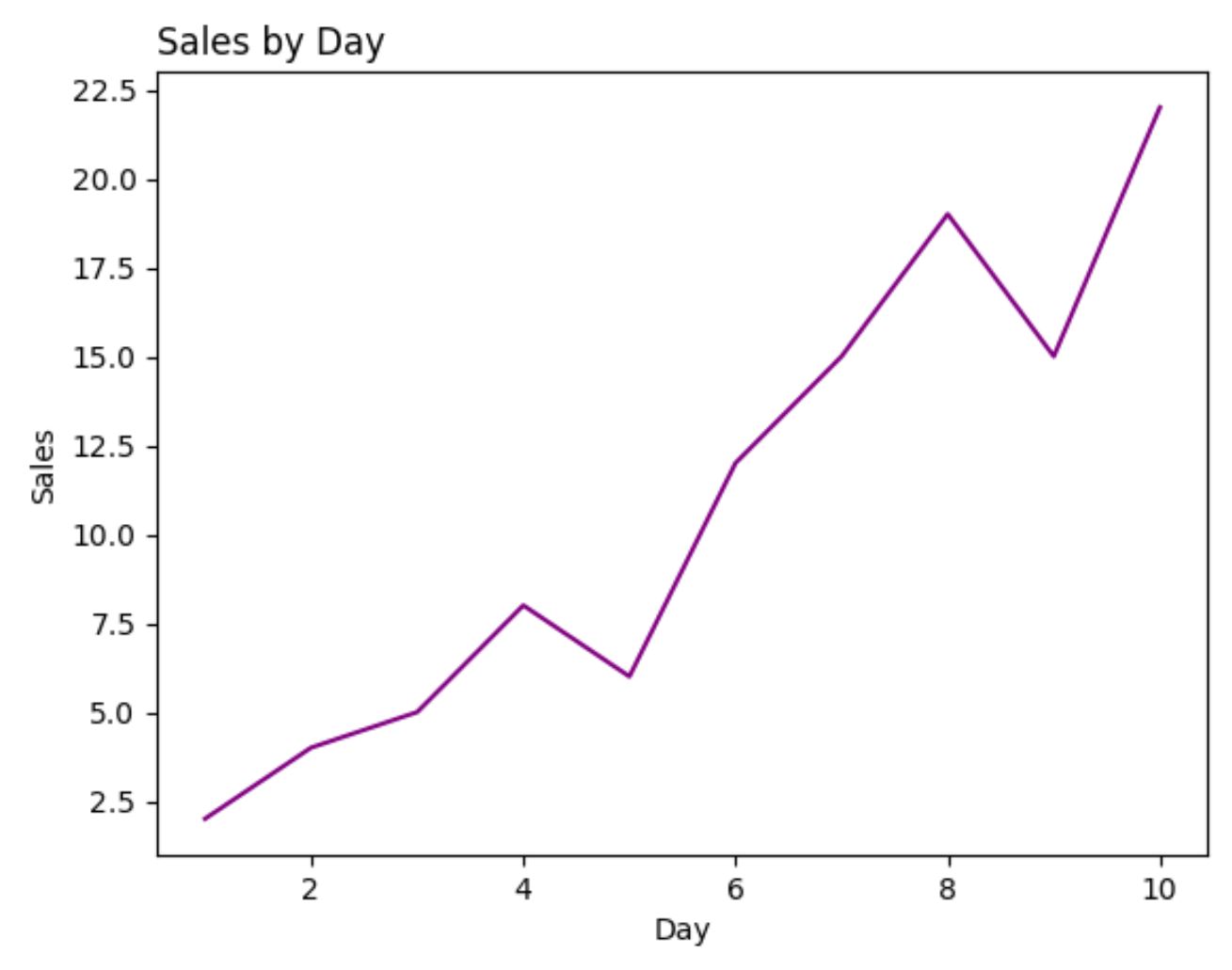
For this example, the number of lines of code needed to generate each plot is roughly the same between ggplot2 and Matplotlib.
Scatter Plots: ggplot2 vs. Matplotlib
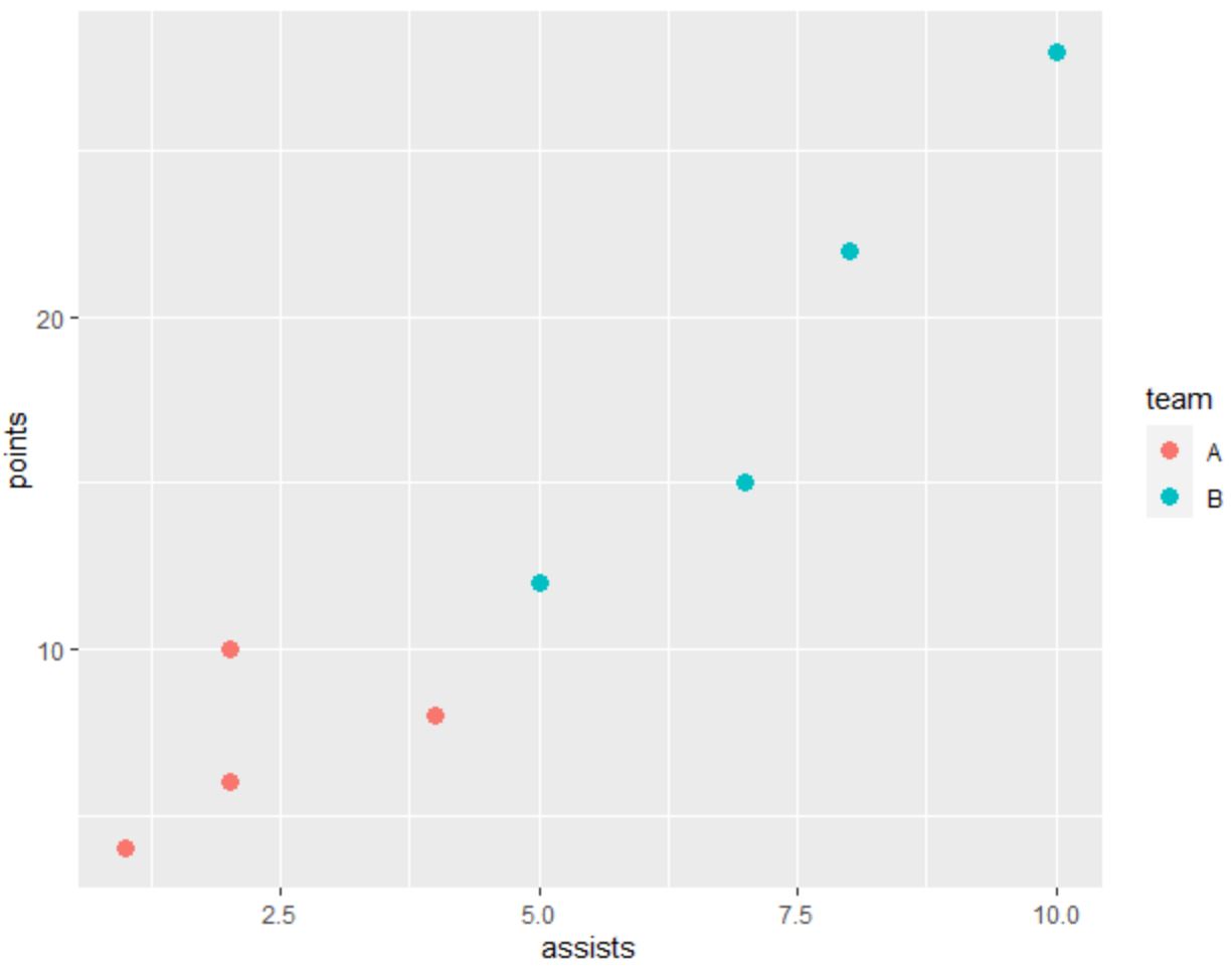
The following code shows how to create a scatter plot in ggplot2 in which the points are colored by category:
library(ggplot2)

#create data frame
df frame(team=c('A', 'A', 'A', 'A', 'B', 'B', 'B', 'B'),
                 assists=c(1, 2, 2, 4, 5, 7, 8, 10),
                 points=c(4, 6, 10, 8, 12, 15, 22, 28))

#create scatter plot
ggplot(df, aes(x=assists, y=points)) +
  geom_point(aes(col=team), size=3)
And the following code shows how to create the same scatter plot using Matplotlib:
import pandas as pd
import matplotlib.pyplot as plt

#create DataFrame
df = pd.DataFrame({'team': ['A', 'A', 'A', 'A', 'B', 'B', 'B', 'B'],
                   'assists': [1, 2, 2, 4, 5, 7, 8, 10],
                   'points': [4, 6, 10, 8, 12, 15, 22, 28]})

#define colors to use
color_list = []
for x in df['team']:
    if x == 'A': color_list.append('#F8766D')
    else: color_list.append('#00BFC4')

#create scatter plot
plt.scatter(df.assists, df.points, c=color_list)
plt.ylabel('points')
plt.xlabel('assists')
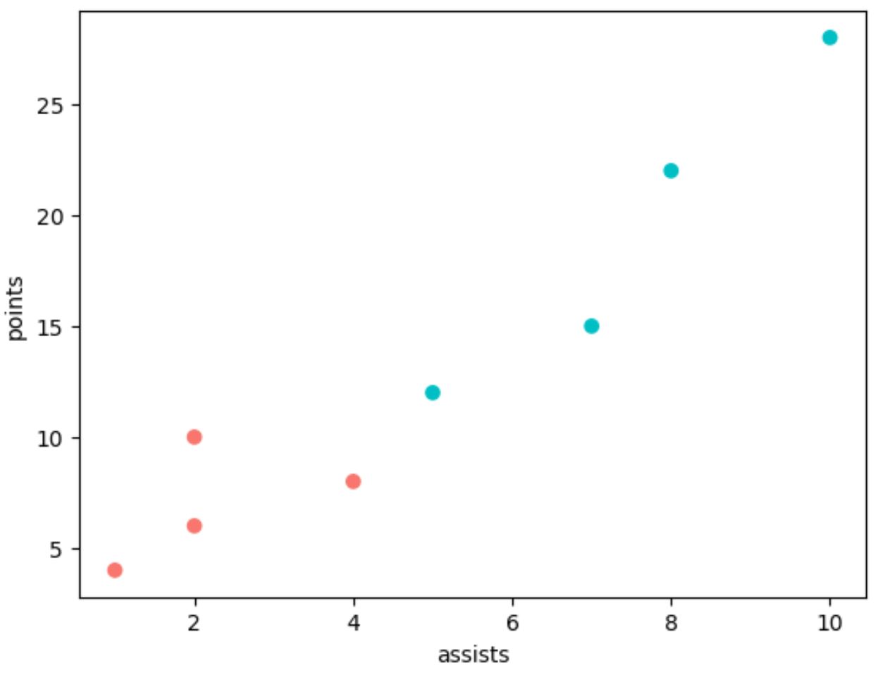
Notice that we had to use many more lines of code in Matplotlib to generate the same plot as ggplot2.
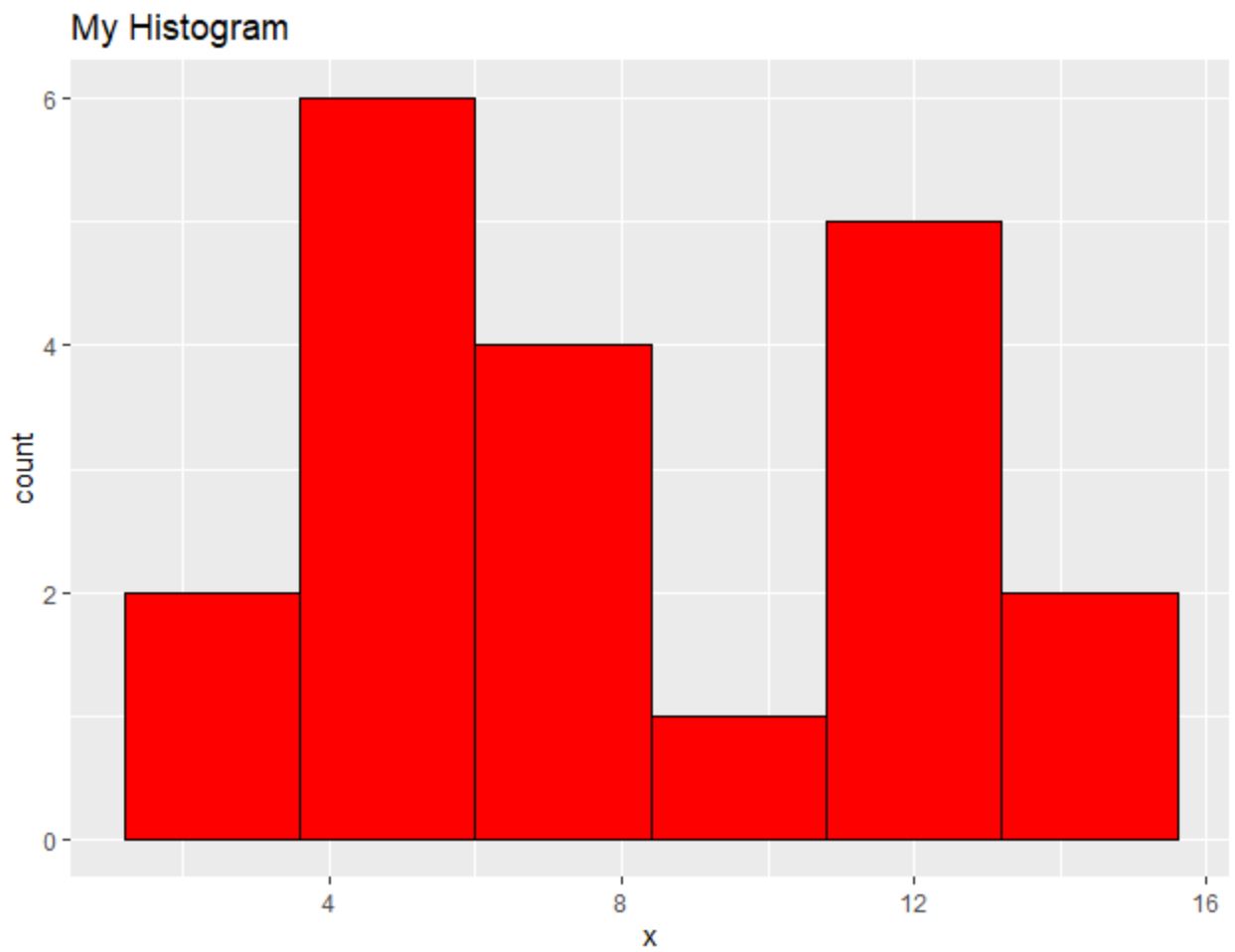
Histograms: ggplot2 vs. Matplotlib
The following code shows how to create a histogram in ggplot2:
library(ggplot2)

#create data frame
df frame(x=c(2, 2, 4, 4, 4, 5, 5, 6, 7, 7, 8, 8,
                     10, 11, 11, 11, 12, 13, 14, 14))

#create scatter plot
ggplot(df, aes(x=x)) +
  geom_histogram(bins=6, fill='red', color='black') +
  ggtitle('My Histogram')
And the following code shows how to create a similar histogram using Matplotlib:
import pandas as pd
import matplotlib.pyplot as plt

#create DataFrame
df = pd.DataFrame({'x': [2, 2, 4, 4, 4, 5, 5, 6, 7, 7, 8, 8,
                         10, 11, 11, 11, 12, 13, 14, 14]})

#create histogram
plt.hist(df['x'], bins=6, color='red', ec='black')
plt.title('My Histogram', loc='left')
plt.xlabel('x')
plt.ylabel('Count')
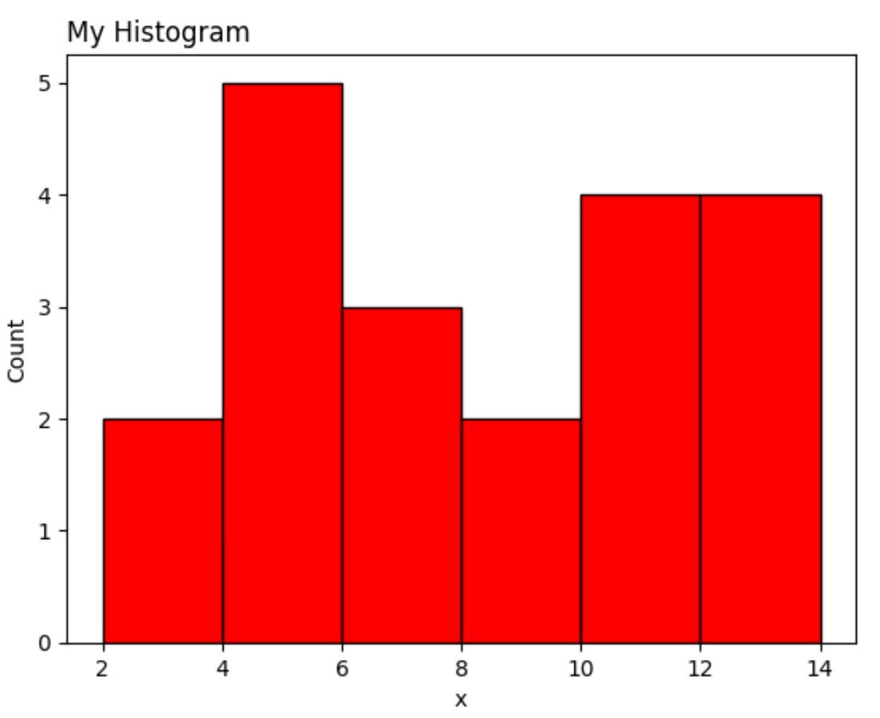
Once again the Matplotlib version requires more lines of code than ggplot2.
Conclusion
Both ggplot2 and Matplotlib allow you to create highly customizable data visualizations, but ggplot2 tends to use less code.
Often the preference between ggplot2 and Matplotlib simply comes down to which programming language you use for data analysis.
People who use Python tend to use Matplotlib since they can perform their data analysis and create data visualizations using one programming language.
Conversely, people who use R tend to use ggplot2 because this allows them to perform all of their data analysis and visualizations in one programming language.