You can use the following basic syntax to shade a particular area in a plot in ggplot2:
ggplot(df, aes(x=x, y=y)) +
  geom_point() +
  annotate('rect', xmin=3, xmax=5, ymin=3, ymax=7, alpha=.2, fill='red')
This particular example shades the area between the x-values of 3 and 5 and the y-values of 3 and 7.
The fill argument controls the color of the shaded area and the alpha argument controls the transparency of the color.
The following example shows how to use this syntax in practice.
Example: Shade an Area in ggplot2
Suppose we have the following data frame in R that contains information about the points scored and rebounds collected by various basketball players:
#create data frame
df frame(points=c(3, 3, 5, 6, 7, 8, 9, 9, 8, 5),
                 rebounds=c(2, 6, 5, 5, 8, 5, 9, 9, 8, 6))

#view data frame
df

   points rebounds
1       3        2
2       3        6
3       5        5
4       6        5
5       7        8
6       8        5
7       9        9
8       9        9
9       8        8
10      5        6
We can use the following code to create a scatter plot and shade the area between the x-values of 3 and 5 and the y-values of 3 and 7 with a light red rectangle:
library(ggplot2)

#create scatter plot with shaded area
ggplot(df, aes(x=x, y=y)) +
  geom_point() +
  annotate('rect', xmin=3, xmax=5, ymin=3, ymax=7, alpha=.2, fill='red')
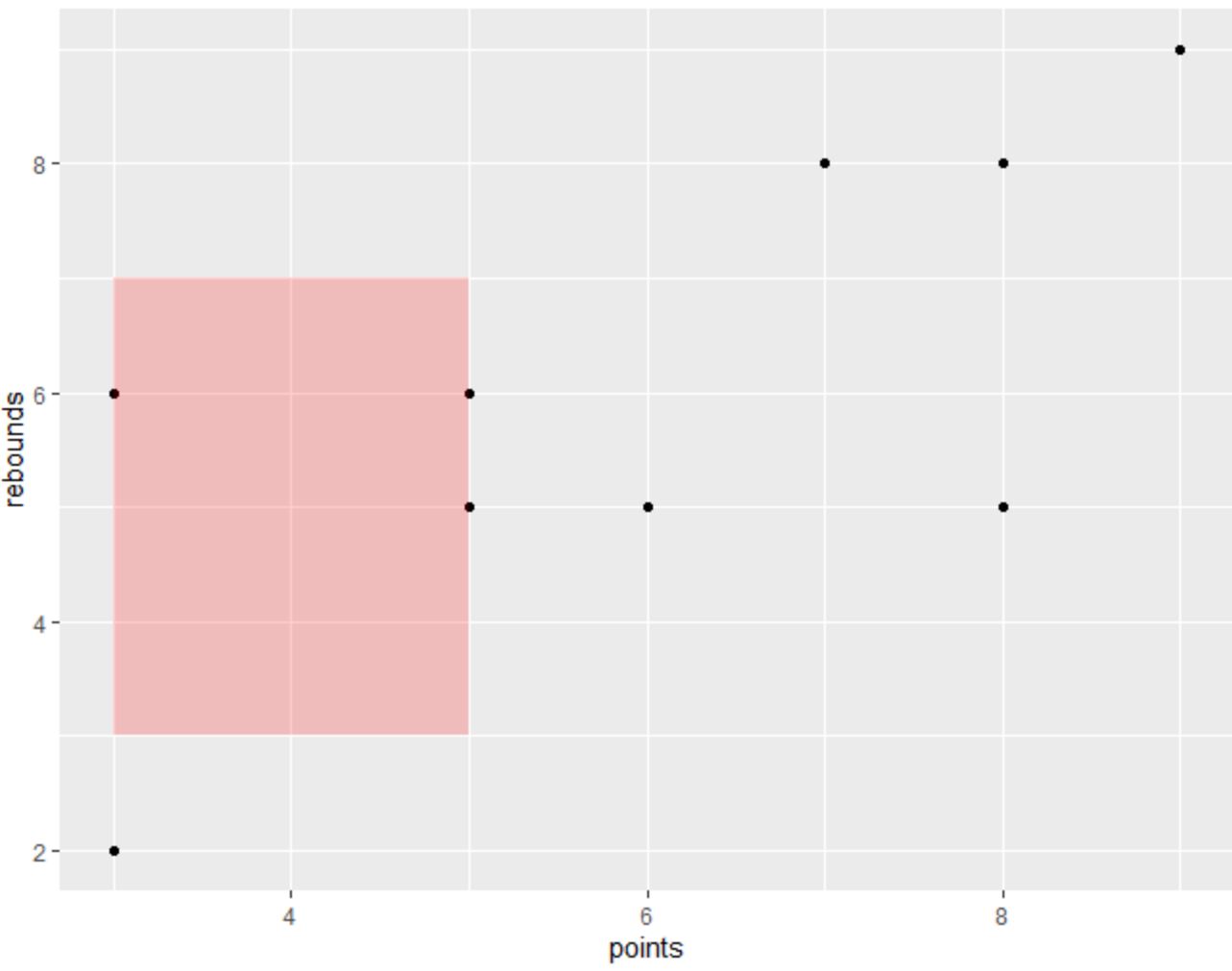
The area that we specified in the annotate() function is shaded with a light red rectangle.
Note that the value for the alpha argument ranges between 0 and 1 with lower values indicating greater transparency.
For example, if we change the value for alpha to 0.5, the color of the shaded area will be darker:
library(ggplot2)

#create scatter plot with shaded area
ggplot(df, aes(x=x, y=y)) +
  geom_point() +
  annotate('rect', xmin=3, xmax=5, ymin=3, ymax=7, alpha=.5, fill='red')

Also note that you can use the annotate() function multiple times to create multiple shaded areas in your plot:
library(ggplot2)

#create scatter plot with two shaded areas
ggplot(df, aes(x=x, y=y)) +
  geom_point() +
  annotate('rect', xmin=3, xmax=5, ymin=3, ymax=7, alpha=.5, fill='red')
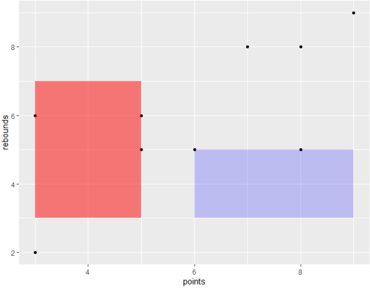
Feel free to play around with the arguments in the annotate() function to create the exact shading that you would like in your plot.
Additional Resources
The following tutorials explain how to perform other common tasks in R:
How to Add Text to ggplot2 Plots
How to Remove Gridlines in ggplot2
How to Change X-Axis Labels in ggplot2