Residual plots are used to assess whether or not the residuals in a regression model are normally distributed and whether or not they exhibit heteroscedasticity.
To create a residual plot in ggplot2, you can use the following basic syntax:
library(ggplot2)

ggplot(model, aes(x = .fitted, y = .resid)) +
  geom_point() +
  geom_hline(yintercept = 0)
The following example shows how to use this syntax in practice.
Example: Creating a Residual Plot in ggplot2
For this example, we’ll use the built-in mtcars dataset in R:
#view first six rows of mtcars dataset
head(mtcars)
                   mpg cyl disp  hp drat    wt  qsec vs am gear carb
Mazda RX4         21.0   6  160 110 3.90 2.620 16.46  0  1    4    4
Mazda RX4 Wag     21.0   6  160 110 3.90 2.875 17.02  0  1    4    4
Datsun 710        22.8   4  108  93 3.85 2.320 18.61  1  1    4    1
Hornet 4 Drive    21.4   6  258 110 3.08 3.215 19.44  1  0    3    1
Hornet Sportabout 18.7   8  360 175 3.15 3.440 17.02  0  0    3    2
Valiant           18.1   6  225 105 2.76 3.460 20.22  1  0    3    1
First, we’ll fit a regression model using mpg as the response variable and qsec as the predictor variable:
#fit regression model
model
Next, we’ll use the following syntax to create a residual plot in ggplot2:
library(ggplot2)

#create residual plot
ggplot(model, aes(x = .fitted, y = .resid)) +
  geom_point() +
  geom_hline(yintercept = 0)
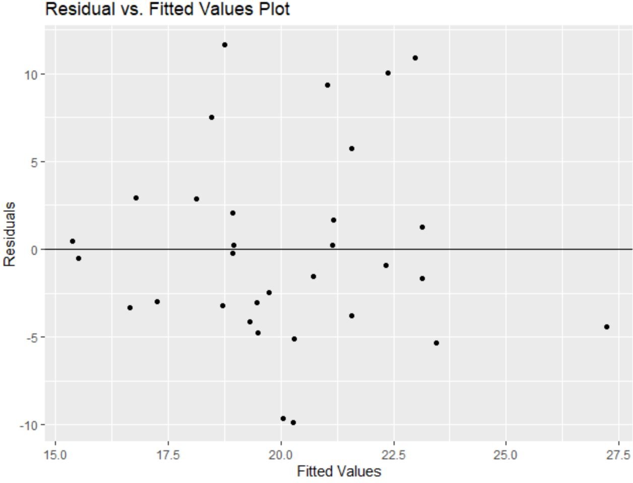
The x-axis displays the fitted values and the y-axis displays the residuals.
The residuals appear to be randomly scattered around zero with no clear pattern, which indicates that the assumption of homoscedasticity is met.
In other words, the coefficients of the regression model should be trustworthy and we don’t need to perform a transformation on the data.
Also note that we could use the labs() function to add a title and axis labels to the residual plot:
library(ggplot2)

#create residual plot with title and axis labels
ggplot(model, aes(x = .fitted, y = .resid)) +
  geom_point() +
  geom_hline(yintercept = 0) +
  labs(title='Residual vs. Fitted Values Plot', x='Fitted Values', y='Residuals')
Additional Resources
The following tutorials explains how to perform other common tasks in R:
How to Calculate Standardized Residuals in R
How to Calculate Studentized Residuals in R
How to Create a Histogram of Residuals in R


